One thing I do not want to do is get into a habit of 'standard' print images, every one the same. That only works for me if that tonal range benefits the image. Some images aren't meant to be exactly the same tonal range as another, and it is obvious. Considering the images in the Tombstone Portfolio, they center around activity on Main Street during the day with the sun out, which happens to be the reality of things in real life. So, for me, having the same tonal range over the majority of those prints isn't out of the ordinary. It's usually always a sunny day in Arizona. It would be my guess one wouldn't see cowboys hanging out on the street when it's raining, these days.
The other portfolios of prints aren't nearly as standard. There is far more variation in tonal ranges within those bodies of work. Each shot was a different place different time and under different conditions, making them more unique in the lighting conditions, and hence print images respectively. Having said all that, with this portfolio I have arrived at a preparatory process that defines each image to its best effect, then reverse it to a negative and apply a <curve> function I created for Kallitypes. That is giving me a ten minute print time, which, as I have written on many times, is the sweet spot, for me. Twelve minutes would also be good. Under ten minutes not as good. It has to do with arriving at dMax during the print time.
I'm using the same digital preparations for the negative as the previous print images. Also the same paper, developer and toner; palladium. Being my eyesight is basically crap, for seeing finer details and any color within the red/green spectrum, I tone my prints close to ten minutes to ensure the toner is reaching the blacks, as most toners I use are 'top down' toners. That is the toning begins at the highlights and works down to the blacks, from five to ten minutes, usually. I have no doubt I miss much of the subtle shifts in tonal color over that toning time. I just make sure it's toned to the fullest.
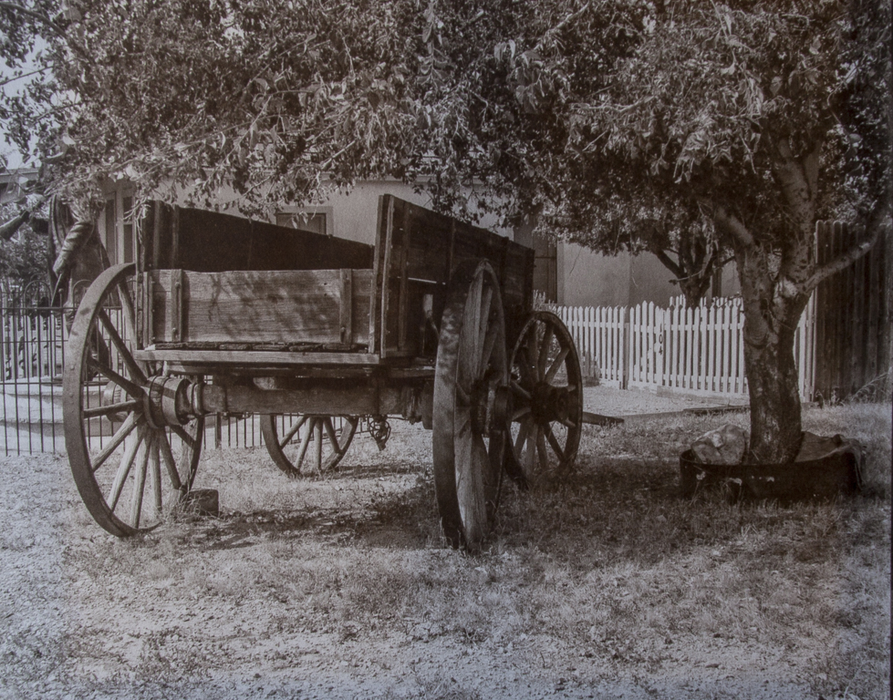
Palladium toned Kallitype
"Wyatt Earp's Wagon" ~ 8x10 ~ 1/5
Tombstone, Arizona