Wednesday, December 28, 2016

Phase III ~ The Finish

I had held out hope that I would now be standing in my new darkroom, happily making prints. I can say that I am sort of standing in said new darkroom, although not yet printing. I will be painting what is left of the small area left after the first gallon of paint disappeared. By week's end the new room will be painted, with the final flourish arriving next week when my old friend Harry arrives to make the water and new electric lines connected, and the sink frame and work tops framed in.

This project provides the mixed blessing of a fabulous new foundation for my artwork, as well as the physical demands best suited for a much younger man, with much more energy. Before the project began I had only cursory expectations of ever producing a meaningful portfolio of palladium and gum prints every again. Printing a couple times a month in someone else's darkroom is not all that conducive to printing such a portfolio, in one lifetime. With this facility I will be able to produce four prints per day should I choose to do so. Gums of course take weeks to accomplish.

I have written here on the subject of hand coated printing processes, mostly focused on the prints I had already printed, all of which were printed thirty years ago. The few prints I have been able to make in PJ's darkroom have begun the conversation on work being produced now. That conversation will be ongoing once the new darkroom becomes functional. I will be able to address more specific issues and practices being applied, with print examples to show. That makes it a bit more meaningful than theoretical discussions.

If you do see this post then thank you for your visit. I hope to make your visits more meaningful and enjoyable as time goes on. I am currently printing an "Arizona" portfolio. The images are from two historical towns in Arizona, Tombstone and Jerome. With sufficient patience, it is possible to capture photographs of historical locations and period characters in Tombstone sans pretty much all evidence of modernity, leaving an image that fairly replicates what would have been seen a century ago. One of the images I will be including in this portfolio is a photograph I took inside Paul & Jerry's in Jerome, Arizona, in 1986 during a visit. The locals would recognize the patrons sitting at the bar, as being the "old timers". 

Salted Silver Print
" Paul & Jerry's" ~ 5"x7" ~2/5
Jerome, Arizona
 

Friday, December 9, 2016

Phase II

After three weeks of steady work I am at the finish line to completion of the new darkroom. Body aches and self-inflicted wound as they are, the finished printing room will be worth the blood and tears in bringing it to life. This is a true work of love for me. Only a distant dream over the past thirty years. This is way better than a shiny new wagon. But then I'm just old.

Phase I was building a new workshop building, with sub-floor and roof. Three parts. Done. The past three weeks has seen my building shelving and other accommodations in the new shop to hold all the stuff from the old building, then clearing it out to bare frame to be insulated and sheet rocked, with sink frame and working counters. The final phase arrives next with when my contractor friend returns for finishing the darkroom. Final piece to it all is building my Solar Printer, in my new workshop.

With my daily focus on building things, I have had little opportunity to print, with exception to a couple hours last week on Saturday in PJ's darkroom. That netted me one new print I had yet to print. Tomorrow with the light in my favor I will get it digitized to post. What I can tell you is that by the end of the year I will be printing regularly, daily. There will be prints to show, new things learned, as I will be ready to print in palladium, not just tone in palladium. That is going to be a very nice upgrade for me.

My thanks to you for visiting my blog, and returning. Soon, there will be a new stream of images to check out and possibilities to explore. Stay tuned.

Tuesday, November 22, 2016

Phase I;

The building project to put together a custom printing room is moving along nicely. The new workshop & tool shed is complete. Roofing comes next, then complete stripping of the current workshop down to the floor and rebuild everything, including the wiring. At my age, this is epic stuff, as well as hard on the body. Worth every ache and pain though, having a printing room out my back door. With the holidays and building there is precious little time for printing. My apologies. Soon though.

Tuesday, November 15, 2016

Schedule Break ~ Building Printing Room

Tomorrow my old friend Harry arrives to help be build a new tool shed/workshop for me then remodel the existing workshop into a custom darkroom/printing room. The first phase unfolds this week building and roofing the new shed, pulling down a dividing wall in the old workshop and hook up fresh switches and four-way plugs for the workshop. Phase two unfolds right after Thanksgiving when we finish the new space, add a dedicated electric leg for the air-conditioner, and new water line & sewer line hookups.

When the new printing space is completed I will be buying a Epson C88+ printer for printing the negatives, and will have a new UV printer that I'll build right here in the new workshop. I will be wringing out the new space and by year's end, all the bugs will be cleared and real printing begins in earnest. Be patient and good things will show up soon enough. I appreciate you taking the time to visit. Hopefully I make it worthwhile.

Second Print ~ Hot Negative

A second print from yesterday's printing session comes from the same negative group, so it also has a density range that is too long to print in well. The same situation with this image as the Longhorn Restaurant print, textural loss at both the lower and upper densities. Again, I have already corrected the negative to reflect the new density range. The print time will be approximately the same, there will just be more texture and detail at both ends of the tonal scale.

One more A/P print to hang on my walls at home, for awhile, until it is time to replace it with something newer. There will be three dancing Indians images in this portfolio. When they are printed right they will  be a nice accompaniment to the other period images. The Kallitype is very successful in showing off the dMax blacks. In this case the palladium toner enhanced the blacks a lot. Gold toner would also enrich and deepen blacks like nothing else, without adding the overall print warmth. There will be a lot of gold toned images coming after this palladium portfolio is finished. For me, the palladium suits these period images better than a stark black and white imagery. But then again, that's part of the printer's choice.

Paper; Revere Platinum ~ Print Time 15 minutes

Palladium toned Kallitype
"Sacred Spirit Dance" ~ 8"x10" ~ 1/5
Tucson, Arizona

Monday, November 14, 2016

Fresh Prints ~ New Insight

Today was not the best of days in the darkroom. Intervening variables made themselves known during the printing session, rendering two prints useless. Not the important part of the printing session. I've allowed my my calibrated eye to lose sight of the density objective, for most images. The nice bright densities slipped in to leave two negatives more contrasty than needed, losing texture in the top two tonal ranges as well as suppressing the lower tonal ranges from overprinting.

Today's printing session was working with the Kallitype. There are elements of that process I find enjoyable, even intriguing, although it is not the easiest process to nail down. As you know, the Kallitype is a mixed process; printing out before developing out. The print time being roughly 50% of normal print time, and I can only imagine that is derived from a fully printing out process such as the salt paper process. It is the other silver process I work with, and the one I worked in thirty years ago. I feel at home with salted silver printing, a printing out process.

As I mentioned before, the Kallitype will print more contrasty than the salted silver print, using the same negative and toning procedure. In my case it is because I use 13% silver solution for salted silver and the Kallitype calls for 10% solution in equal parts ferric oxalate. The lower silver percentage will create much deeper blacks; dMax. This print has plenty of dMax value, as well as Zone 7 and above, and that makes the image overall too contrasty for my taste. The second floor area of the restaurant should have full texture, and the areas under the roofed sidewalk could be a bit denser to hold in more texture as a Zone 3, instead of Zone 2. This is one of those prints I will hang on my wall for awhile, an artist's proof. When this one is reprinted it will have all the tonal values in place.

The drawback to the density setting method for negatives I use is that it is a visual calibration, and therein lies potential missteps like this one simply being too contrasty, too long a density range. I have already gone through the next batch of upcoming negatives to reset them to the corrected calibration.

Paper; Revere Platinum ~ Print time 10 minutes; the print time is correct

Palladium toned Kallitype
"Longhorn Restaurant" ~ 8"x10" ~ 1/5
Tombstone, Arizona

Sunday, November 13, 2016

Continuing the Portfolio

Thanks to PJ I have three new negatives to take with me to the darkroom tomorrow to continue the portfolio. As exciting as that is for me, even more titillating is my old friend Harry arriving on Wednesday to begin the work of remodeling my current workshop into a custom printing room, after, building a new workshop & tool shed before making over my printing space. Two phases to be completed before month's end. Then the prints will come fast and furious, ten steps outside my back door to the printing room.

For now, I can keep the focus on the printing at hand, which is finally calibrated well to the processes involved. I have been printing in salted silver (salt paper) and Kallitype, then toning the prints in palladium, for the most part. I have been focusing on these two mediums to begin with as they are more straight forward than gum prints. Having spent an afternoon with a new found photographer friend, enjoying the hung prints at the Center for Create Photography on the UA campus, and a special viewing of W. Eugene Smith photographs upstairs, then on to the Etherton gallery to view a show including Roger Ballen, and the prices on his prints should make any photographer take notice. Apparently I haven't been paying attention to exhibitions over the past years. A fine discussion for another time.

Now that I have settled into a known routine for scaling negatives, there isn't much to discuss on that front, unless someone actually queries on that subject. What did come up in the discussions with my friend yesterday, was the ongoing photographic courses he is taking at the community college. All I will say on that front is to repeat what I have said before. Teaching general photography in a classroom setting, as well as photo journalism, event photography, commercial photography and the like can be useful. Attempting to teach fine art photography in a classroom tends to be a disaster. When I heard the curriculum and approach to hand coated processes, and the outcome, well, I kept my thoughts to myself.

Having been away from printing as long as I have has some big downsides, like not knowing the photographers who have kept to historical hand coated processes and stay with them. My friend left me with a link to such a photographer's website, who works in historical processes and can actually print well in gum, a very rare talent these days. I don't believe this young woman would mind my mentioning her here; dh bloomfield photography: http://www.dhbloomfield.com I applaud all those who keep the historical processes alive and well. Hopefully I will have an opportunity to meet this printer and see more of her work. In my thinking, there are advantages to gathering talent within a group effort to fortify and enhance all involved. Such a group effort within hand coated print makers to come together would be beneficial for everyone. I'm working on that.

Saturday, November 12, 2016

The Tombstone Portfolio

Yes, I squeezed three posts out of three prints. You know that's fair, for a one eyed old guy. Printing will be more continuous when I have my own printing room at my house. That begins the 16th when Harry arrives and phase I goes into affect. The week after Thanksgiving is when Harry arrives for the completion of phase II, the actual printing room. I will also be building a second printer, now that we know this setup works as well as it does.

PJ was kind enough to print three more negatives for me this morning, which I then rushed to the darkroom to print. They confirmed the earlier negatives of the same densities before them, this is the optimal density range, with corresponding print time, for a final print with a full tonal range, or at least one desired. The entire tonal range of the negative can be manipulated, altering the densities in two aggregate groups. One group representing Zone 1, 2, 3, and a smidgen of 4. The second group controlling Zone 6, 7 & 8. By stretching or contracting those grouped densities, the image can be controlled quite closely. The values I assign are for my tastes, and might be printed slightly different for another rendition, but I believe I have shown that the density range is proportional as expected for the lighting conditions presented, being full sunlight.

I have worked on this print through numerous iterations of the image. This is what I had been working towards all along. As in all the other prints, the paper is Revere Platinum paper, using the salted paper process; 2 2/1% salted paper; 13% silver solution- 2 coats. This one was a seven minute print. It could have been an eight minute print. I saw this, after the toning and fixing of course.....

Now notice the Kallitype print below the salted silver print. Same negative, same toning, but what you see is the silver levels. 

Palladium toned Salted Silver Print
"Stagecoach on Main Street" ~ 8"x10" ~ 1/5
Tombstone, Arizona


Inkpress negative; Spectral density using green over a scaled negative I refer to as 'bright'. The use of spectral density as a valuable tool cannot be overstated.


Palladium toned Kallitype
Same negative, same palladium toning
The most obvious difference between the two images are the stronger blacks of the Kallitype. Some of this visual difference can be accounted for by personal error, copying the print then preparing it for posting can lead to unintended shifts. Basically though, the I have tried to print the image as demanded by each process. I was able to print down the salted silver print until everything had been printed in. For the Kallitype I had to follow rough protocol, being about 50%-60% of print time before development.


Printing conditions are basically the same between the two prints. Same paper, same negative and same palladium toner. Print time for this Kallitype was 5 minutes; 7 minutes for a salted silver. With exception to wanting to add one minute to the salted silver print image, both prints were for all practical purposes spot on. Full tonal range print in direct sunlight, everything in textura sl tonal range.

The real beauty of hand coated printing methods is the ability for each photographer/printer gets to create their own interpretation of any given image. I am a traditionalist, sort of.... I shoot and print pretty much like I was hoping to take my portfolio to Gallery 291 to see Alfred about a show. That's just me. By the time this post is being read I'll be at PJ's having negatives printed, more images for the Tombstone Portfolio. I plan on having fifteen prints for that portfolio. Portfolio II is already being organized.


Friday, November 11, 2016

Personal Artistic Tastes ~ Printing Choices

Although this blog has a stated focus of discussing hand coated processes and printing methods, the very energy that glues all the process and procedural elements into place is the artistic vision of the photographer. Nomenclature being what it is I prefer using the term printer, and printmaking. Many lines have been blurred over the years with technological advancements. Printmaking is the same now as it was 150 year ago when it was first applied. Speaking for myself, this is exactly why I adore it so much. In the past century of coating rag paper with silver or palladium, the traditional method was rodding, using a thin glass rod, heated and bent for 'handles'. The only real change to that procedure in that century is the advent of the "Puddle Pusher". Acrylic at its best, an 8 1/2" small rod, with a flat handle attached on one side. No more bending glass for handles....

Pushing silver back and forth over a piece of Revere Platinum 100% rag paper, a little soaking in each pass of the rod, is the same thrill today as it was when I first tried it thirty five years ago, as it was a century ago when the Secessionists hung their "poor man's platinum" on gallery walls. I'm going to stick my neck out here and posit that Paul Strand likely printed using platinum or platinum/palladium, as did Edward Steichen in his print of Alfred Stieglitz, and vise versa. Some day, perhaps palladium. My words will only ring well to only a slice of photographers today. Although a growing resurgence in hand coated processes. If there is karma, the resurgence in hand coated printers will continue to grow, and reciprocally, the art buying/collecting public at large will take notice of hand coated printmaking, in limited editions, and come to realize the collectable bargain those prints represent. Those that know me are aware of my fierce belief in limited edition artwork. Open edition and collectable art, are not mutually inclusive terms, for me.

At my age, my only intention is creating as many beautiful prints as is possible in the finite time I have left. How that is received by the public has no part to play with my printmaking. What I do intend for every print that is made by my hand is that it be worthy of an exhibition image, in archival form, printed well to represent the image as previsualized. It is true that pieces of modernity infringe upon the original salt paper process. Today I use a "Puddle Pusher" coating rod, on rag paper that's been around longer than I have, and today I'll slide the printing frame under the Solar Printer, close the printer door and flip on the timer. But that saturated solution of silver, soaked two coats deep into that rag paper is going to get black the same way it did for me thirty years ago, using the sun. I am enjoying the advent of technology upon my beloved printing procedure, but the print quality remains the same as it was those many years before.

What all this is about comes down to is finding a process, as well as a negative density range that reflects your vision. The density range of a negative alters the outcome of how a silver print will look, toned or not. One of the things I hope to bring out is the differences between processes. There are several processes that use silver, like the simplest of them all the salt paper process, the Kallitype, and the Van Dyke Brown. Each process uses a different form of ferric iron or salt as the binder for the silver solution, which ranges from 10% to 13%. Also, there are more than one developer for Kallitype and Van Dyke's, with each altering the final image color, from purplish, through red, red/brown, brown, black. It is the same with Pt/Pd printing. There is more than one developer.

I have found the Kallitype to be a very nice outlet for the printing. Tomorrow's post will show two prints from the same negative, same palladium toning, two different looks for the same image, a salted silver & Kallitype. The salted silver print was a 2 1/2% salted paper & 2 coats of 13% saturated solution of silver on Revere Platinum paper. The Kallitype is a single coat of 10% silver solution to equal part ferric oxalate 20% sol. The salted silver process using this relationship of salt/silver solutions handles a much longer tonal scale than the other methods. By reducing the silver solution, and salt solution relationship, increases the contrast of the image with the salt paper process. Hence the 10% silver ratio of the Kallitype reflects a more contrasty image. You will see this in tomorrow's post, with the two finished prints side by side.

The images I've been working on and posting make up the first portfolio, the Tombstone Portfolio. Next up will be another portfolio with more historical shots of Arizona, some taken in Jerome in the eighties when I made the pilgrimage home from Eugene, Oregon to visit. My connection to Jerome goes back to 1958 when I sat astride one of the burros that took children for rides on the cobbled streets, for 50 cents.

Paper; Canson White: salted 2 1/2% ~ Silver solution 13% ~ 2 coats
Negative; Kodak F-250 Super XX ~ using Burke & James 5x7 flatbed view camera
                 developed in Pyro/Hydroxide (Hybrid Windish formula) 20 minutes

Un-toned Salted Silver Print
1985 ~ 5"x7" ~ Unique
"Jerome House"
Jerome, Arizona

The Tombstone Portfolio

Every photographer who has ever developed their own film and printed knows what I mean when I say that the testing is over, printing begins. If I didn't make that abundantly clear whooping it up in the last post. My theoretical process is functional. One can set the densities of a negatives in an ordered way through visual inspection and arrive at a predictable print time and tonal range. In a nutshell.

The negative I posted a few articles back can be compared to the print that it made, and pretty the subsequent prints thereafter. That print was the sweet spot. Each print now may differ a minute or two, depending on interpretation of tonal values, which for me is when I see a Zone 8 slip into the texture of a Zone 7. I would also mention here again that toning will alter the print image. Palladium toning tends to lighten up darker areas of a print, meaning the blacks. If the black is well burned in it will remain, although perhaps not as deep. A gold toner would strengthen any black, deepening and enriching.

This print was a new one, a wider angle shot of the horse's head, posted earlier. Here, again, I will add two minutes to the print time, to bring in the fuller textures of the horses. I pulled the print as the man on the left was almost entirely black and I didn't want to lose any more detail. All that opened up when the print went into the palladium toner. Next time.

Palladium toned Salted Silver Print
"Hitching the Team" ~ 8"x10" ~ 1/5
Tombstone, Arizona

Thursday, November 10, 2016

The Tombstone Portfolio

The testing of density range and print time is finished. I have arrived at what I believe is the optimal print time, and the finished print image is what I had envisioned. Once again I made three palladium toned prints in one print run. I consider that a pretty successful print session. These three well scaled negatives left reciprocal full scaled prints with 8 minute print times. Much less needs to be said about the final print beyond the tonal scale representing what I had in mind for the subject.

The OK Corral is the heart of Tombstone, the consummate story of how grudges were settled in the old west. My photographer's eye was always seeking dynamic opportunities with historical characters and scenes, when I see that opportunity approaching most signs of modernity can be eliminated as well, sometimes all, as in these shots. I haven't altered the natural signage.

The image I have most wanted to capture was the OK Corral, with Doc Holliday, bright sunshine outside and the Doc & woman character in the shade are both fully scaled. The new formula for scaling the negative has shown six prints in a row all print between 5 minutes and 10 minutes, most at 8 minutes. The variation mostly comes from personal interpretation of the print, and expectation of changes in the print due to lightening and darkening, respectively. I decided to error on the lighter side, leaving a Zone 7 white at Zone 8, say. Careful note taking helps when printing the image again.

The new negative accommodated for the roof & building facade brilliant sunlight as well as the deep shadowed area underneath the porch. Keeping the light effect on the woman's sleeve, and the crisp white took some tweaking. In the print, there is a full tonal range underneath the porch, as well as above. A good example of a compaction.

Palladium toned Salted Silver Print
"OK Corral" ~ 8"x10" ~ 1/5
Tombstone, Arizona

Wednesday, November 9, 2016

Consistency in Print Time

I have a stack of finished prints of the original dancing Indians in "Sacred Dance", flawed all, three of them with unexplained contamination marks, immediately taking them out of the exhibition level print. No need to mention this becomes painful after awhile. I haven't reprinted that particular one as after extracting the negative from the printing frame it too got contaminated with some sort of liquid. A quick check today shows that the liquid had no lasting effect on the negative.

What I did print was another variation of the dancing Native American Indians at a Pow Wow in Tucson. Native American Indians tend to shun having their photograph taken, for spiritual reasons. I try to respect that, for the most part. I don't single them out and try to make the portrait. If they are in the open public performing I feel that is fair game, and I have a long lens. One upcoming print will be a full frame image of Doc Holliday, mugging for the camera, and he looks glorious.

The Tombstone portfolio continues to grow. These new negatives are printing as hoped. The print time is such that the print reaches a 'good' point when the blacks reach dMax and the rest of the tonal range is separated to represent the subject matter in the lighting conditions of the time, or as the printer wishes to represent the lighting. The best aspect of the consistency within negatives is foreknowledge of outcomes to variations within the process. Variables like choice of toners, etc. it's all part of shaping the outcome

This was the third print, printed on Revere Platinum paper; salted 2 1/2% ~ Silver Ag 13% - 2 coats
Toned in palladium/citric acid ~ Center dancer is holding a large feather in front of his face.

Palladium toned Salted Silver ~ Salt Paper
"Horse Head" ~ 8"x10"
Tombstone, Arizona

Tuesday, November 8, 2016

Capturing the Light ~ Print Time

One of the biggest visual struggles when printing the salted silver prints is deciding exactly when to stop printing. At what point does further printer begin to suppress the middle tones without adding anything of value to the whites. Toning changes and fixing changes, then dry down all have small influences upon the final print, as many of you know. Having a predictable negative when printing just can't be stated well enough. The negatives of the new formula of visual inspection of density values is finally paying off. The prints are all coming out to be 10 minute prints, giver or take a smidgen. We have effectively created perfectly scaled negatives to work well with our 160W UV printer with light source 8" above the print surface. All of that can be rearranged to fit different printing needs.

The portfolio I have begun printing up is made up of images I shot some years ago while visiting Tombstone, Arizona. If one is sufficiently patient, there are short golden moments whereupon the shots are devoid of any modernity, which then makes the image a bit more visually traditional, especially in the palladium form. Perhaps that is but my personal proclivities, but I am hoping to present the images in as traditional a light as possible. The intent not being to deceive, but to visually show what one might see had the print been made a century before. There are a couple of time when a piece of a modern car needed to be cloned out, or some other small visual evidence out of period that would otherwise distract. I don't remove or re-text natural town or business signs.

I have other images of historical sites in Arizona, some being of Jerome, an old Copper Town that has legends of its own. The first portfolio of historical western images will consist of twelve planned prints. Perhaps that might swell to fifteen, as there is a sizable collection from which to draw from. There will likely be three or four prints with a stagecoach in the image, as it makes for rather fine historical material context. The negative formula has to do with offering good dMax, good shadow detail with full highlight texture and detail, all in a natural relationship to the lighting conditions.

I liked the weight of the barrel in the lower corner of the image, with decent blacks, showing detail in full shade, while holding in detail in the upper tonal values in full sunlight. The print time cut off was when the driver's white sleeve just separated from the surrounding tones and showed the first texture. That's the break between Zone 7 & 8. The gray range of the middle tones fell into place once the texture areas of Zone 3 and Zone & reached their optimal point (print time).


This print was also printed on Revere Platinum paper; salted 2 1/2% ~ Silver Ag 13% - 2 coats
Toned in palladium/citric acid

Palladium toned Salted Silver ~ Salt Paper
"Stagecoach from Porch" ~ 8"x10"
Tombstone, Arizona

Monday, November 7, 2016

New Prints from New Negatives ~ The Sweet Spot

I'm late. I know. Life and paying dues to the Trickster. I did make it to PJ's darkroom for a quick printing session before an appointment, then squeezing in a third print afterwards just because the new negative formula is right on. The sweet spot, the ten minute print, fully scaled. We have adjusted for every conceivable contamination scenario and now every print is a pristine print. The Puddle Pusher, can't say enough good things about that thing.

The original task was finding the correct density range/print time to print in silver, tone in palladium. The "Poor Man's Palladium". We've begun with the salt paper process to use as a baseline for print time, being one prints to visual completion in the salt paper process. That is, print in the image to where you would want the value to look like when the print is finally dry. There are considerations to make to do that. The above has caveats, one being toning choice. Toning in gold doesn't come out the same as toning in palladium. Then a small change after fixing, as a slight lightening, before that is mostly nullified after dry down.

The palladium toning lightens up the print image, mostly seen in the lower tonal range, where areas of black of about Zone 2 opens up, or lightens up to something closer to a Zone 3. The longer the density range, longer print time, this affect of lightening in the blacks decreases a bit. The negatives I have been working for, and how have, are effectively scaled for a full density range in the print, from pure black (Zone 1) to perhaps blank white (Zone 8), but certainly show the fully textured whites for the most part. I reprinted the Horse Head negative to fit the new negative formula and printed it today as a salt paper print, then toned it in palladium. I was after holding the majority of the white horse in the Zone 7 range of full texture, with the highlights in the white area, like along the upper mane, to be Zone 8, but just below complete paper base white.

The three prints were printed on Revere Platinum paper; salted 2 1/2% ~ Silver Ag 13% - 2 coats
Toned in palladium/citric acid

Palladium toned Salted Silver ~ Salt Paper
"Horse Head" ~ 8"x10"
Tombstone, Arizona

Sunday, November 6, 2016

The Target Negative ~ Straight Printing

The first successful photography business I ventured into was called Straight Photography. I was something of a purest at the time. As I noted more than once, my mentor in all t hings black and white photography was Alfred Stieglitz. And no, I didn't actually meet him, although... I was only two years off when he passed on. What he espoused and promoted a century ago remains pertinent today, and I believe any photographer today who fervently remains in the black and white camp, especially film shooters, are the choir of this position.

I might mention here that even the digital black and white photographers keep to traditional b&w values, applied using digital tools instead of chemistry. Good news for them is the new Piezographers who are replacing ink sets; both dye and pigment, with carbon based ink, applying it to black and white photography digitally with nine nozzles of black. Technology marches along as healthy as ever, while the beloved black and white realm of photography remains constant, albeit perhaps, less printers today, with so many other avenues now available. Perhaps too, I am wrong, with more interest in black and white photography today increasing, with the Millennials finding the artistic joy of this craft as inviting as screen based entertainment. I have grandsons who show me a lot of said pulse.

Having opened this post with Straight Photography, such a subjective position makes for a seeming conundrum, although I might argue otherwise. I refer to Stieglitz' "equivalence", in that the final print is what the photographer/printer deigns it to be through personalized treatment. As you know, from printing. The comparison between the Salted Silver and Kallitype image of the stagecoach was for exactly that reason. By altering the negative, I alter the print's outcome. Personally speaking, I am after something in between those two images, and I believe the new negatives I just printed up will do exactly that.

One of the negatives I just printed up is the image of "Horse Head", which I printed a couple of sessions ago. What I came to see of this print was that the density range was off, leaving the print lacking detail,  yet shorter print time which shifted the image much warmer, with the palladium toning moving things even further warm brown. The new negative should/will correct this, printing in the upper tonal ranges, which are important being the primary image, the horse, is white. That's working for a tonal range within a tonal range. Fine tuning.

This print is a salted silver (salt paper) print, on Revere Platinum paper, salted 2 1/2% ~ 13% Silver solution; Print time 8 minutes, toned in palladium toner 4 minutes. The new negative will bring down the highlight zones and fill in lower tonal zones, shortening the density range just enough that everything prints in as desired when Zone 7 fills in. This print is okay, but not what it could be.

Palladium toned Salted Silver Print
"Horse Head" ~ 8"x10"
Tombstone, Arizona


Saturday, November 5, 2016

New Negatives Printing

The last print sessions were very instructive on how the green toned digital negatives respond to the two different silver processes, with the density range from the last printing batch. The negatives I will be printing tomorrow will be pretty much the sweet spot between the green toning, in conjunction with the shorter density range. I am also reworking the lower tonal ranges, adding densities in balance with the upper tonalities to end up with a print with a full tonal range, when it is desired.

As I noted in an earlier post I had been training my eye to see a density range from very thin to 'can't see through it' densities, using ink alone. Before coming across Dan Burkholder's spectral density procedure. That has helped immensely in this pursuit. Being I have been working towards an identifiable negative it was necessary to continue using the same images for comparative analysis. That has shown me how the print warms up or cools off depending on the contrast of the print, which is controlled by the density range of the negative; i.e., print time shaping the final image. More print time deepens blacks, Zone 1 & 2, also better separation between tonal ranges.

A shorter density range and reciprocal short(er) print time tends to warm the print, and showcase the toner as well. The two prints in yesterday's post demonstrate this quite nicely. Both prints were made from the same green toned digital negative. Both prints were toned in palladium toner. The first print was as made in the salt paper process and the second print is a Kallitype. Print time for the salt print was 26 minutes, with an 18 minute print time for the Kallitype, which would have been better served with another 3 minutes of print time to bring in the top tonal values; Zone 7 & 8. There's no real texture in those areas. The fuller explanation of print time/print color is encapsulated in yesterday's post.

The negatives I will be working with now will be quite a bit softer in the sense of comparing them to the negatives I began with. Much of that has to do with the spectral density. That has become a constant, with a known value that can be easily added to any image when the density range has been set. That, is an intuitive procedure through visually inspection, in setting the fuller tonal range of the image by using the controls in Lightroom. Those controls manipulate tonal areas, pretty much divided around Zone 5. Zones 1, 2, and 3 are one group, Zone 6, 7, and 8 are another. Then there is overall amount of density of the negative, and specific controls for blacks & whites.

This post is about negatives, and these will be printed tomorrow for the next print session. PJ's "Puddle Pusher" coating rod is absolutely wonderful by the way. I will actually be working with new images that haven't been seen before. What a concept. The print I posted earlier of "Sacred Dance" printed very nicely as a Kallitype, a 10 minute print time image that developed out as hoped. These following negatives will be set accordingly to that negative. Here is what that looks like.

"Indian Spirit Dance" ~ 8"x10"

Friday, November 4, 2016

Diffferences between Salt Paper & Kaliltype prints

The first run at printing this image as a Kallitype was mostly successful, being I ended up with a print that wasn't ugly, yet not where it needs to be yet. As noted in yesterday's article the salt paper and Kallitype are cousins using an iron component for the silver to work with. Being the Kallitype printing method is still new to me I continue to learn new things about it each printing session. One of those new insights was seen today, printing the Stagecoach image. I had been working with that image using the salt paper method, as it one I have a feel for from the earlier years working with it.

The Kallitype is quickly becoming my new printing thrill. I like the methodology, perhaps because it is a mirror to the Pt/Pd process, and can be swapped with the Kallitype with a small tweaking of the ferric oxalate. Same process. What I learned from this print is that the same negative is much more contrasty in Kallitype form, The reason is the difference in silver content.

For now I am single coating the paper with the Kallitype process as it offers a good rich look and can handle the longer scale negatives. And there is where the contrast is showing up. In the salt paper print the silver is at 13% and the paper is coated twice. That's 1 ml each coat for 2 ml of 13% silver. The Kallitype uses 10% silver solution; and a single coat. That's a lot of difference in silver content in a print. The Kallitype is going to be more contrasty of an image than the salt paper print counterpart, using the same negative.

That showed up quickly today. That negative printed 18 minutes today, the salt paper print time was 26 minutes. That was the second lesson. The more contrasty the negative, the more print time can be given a Kallitype before it just turns dark. The Kallitype 18 minute print time difference is roughly 60% to the Salt Paper 26 minutes, and still the top highlights were not quite printed it. The print time will be adjusted to 21 minutes (a + 3 minute adjustment)

As with the other images the paper remains Revere Platinum

Palladium toned Kallitype
"Stagecoach on Main Street" 8x10"
Tombstone, Arizona
Kallitype ~ 18 minute print time ~ same negative both prints

Salt Paper Print ~ 26 minute print time


What also shows up is the print 'color'. The Kallitype is a cooler toned print, even though it was toned with the same palladium toner. Printing the image in tends to warm the print. Also the silver you are seeing in the salt paper is over four times richer than the Kallitype, well, originally, as the palladium replaces the silver in the paper and becomes a palladium print. What I will be looking for is any advantage to super soaking the paper with silver to make it very silver rich, if it is to become a palladium in the end. The question remains, does that structurally or aesthetically add to the image?

Thursday, November 3, 2016

Print Day

A fairly decent return on the day's printing. The focus was on Kallitype printing. There are differences in how the final print looks, between the salt paper version and Kallitype. One of the variables at work here being the level of saturation of the silver solution in conjunction with the density range of the negative. With contrast being somewhat inversely proportional to silver saturation; that being, as the silver solution decreases the contrast increases with the density range of the negative remaining constant. The printing formula I use for the salt paper print is a saturated solution (13%) of silver nitrate, then two coat the salted paper. That allows for the longest possible density range of a negative. Perhaps it could be increases slightly by increasing the salt percentage from the 2 1/2% solution as I use, to 3% salt solution. After that, you're in uncharted territory.

PJ's "Puddle Pusher" coating rod arrived in time to be used today and I give it twelve stars our of five. It has all the advantages of using a glass rod without the necessity of having to use something equal to a Bunsen burner to bend it for the handle areas, etc. This plexi type tube comes with a rectangle handle that makes it all amazingly easy for coating the paper. No streaks, do uneven coating, just back and forth until the wall of silver ceases to be enough to move. Thanks to Photographer's Formulary for that wonderful little device.

I worked on two prints today. The first, of the dancing Native American Indians I've printed before,  using a different negative. The negative I used today had a longer density range and I believe printed in more to how I had envisioned it. It is from this negative I am redoing my other negatives. My eye now can look at the negative image and know if it will print well and for roughly how long, in our UV printer anyway. I will post the second image in another post as there is enough to discuss on the changes to the final image it is worth separating.

I am still printing on Revere Platinum paper, 300 g/M2 weight (approx 140lb) and I find it to my liking possibly just a tab bit more than the Platine paper. Both are high quality. Both come pre-sized as well. They both work well with and hand coating processes. This print was more contrasty than the print before it, and this shows up not only in saturation of the lower tonal values but also in the color shift in the final print; from the warmer toned print of the flatter negative/darker print. The print today is cooler toned, yet printed longer, as it had a longer density range.

Palladium toned Kallitype
"Sacred Dance" ~ 8"x10
Tucson, Arizona


Wednesday, November 2, 2016

Back in Printing Wonderland

The journey through Florida over the past almost two weeks was most enjoyable, as expected, with the view to view coverage of thick green, and water, lots and lots of water. The simple of it was six days in our favorite little town of Gulfport, Florida, the spit of land at the edge of St Petersberg, on the water. Our spot was on Madeira Island, one long, powder soft, white sand beach stretching for miles, uninterrupted along the waterline. Sand Pipers, White Egrets, Blue Herons, Pelicans, Gulls.... all diving and weaving and running about the shoreline eating along the way.

I did of course collect images. Lots of images of beaches and palm trees and funky structures still intact from times way before me, and well, beautifully funky. Doesn't fit well with the thread of this blog. No need to tell photographers the shooting gallery of images available the lens at any given time. For the flat field shooting of snapping a view, it's hard to beat the digital automatic form now. One of the ones I take with me is a Nikon 20meg 50X lens setup that is something like 75% or 80% efficient to grab a desired shot before it gets away. That's figuring in turn on time, hold shutter button for the metering/focusing function before capture. If it's a Dolphin all of a sudden leaping out of the water... don't even try. But if the shot is down an historical street or building, that's what it's good at, with exception to the normal parallax issues.

Which takes the issue back to an earlier post concerning the wonders of digital negatives. The photographic input can come from film or digital recording. It all goes through digital manipulation before final output onto the acetate sheet. PJ informs me his Fomapan 4x5 sheet film is on the way, as is the Inkpress acetate sheets, and Revere printing paper. Having stocked up on silver, palladium and supporting chemistry recently, it is printing time. There could be a time when I will call upon the images from the Florida trip, working on a beachy type portfolio. But for now, I have at least one portfolio worth of images of historical sites and activities from the Old West, sans any (almost) modernity showing, and worthy of being candidates to become a palladium print. Coming soon.

Saturday, October 15, 2016

Recess ~ Travel Venue

The printing testing has been most insightful for me, re calibrating my eye to recognize a new reality in negative densities, from the original method of allocating densities that light can barely pass through, to a density range I wouldn't have believed would print on silver with any success, toned green. The learning curve was slow due to finding a way to have my negatives printed, long drive cross town to try that out and normal entropy. Soon, relatively speaking, I will have a printing room a short walk from my back door.

Another new addition is the Epson printer I bought. Next step is finding any avenue for increasing the amount of ink it can put out, as it is now, anemic is overstating it. It was over ten years ago I bought the Epson 2200 and was printing very nice full color slides on acetate sheets that far exceed what I'm getting. Next step is having a long conversation with an Epson service tech.

Coinciding with these two above conditions, I am taking my sweet wife to Florida for ten days to soothe her Jones for beaches and a tropical setting. Along with the yearly family gathering that will be stitched onto our days beforehand. There will be snaps. Perhaps usable in a later portfolio.

Thursday, October 13, 2016

Test Print ~ Comparing Single and Double Coating

Having tested sizing affects on Revere Platinum paper, I also wanted to see the difference between a print of a single and double silver coating. As the salt solution increases in the prepared paper, so lengthens the printing scale possibility. Paper treated with 2 1/2% salt solution can handle a negative with a very long density range. 3% solution can handle even more. The amount of silver applied to the treated paper also works roughly in this way. The richer the silver application, the longer the scale the print will be able to render.

From what I read it would seem that a single coat of silver is the standard application. I don't do that. I have always applied two healthy coats of silver on a salted paper print. In my thinking, it stood to reason that two coats further saturates the paper with silver, but also deeper into the paper, to an extent. Much of that has to do with sizing choices. I also didn't size back then. Hence my thoughts on the test for double sizing and how that affects the print. As anticipated, the image didn't seem as embedded in the paper as much as a single sizing and certainly much less so than on an un-sized paper. The double coating also exaggerated the densities in the negative, making a much more contrasty image than from the same negative on another paper with standard sizing.

All of which goes to demonstrate the latitude of printing characteristics that can be achieved by altering the variables even slightly. My eye continues to study the density range and relationship to each other, and how those densities actually print out, individually and in aggregate. That shapes the contrast index curve and hence the very appearance of the print image. I have now revisited this group of test images and further tweaked the densities to print in shorter times, and less harshly, as demonstrated in the print "OK Corral".

This print would have been an exhibit quality print had it not been for a spot of contamination on the paper. Just enough to make it a test print for comparison. Easy enough to visually disavow it ever happened, in Lightroom, for demonstrative purposes. I found the Epson printer that fits what I am looking for as a dedicated film printer. In a town this size it should be easy to find Arista OHC sheets or Inkpress OHC or even Pictorico OHC, but alas, that is not to be. B&H will likely get my order.

The detail of the dancers' breast plate and feathered costumes separates much better, with very good acutance on a double coated print. Also dMax is better reached and held, in a double coated print. A single coated print can show roughly the same tonal range as a double coated print, those tonal ranges won't be as sharply defined or detailed, nor the image as visually deep as a double coated print. There's just more silver to be melted and reduced. Even the the double sizing, the silver coated will and evenly and the image isn't completely on the surface. The print, without the contamination would have been a good one. The front dancer's top feather is Zone 8 and the cotton fluff strips on his costume have reached Zone 7. All other tonal values printed in accordingly.

Paper; Revere Platinum: (sized; 2g gelatin), salt solution 2 1/2%, Sensitizer; Silver 13% sol 2 coats

Palladium toned Salted Silver Print
"Sacred Dance" ~ 8"x10"
Tucson, Arizona

New Paper Test ~ Final Image

Sometimes when testing out a variable, you end up with a twist to an image not expected, nor anticipated, yet acceptable as a finished print. That might sound rather blase discussing a salable print, and should that be in your thinking I would invoke Ansel Adams 187 versions of "Moonrise Over Hernandez". The first and last have little in common beyond subject matter.

I have an image in my head for how "Stagecoach on Main Street" will look when I have tampered with every aspect of that image in creating 'my version' of what that image should look like. Another printer might likely alter things to suit their own tastes, perhaps even changing toner. After seeing the finished print of the horse head, I have changed plans for toning that image. I will be using gold toner. But first I will be adding density to the lower tonal ranges and reducing density of the highlights by just a smidgen, to better print for a gold toner, which will deepen the shadow area and below like nothing else. Palladium toner lightened the very same shadow areas, considerably. The warm palladium tone for the white horse leaves a sort of dirty look to the white horse. It did make the harness look good, but then the gold toner will also make it snap, and make the shadow area and lower tones a deep black. Weston's Amidol black, and that would make the image more visually impactful.

Sharing the darkroom printing days now with PJ leaves a finite ability to print. We work quite well together, sharing space and printer, and processing. We average three prints each per print session. Today's session was a paper test, using the same negative. What was printed on Platine, or Arches 140 lb hot press paper, sized with the standard 2g/liter sizing with the 2 1/2% salt, coated twice with 13% solution silver. This print run we used the new Revere Platinum paper, which is pre-sized, as is Platine paper. What I printed on today was Revere Platinum paper, with two levels of sizing. The standard sizing that comes with the paper, soaked in the salting solution, and, same paper in a salting solution that also had 2g gelatin, or, a second sizing of the paper.

What I found out, is that the paper continues to coat quite well, evenly absorbing the silver over the same amount of time, roughly, with all other variables held the same. The print, however, is quite a bit more contrasty than the earlier version printed on Arches paper (with the sizing). That image printed in the full tonal range of the negative in 15 minutes. This print image on the double sized paper printed 25 minutes, with Zone 7 not fully in to my liking. A fine tuning thing, but still not what I am looking for.

Paper; Revere Platinum ~ Binder solution; 2g gelatin, 2 1/2% salt (25g) ~ Sensitizer; Silver 13% sol
The finished print was digitally photographed, then transferred to Lightroom for straightening and prepping and hopefully toning correctly to be very close to the finished print, next to the screen with my patient wife (who is a watercolor artist, and sees all the colors) for guidance.

Palladium toned Salted Silver Print ~
"Stagecoach on Main Street" ~ 8"x10" ~ 1/5
Tombstone, Arizona

Tuesday, October 11, 2016

Second Test Print ~ First Printing

The portfolio of southwestern themed images continues to slowly expand as I work through the density issues. As I noted in the last post we have reached a printing range, averaging 8 minutes, sometimes 10 minutes, which is right about where we want to be. The work now is fine tuning the negatives to arrive at the optimal print image as we each envision it to be. My tastes for what a print should look like have changed over the past thirty years.

For me, printing in the high density range is the trickiest part of the process with hand coated processes, lightening or darkening during toning and dry down can sometimes be considerable. It takes practice to more fully control for those variables. The print sessions are demonstrating that in big ways. Several of the images I was able to capture in Tombstone were without any modernity in the scene. No vehicles, people or parcels to take away from the frontier facade the town goes to great lengths to convey to the visitors who flock there. There are also period characters who make the setting even more authentic. I will be printing more of the scenes with characters, one being of Doc Holliday graciously posing naturally on the board walk.

This image of a white horse, with full harness, seemed a decent challenge to portray in silver or palladium. Zone 7 in all its splendor, full range with textural detail. I'm not there yet. I am close, on this first test print. Now the tuning comes into play. Next run, it will be much better.

Paper; Revere Platinum ~ Salted; 2 1/2% solution ~ Silver; 13% sol (saturated) 1 coat

Palladium toned Salted Silver Print
"Horse Head" ~ 8"x10"
Tombstone, Arizona

New Printing ~ Print Comparison

After umpteen articles on theoretical application and procedure we re arriving at the printing range needed for a fully scaled image at a print time as close to ten minutes as possible. I view print time the same way I do setting densities in a negative. Each negative is unique, in density arrangement and printing time because of unique density range & and shape of the contrast index curve. Realizing I will catch hell for saying that, but that is the case.

Below is the before and after images, from the negatives I compared in yesterday's post, respectively. At one time, I would have likely preferred the first image for it's strong contrast, and deep blacks. Apparently my tastes have mellowed over the years, as I tend to like to see textural detail in all the zones that would normally exhibit detail, even texture. What was altered in the newer negative is an adjustment of approximately one tonal range worth of density added to the lower tonal range; the shaded area  under the roof, especially the deeper shadow area around the woman at the door. I also manipulated the highlight region, representing Zones 7-8 and decreased the density.

In this particular instance, using the contrast adjustment would have corrected the too long of density range, but the hand manipulation, using standard Lightroom controls works best for me. Perhaps when I get good at reading densities I can incorporate other tools and techniques. After a thirty year hiatus, my eye has forgotten a lot. There is another element involved with decisions of negative density and how much to print down a negative, personal proclivities of vision, tastes. I am not yet finished with this image. All the images I am posting are test prints, considering all of the above variables. I have arrived at a workable printing range in the basic sense. I can get each negative to print and come out alright, I just haven't reached any final analysis on how exactly I want the image to look like. At this time, I am inclined to go the way of PJ's exploration of masking work, whereupon I would be able to work with just the tonal ranges in the shadow area under the porch roof, separating them better dropping the glassed area densities to Zone 1, woman Zone 2, porch area Zone 3 and the roof top and building facade Zone 6-7. That is the next step in fine tuning the negative to print exactly as envisioned.


Palladium toned Salted Silver Print
"OK Corral" ~ 8x10
First Negative


Area under the roof line has good separation and rich blacks but much is lost in the deeper shadow area around the woman. The roof and building facade have no detail at all.


Palladium toned Salted Silver Print
"OK Corral" ~ 8x1
Updated Negative

The area under the roof line here has been flattened by increasing the densities from
Zone 1-3. The manipulation I did affects this tonal range. The second manipulation was with the highlights Zone 7-8, which I decreased a full tonal range. This effectively compressed the entire density range of the image from the ends, towards the middle tones. There are parts of this I like, seeing detail and even texture, however I also want more contrast to show up, and that will take more local control of the densities. The next negative I print of this image will have the best attributes put to the final negative.


This is why I have come around again to my original approach to negative development. Each image is unique in all of its qualities, including density range, shape of the curve for controlling the relationships between densities, printing depth, toning choices and so on. Alter any of those variables and the final image is altered. Each image is an expression of one's artistic expression. I cannot imagine showing a portfolio with a dozen prints that were all identical. That's for computers to do, not an artist. Oh yeah, I am going to get slammed for that remark. Takes me back to explaining to a room full of photographers of every level and stripe that what we are actually looking for, in our gallery, were accomplished black and white photographers with a body of work  to show for it. Raucous to mayhem in under ten seconds.

One thing is becoming very clear to me about toning with palladium. I do like the warm tones it brings to a print image, for the most part. One of the things it does do, in the formula I am using anyway, it lighten the shadow area over the course of toning. This was evident in the second print, whereas what appeared to be a rather dark area under the porch lightened up considerably after toning in palladium/citric acid solution. What I had thought to be plenty of print time, calculated by watching the highlights printing in, turned out to be just shy of where I had wanted it to be after toning. Gold toning is another animal. The formula I am using with the gold chloride (1%) luxuriously deepens the shadows and blacks. I mean Weston blacks. Choices. That is what it is all about, making artistic choices.

Monday, October 10, 2016

Finished Negatives ~ Ready for Printing

I am sticking my neck out a bit here posting a negative as finished, before printing. It certainly won't be the first run around the block I've made for naught. I am fairly confident of this negative and these densities though, due to the last negative out; Stagecoach on Main Street, which printed right on the pre-visualized density range/relationship, as hoped. The negatives following have all been prepped the same way, roughly with the same density range and relationship as that one. The optimal word here being 'roughly', being the process utilizes visual inspection in setting the actual densities. There is no scientific or mathematical formula for this route. Old fashioned visual inspection brings this about. Sort of titillating, no?

I'm bringing up the terms range, and relationship separately simply because I believe them to be separate yet dependent variables affecting the negative, and hence the finished image. Once again, density range denotes the difference between the thinnest density of a negative (Zone I) and the densest density (Zone VIII), the basis of which means that when the 'print time' has been reached, Zone VII will have printed in, with the expected textural detail, and all Zones beneath Zone VII will also be printed in according to their relationship to other existing densities. That's the handshake.

Once a printable density range has been identified and applied to the negative image, the shape of the contrast index curve, more specifically the relationship between the tonal densities of that negative, is then created by defining the relationship of the tonal densities. By using the Curves function, bulging the curve to add overall density, shapes the curve to favor middle tones, decreasing the amount of the image's lower tonal values, and some highlight values. Utilizing the contrast function, then adding dichromate to the sensitizer, or developer, for increased contrast range reverses this, with most of the print image either as Zone 1-3 or Zone 7-8, with very little if any middle tones. Both processes produce finished images of beauty. They both have very different visual qualities.

The point of which is simply this. The choice of how your final print will look is yours to make, when preparing the negative. My personal view being that this should be done with each image to be printed, on its own merits, and personal choice of the mood of the image, bases upon those choices. Each printer has to find a process that accords to how they want their prints to look. There are numerous processes from which to choose.

One negative; two density ranges ~ two different density relationships
Original Negative;


What would have been a 'soft' negative when I began working with digital negatives, is now very hot, when also applying the spectral density. The woman in the doorway, and the storefront area behind her were depressed when trying to print down the roof & building area top of print.


Updated Negative; shorter density range with increased density in the lower tonal ranges.


The densities on the roof area is not that much more than the rest of the densities. I have not defined any part of this print where Zone VIII will be present. The only area I can see where Zone VII might show up is the strip of sunlight that separates the roof from the upper building facade. This is not planned as a full scale 8 zone print. The highlight area may reach Zone VII when all other values reach their respective print time. What can be seen is the redistribution of density values in a slightly different relationship to each other.

Sunday, October 9, 2016

Sunday Theory

I don't have an fresh image to post for today, but you already knew that from the last post. This is more about process than product, as it is process that defines the outcome of the print. There are a number of methods to scaling a digital negative for printing in hand coated processes. Probably one of the originators of such a method is Dan Burkholder, who has applied his technique and written about it for twenty years now. He is also one of the photographers offering a workshop in connection with Bostick & Sullivan. I respect his methodology and his photographic work.

This isn't about any particular photographer or their methodology. This is about realizing a personal vision as a photographer, how you envision your prints to look. As a photographer and printer I have
my own preferences for how I shape the negative in order to arrive at that 'look'. No need for explanations there. Most of the photographers who might stumble across this blog, feel themselves to be a photographic artist, and stay with it long enough to have built a body of work demonstrating their photographic skills, would be in my opinion the remaining vanguard of black and white photography, in the traditional sense. These are the potential visitors I speak to.

I am honing my skills at visually inspecting a negative and realizing how it will print. And being anywhere near correct. More than once I approached a print using a negative I thought was going to make my heart glad, only to realize another failure far more extreme than I could have imagined. I was still what I call 'calibrated' to a visual density range derived before the addition of spectral density. The density range I was producing probably exceeded Colloidal plate density standards. Not even salt paper with 3% binder and double coating with saturated silver could record the upper densities without totally blackening the bottom half, after very long exposure times. Stunning failure, as I remember it at the time....

The above description of heartache on the road to discovery, is, I believe, part of the personal process of the photographer to shape their printing methods to better realize their photographic vision, through the various historical printing processes. So, back to existing methods for scaling the digital negative, something that will have to be addressed for anyone using digital negatives for printing hand coated processes. If you don't already have your own personal method that is working for you, there are several different methods to choose from. Each method results in a different 'look' to the print. This is not a good or bad, right or wrong thing, but a preferential choice. No different than choosing a method leading to a print that looks like a W. Eugene Smith, or say at Paul Strand. Both excellent photographers and printers. Their prints just don't look the same, which is why they are very recognizable as artists.

If you are already printing and having a ball, then there is little I can add to your experience unless it has to do with a medium you haven't tried out and are curious about. Pretty much the reason I take the time to write these articles. An open discussion, ideally, where ideas, practices and procedures are discussed to general knowledge or perhaps a different slant on the process(es) not already tried. As I said, there are numerous methods of arriving at a printable negative. Some are variations upon the theme. All are globally applied methods. That is, one theoretically "ideal" scaling is saved and later applied to each negative as it passes through. One outcome (tonal range and CI shape) for every printing.

I will mention again, that tonal range and the shape of the contrast index curve are not one and the same. They are two dependent variables intertwined in their actions in adding density to various tonal values, or tonal ranges, respectively. It is possible to have a very long tonal range, lowest density to highest density, and show mostly those two ranges without any middle tone values. It is also possible to have a print image with mostly middle tones, with lots of luxurious textural detail, but little dMax or even Zone 2 or even 3. Both realized a density range sufficient to reach dMax in the print time used, while retaining a Zone 7 somewhere in the print. The difference between the two is the shape of the contrast index curve. The first using direct contrast increases, along with potassium dichromate in the sensitizer to increase contrast, the second using curves to bulge the center densities, then applying spectral density (green). Both work. The prints look nothing alike. It's a choice.

I do not believe in using a global application for shaping a negative because for me it comes down to mood, for the print decision. What mood do I want attached to the image. Each negative for me is a canvas where anything that is going to happen, will take place, and where the goal is manipulating densities to reflect the feel of the final print. Every negative is a unique statement. Each negative has its own evaluation and manipulation to realize this effort. My personal vision for the print is scaling that image to showcase the full range of the tonal scale, proportionately. What I fudge sometimes are the density values that might not otherwise show much textural detail, say, Zones 3 & 7. But that's just me.

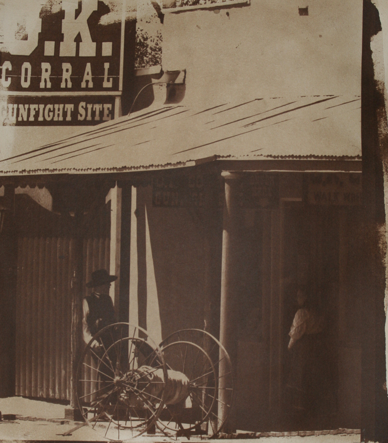
I have begun the process of printing a portfolio of southwestern images. Some of the images were captured thirty years ago using my Burke & James 5x7 blat bed view camera. It's actually older than me. The stagecoach image came from a Canon 20D DSLR a few years ago. There will also be images from Jerome, Arizona, and the Mesas in the Sedona Valley.

Here is a sample of an advertised application for scaling digital negatives. I have no knowledge of this product, and I do not advocate for its use. I am posting it to showcase the possibilities available photographers today. The use of the words "LOSSLESS" and"destructive" caught my eye..... This isn't free. This application is $75. I'm just too traditional to go there.

Precision Digital Negatives; http://www.precisiondigitalnegatives.com/
"The unique, patented, Color Density Range Control is a LOSSLESS method of tuning the negative to the requirements of your alternative process—resulting in far less drastic and less destructive adjustment curves.  This system can do things that are impossible with any other system."

 The plan is to spend my Monday in the sweet arms of the darkroom where I hope to print an updated version of "OK Corral" and a few other images from Tombstone. Well, that's the plan.

Saturday, October 8, 2016

Print Results ~ From Posted Negative

I'm feeling vindicated, having written about scaling a negative by visual inspection, and a good bit of it being theory. Well, some things stand up to reason with enough probing for holes. The newly added variable to the process is this spectral density. I have to say, it's fairly awesome to use, and I'm not sure it even matters exactly which green color, as long as it is a nice forest green, enough that someone who is color blind to green can see it on the screen.

I had sort of calibrated my eye to see a density range commensurate with what I would expect to see on a developed out negative, thick densities, to be able to print long enough under UV to reach dMax and still have highlights. The addition of spectral density changes that. It also seemingly increases the UV resistance of the green increasingly with each increased tonal density. Nothing scientific on my part to check this out specifically, yet having been seeing good results with negatives having extreme densities to get a full range silver print, negatives with an almost normal density range prints well.

This print is the result of printing the negative posted yesterday, 10/7. As I had hoped, the range of the negative has been compacted quite a bit, with the middle tones also greatly enhanced, to arrive at a negative that was visually representative of all the tonal ranges. The image is also copied with a DSLR and prepared to fit on screen and hopefully representative of the original. As close as my eye will allow.

Although I like the finished print, it remains a test print, perhaps an artist's proof to hand on my own wall. The final print will be about 2 minutes longer under the printer light to print in the details of the textural zones. I wanted to see how much dry down there would be on this print. Now I know. Two more minutes would increase detail enough to warrant the extra time. As I had hoped this negative allowed for detail on the top right corner, building top, and on the street in front of the coach. What this digital image isn't showing is the detail on the carriage and around it. What I learned is what those densities look like on a negative now. Now I'm in the sweet spot.

The print is printed on Arches 140 lb, gelatin sized and salted paper (2 1/2% salt), sensitized with (2) coats of saturated silver (13%) and toned in palladium.

"Stagecoach on Main Street" ~ 8"x10"

Friday, October 7, 2016

New negative ~ Visual Scaling

I have begun altering my approach to scaling the digital negative for printing. As I move through the testing phase of negative densities and use of spectral density, two things have become clear to me in controlling the print. First, the use of green toned negatives as the optimal spectral density works, well. Secondly, the density range of the image doesn't have to be increased all that much.

There is a sort of quasi relationship between the spectral green and how it translates for each density range. What I am seeing is the green retards UV light, in proportion to the tonal density, with an increase in retardation as the negatives densities increase. The same green tone is going to retard the Zone 7 density more than it will the Zone 2 density. That has shown me that the really dense negatives I started out making are no longer needed now that I use spectral density for better print time using the Solar Printer. The green tone setting PJ and I have been using on our negatives has returned about a ten minute print time addition to the negative, otherwise. The sweet spot for printing for me is from about 8-12 minutes for silver based printing; salt paper, Kallitype, etc.

The new negative can be seen to have much more texture showing in the middle tones as well as highlights, where only near black showed before. This will be the revised negative I will be printing tomorrow, for comparative analysis to the original, and between the prints. I am having to retrain my eye to recognize the tonal densities of a negative by looking at the negative of the image. I know that can be done, and was.

"Stagecoach on Main Street" ~ Original Negative

Top right corner too dense to see building. Street density too dense to see any detail. Under belly of horses and carriage show very low densities, which translated to black in the print. There was a tinme when my eye wanted to see very strong differences between tonal ranges. I'm learning that this need not be the case.


 "Stagecoach on Main Street" ~ New Negative
The highlight densities have been reduced a lot here, Shadow detail, as in street, building behind stagecoach, carriage and horses all show more gradation of tones, less stark differences. The middle tones have been favored, with the driver's shirt sleeve and roadway the densest tones. This negative should print as nicely as it looks. Now my eye is seeing the more subtle tonal differences, and allowing the green tone of the spectral density to handle print time. The longer print time means more silver melted on the print paper, better dMax and longer tonal range on the print.

The newer version of this image was done with me setting the densities by visual inspection, instead of relying upon a global application of setting density. I still believe that if we are to rely upon digital negatives for printing, we should also be able to control how each negative prints, and that means shaping the image by setting up the density range, for that image. Not all images are not going to be alike in mood or lighting condition. Creating a density range that creates the optimal effect for each image would be the goal. But that's just me. We'll soon see how this negative prints.