Thursday, December 27, 2018

"The Portrait Stool" ~ Gum over Palladium Print

The newest gum over palladium print is another image I have long wanted to print. The photo was taken thirty five years ago, in what was to become a home studio, a framed in carport. The window was selected for portrait possibilities. Turned out to be a prescient thought as there were many to come from that window, on that stool. That was before I acquired a large commercial studio space some years later.

This print required ten layers of color to arrive at the color and depth needed to make this image work. Unfortunately, the biggest hurdle in showing this image is getting it to look like the original  print, and the biggest hurdle to that is I'm pretty much color blind to many of the colors applied. I don't actually see the red colors coming through the blues & ultramarine blues lain over them. The digital camera that copies said prints wants to show middle tones and detail, based upon color temperature (6500K) and hopefully indirect (north light) for copying. Still there never look like the original.

For those that have followed along through the last dozen or more prints, posted here, you will notice changes to my technique, color applications, as I continue to stray from direct realism, through gum application and the color pallet of that print. Those colors continue to expand to  include colors I had not used before, various shades of different colors, allowing me to have more options of color choice and transparency. I abandoned the standard CYMK printing venue some time ago. I am not all that drawn to 'true' colors of a scene, as normally seen every day, but variations of colors that create a mood of the setting. Being I am printing theoretically, it keeps things interesting. I do run a print through my color metric analysis person, whom sees the fuller spectrum of color, and is a watercolor artist, thus bringing excellent insights to subtractive color theory.

Gum over Palladium Print
"The Portrait Stool" ~ 8x10 ~ Unique
Eugene, Oregon ~ 1984

Saturday, December 22, 2018

"The Photographer" ~ Gum over Palladium Print

The first of the two new gum over palladium prints is finished, ready to be seen. The second will get a clearing tomorrow, then be ready for viewing. Each new print brings a different challenge, as each image to be printed has to be printed in such a way as to work with the elements of the image, holding all the tonalities to their desired depth without altering the other tonalities in the process. That demands correct print time, float time, water temperature, as well as amount of color added to the gum, how thickly applied, all over or locally and other subtle variables that add up to the finished image. If it matches what was forefront in the printers pre-visualization, all is good. If not, well there are some remedies, just not best explained here.

I printed the palladium image to be just at the break of where the light quality illuminates the image, leaving the print brilliance intact. I am not a fan of overprinted, dark imagery, unless it is the mood to be set for the scene. The area front and center of this print image is the subject's skin tones, pretty much the brightest tonality in the print. Keeping those skin tones just below zone 7, into zone 6 but bright, was the focus. This image was captured on a bright day, with north light quality, being an bright, overcast day in Eugene, Oregon. Hence the brilliant skin tones. The developer used for this shot was Beutler 105; 1:10 ~ 8 minutes: ISO 125, set at ISO 64.

Perhaps I will be taken to task for the overall color of the subject's skin tones, as they seem just a slight bit yellowed. Perhaps it's my crappy color acuity. As I mentioned, there are means of reducing dried gum when it is absolutely necessary. Dicey work though.

Gum over Palladium Print
"The Photographer" ~ 8x10 ~ Unique
Eugene, Oregon 1984


Friday, December 21, 2018

New Prints ~ Soon

When one is old, things get done much slower, even when one continues to view the world through much younger eyes. So many interesting things visited upon me since my last post. Not that such is fare for this post. More to explain the lengthy absence.

As noted in the earlier post about cycles, I am beginning a new printing and writing cycle. What should be apparent from my posts that the prints I am making at any given time correspond to the book I am writing on how to do the process, the finished prints used as examples in the book. The last cycle was focused on the Kallitype print, most of which were printed already. What I was posting on mostly was the gum over palladium process, which I will continue, being this process has become the process I want to focus on for my artwork. The other printing, in the noble metals of silver and palladium, also continues, completing exhibition portfolios, as well as for the books being written about said processes.

The hallmark of the gum process is simply there are no real boundaries, thereby showing the printer's gesture, or the stylistic application of the process, like no other process. and what is more plainly seen is the artist's hand in shaping the final image. There is no standard beginning or ending, nor for that matter any standard consensus on general process procedure. The instructions from different authors writing on the subject vary in big ways. I've read a printer's instructions on the how to that pretty much stunned me. So, so different than how I would show how it is done. That will be the fifth and final photo book; The Alchemist's guide; to Gum Printing, which will also have a full section on gum over (silver, palladium, Pt/Pd, etc). It will also be likely the longest, most in depth of all the books, being there is so much potential and so many paths to take.

The next book, which I have officially begun will be "The Alchemist's Guide; to Printing in Palladium" with a full section on the 'double sodium' (Na2) platinum/palladium process. For my thinking if one is to write about a subject they should be proficient in that subject, with examples of what their work looks like. Simple as that. There will be prints posted as what my palladium prints looks like. Pretty much like the portfolio of palladium prints of Tombstone, Arizona, all in period dress and equipment in a period town.

I have posted images of each step in the gum process, layer by layer, to show how the colors begin to stack up, with the observed colors derived from subtractive color theory, same as what controls watercolors. Technically, a gum dichromate print is a photographic watercolor. The current prints being worked on are gum over palladium prints, very near completion, and I will be posting them here as they do get done. Stay tuned.

Thursday, September 6, 2018

"Skinner's Cabin" ~ Gum over Palladium Print

Having recently been resupplied with printing paper and some chemistry I have begun again working on the gum over portfolio, this print in the places portfolio. Two more prints upcoming of people finish that portfolio. The images I have prepared are sort of an eclectic collection of images, some shot over thirty years ago, like The Blue Goose, a now defunct rail line with the last of the engines. Fun stuff for me, as well as something of a challenge, of how to treat the image, realism or something entirely different.

This print has five gum layers over the palladium print, with two layers of split colors, applied locally. The effort is to further separate colors and tonalities, to increase the depth of the image. One of the biggest headaches for me is arriving at a representative digital copy of the original  print, being nearly color blind red/green. I'm close though. The cabin is an historical cabin set on Skinner's Butte, a steep hill on the north side of Eugene, Oregon, where I used to live.

As I progress with these gum over prints I continue to learn subtleties of the technique. What I have found I am after is setting a mood, using soft colors separated by tonalities. There is usually always a focal point of light, like the cabin in this image. This is where holding the light right at zone 7 is important, emulating what light would do if it were shining down on a subject, and how that would play out on the different textures and surfaces.

Gum over Palladium Print
"Skinner's Cabin" ~ 8x10 ~ Unique
Eugene, Oregon ~ Skinner's Butte 


Wednesday, August 29, 2018

New Printing Cycles

I have been remiss in new postings of late, I know. Life stuff, which includes a most excellent trip to Ruidoso, New Mexico to visit a friend for a few days. Beyond personal egoic experiences, I am at a printing cycle juncture. I will be splitting my printing efforts into two directions. One being a continuation of the gum over palladium printing as before, but with an added avenue making palladium, and platinum/palladium prints via printing them directly, not the poor man's palladium, toning the silver (Kallitype) print with palladium, thereby replacing all the silver salts with palladium salts. That makes it a true palladium print, in look and in archival longevity, no different than a printed palladium.

What is different is the scaling of the negative specifically for palladium printing, as well as adding the (double sodium) Na2 ~ sodium chloroplatinate platinum version, not the traditional potassium chloroplatinite. The two versions are platinum, and when added to palladium, as most platinum printers do, two different effects take place. The potassium based platinum doesn't alter the tonal range, as in contrast, to the print image. That platinum adds deeper blacks to the palladium. For any contrast control, if the negatives lack's a sufficient density range. For that function a second binder mixture is used, in conjunction with, or replacing the standard binder mixture; ferric oxalate (27%) solution. The contrast agent is the second mixture of ferric oxalate, adding a small amount of potassium chlorate, creating a chelated version of the binder. Adding more of this increases contrast.

The drawback to that is that with the added chelated oxalate increases articulation of the image, a sort of 'grain' that begins to show up when the oxalate binder is mostly the chelated form. And that, is why the Na2 method is so effective. In my mind, brilliant. This form of printing was created by Richard Sullivan of Bostick & Sullivan, and Dick Arentz, a platinum/palladium printer. I see this printing form more of an addition to palladium printing, than anything like traditional Pt/Pd printing. The switch to the sodium based platinum, hence 'double sodium' format, the platinum becomes a contrast increasing agent. This is accomplished by degrees of platinum solution used, from the pure form of 20%, which would be for basically dead flat negatives, to 2.5% solution; 2.5%, 5%, 10%, etc.

When making a palladium print, there is a condition called 'bronzing', which is where the light affects the darker areas of the print, zone 1 & 2, causing a buildup to this density which appears as a sort of solarization on the darker regions. This is not a given, and can be brought about by a number of issues, some with print preparations, as well as an overprinted image, which implicates the tonal range being insufficient to handle the UV light source. The good news is that the sodium based platinum, when added to the palladium, stops this bronzing effect, effectively making those areas a deepened, richer black. The second benefit is the platinum also being the contrast control agent, there isn't any articulation, no grain, just a clean, potentially long scaled print image.

This will be the subject of the next book; Alchemist's Guide; To Palladium Printing. I will also be including a full section on this Na2 Pt/Pd printing method, which, for my way of thinking is an extension of palladium printing, not traditional platinum/palladium printing, using the potassium based platinum. This will be that second avenue I brought up earlier, printing a portfolio of palladium prints, including some new Na2 Pt/Pd prints. I have already printed one portfolio of these Pt/Pd prints, using 5x7 negatives I had from thirty years ago. I still use the Burke & James camera that made those negatives. They were developed to be printed in the sun, developed in pyro/OH, a Windish Pyro formula I rejiggered for my use, 18 minutes worth.

These negatives printed in direct sunlight (facing the sun) for 10 minutes. These negatives were mostly of Log 1.8 density range, those that were of shorter range printed between 5-7 minutes. Today I print using my custom UV printer, which is of much decreased power than any sunlight. Today I also use printed digital negatives for my contact printing. New prints are being prepared for printing. Soon, I will have something to show. Stay tuned.

Saturday, July 28, 2018

"Discovery" ~ Gum over Palladium

This gum over palladium print nearly completes the portfolio on people that I intend to print. There will be ten prints in that portfolio. The second portfolio has of course already begun with the two prints I've posted in the past weeks. I have caught an error in some of my postings that is regrettable. When listing the conditions of a print, in the form of developer used, paper and the like, it is important to get things right. I believe in some of the posts on gum over palladium prints I listed the paper as Revere Platinum. If I did that it should have been Hahnemühle Paper. All my gum over printing is done on Hahnemühle paper.

I didn't photograph each layer of this gum simply because I have been doing so for a number of gum over print images to demonstrate "technique", over "process". Process is the framework for how things work, technique is how all the variables of that process can be manipulated to end up with a print image that was pre-visualized and intended throughout the printing, arriving at the printer's version of how they wanted the scene should look. In gum printing, those variations are limitless. Gum printing is the most versatile and personal of all the photographic printing processes. No other medium process allows the variety of directions a printer can take, with the only 'ending', simply knowing to when to stop.

As all the other gum over prints, this one  is printed on Hahnemühle paper, pre-shrunk. There are six print layers of gum over the base palladium print. Several were split color runs, mostly to emphasize a color or separate it from another. I also altered the color palate somewhat, using colors I have never used, in color ranges I can't full see. An example of that is the boy's jumpsuit. My normal inclination would have been to use blue, as in denim, as I've done in the past, where it fit the setting. I wanted to do something different here. I shifted to earth tones using burnt sienna as the base color for the boy's jumpsuit, instead of phthalo blue. I also had to emphasize the values of the larger goose to separate it from the surroundings which were of the same tonal value. Here, the normal tonal separation of black and white differs. The tones here, blend. Several layers of earth toned colors to enhance the goose it began to separate from the greenery surrounding it.

The focal point of the image is the connection between the boy and the goose. That was my intent upon setting out, using colors I mostly can't actually see. As always, another really fine adventure in printing. Gum printing utilizes subtractive color theory, exactly the same as used in watercolor painting. Being my wife is an excellent watercolor artist I learned a number of subtle things about that subject and have been applying them in my printing.

Gum over Palladium ~ six gum print layers, six colors
Hahnemühle paper (pre-shrunk) ~ Sodium Citrate developer
"Discovery" ~ 8x10 ~ Unique
Geneva, Illinois ~ 2016

Tuesday, July 24, 2018

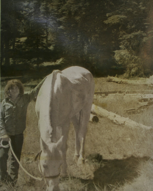
"Girl with Horse" ~ Final Print

The sixth and final color layer was added as an enhancement for the areas of the image that have direct bright sunshine on it. The final color was quinacridone gold, mixed very sheer and laid on thinly to those higher tones. The intent of this application is simply to infer the sunshine reflecting off the different textures.

The purpose of step by step, layer after layer posting was to give those taking the time to read the material an insight into how the process is done, and how technique by the printer shapes the image, layer upon layer, until the printer's "gesture" can be clearly seen in the final print. After several examples of this process I will be posting the final print image and discussing it. The amount of time it takes to photography and track each print layer is very time consuming. The third book in the "Alchemist's Guide;" series is finished and in final stages of layout before being uploaded and listed. I will soon begin the work on the fourth book of the series on Palladium printing, with a section on the Na2 platinum/palladium process. There simply won't be time to photograph each layer and write on it and keep up with the printing schedule and writing.

I can even see that the photo of the print image falls far short of representing the actual print and the colors therein. My apologies for this lack of color perception in the transition.

Gum over Palladium Print ~ digital negative
Sodium Citrate ~ Hahnemühle Paper (pre-shrunk)
"Girl with Horse" ~ 8x10 ~ Unique
Willamette National Forest, Oregon

Monday, July 23, 2018

Girl with Horse ~ Layer 5

I am told by my color guru that the background area with trees is simply not visibly green. More knowledge of subtle color issues, being, the lower tonal ranges, say from zone 4 down, don't show color as much as the upper three tonal ranges, using the same color mixture. The deeper tones need much more pigment to make them that color. The print Tammy's Rose has proven that out. The comments returned from viewing that image is that the print tones were muted, basically neutral in the background. And here I thought I was seeing green. Such is color blindness to red/green.

This print run was focused on strengthening the darker background area with the trees, especially the foliage lighted by direct sunlight, showing as highlights to the surrounding area. I believe I have accomplished that. The rest of the print is where I had intended. The girl's denim shirt and jeans look like worn denim and the lighter grasses in the sunshine, when the dichromate stain is removed, will remain the yellowish color they naturally are at that time of year. The overall color arrangement, as well as the brilliance of the sunshine is left, which was the object of the printing.

I photographed the print just before it was fully dry. The slight wrinkling of the paper shows a streak left from the shine of light across that area in the background. Not in the print.

Gum over Palladium ~ Gum Layer 5 ~ Hooker's Green mixed with Cadmium Yellow
"Girl with Horse" ~ 8x10

Saturday, July 21, 2018

Girl with Horse ~ Gum Layer 4

This print layer is the last of the coloring layers. The print is where I had intended with the color depth of each area colored. The mid-ground got another layer of cadmium yellow to keep it in the yellow spectrum after the dichromate stain has been removed. The darker area in the background also got that yellow layer to strengthen the blacks as well as shift the blue(r) color in the trees to a definite greener look. The second color added was phthalo blue, mixed to replicate denim, applied over the girl's shirt and jeans, and the horse's shadow, to shift it to a cool tone shadow in a warm toned area.

The print is now at it's end, with exception to an embellishment that will cap the end of the printing. A very sheer mixture and thin layer of quinacridone gold will be applied to the yellow grasses, the girl's hair, and the highlighted foliage in the background. This has to be done very, very sparingly not to look like gold has been painted on the paper. The idea is the 'affect' of 'golden sunshine', not a gold color. The horse remains the brightest object in the image. It is the central focus leading to the area around it. X amount of yellow must be visually subtracted from the image for what it will look like after clearing.

Gum over Palladium ~ Gum Layer #4
"Girl with Horse" ~ 8x10

Friday, July 20, 2018

Girl with Horse ~ Gum Layer 3

This gum layer further separates the background from mid-ground and foreground, with a layer of phthalo blue over the background of forest flora, and shadow of the horse. This was also layered over the girl's shirt and jeans. The second color used in this split color application was raw umber. This was mixed just as it reached brown from the more golden color when mixed sheer. This was layered over the fallen trees in the mid-ground as well as on the girl's hair, and the horses halter & hooves.

Splitting the scene with warm mid-ground and cool background sets up the separation in the scene I was after. I use this technique often, separating tonal ranges using opposite colors, which according to the color wheel are complimentary colors. I'm game. For me, printing colors is a most interesting process utilizing subtractive color theory, and lots and lots of practice to arrive at images that work out. It's a mystery.

At this stage this separation can be seen. What must be considered is the subtraction of X-amount of yellow (dichromate stain) which will be removed (subtracted) when the print is finished. To do that now demands some practice time to grasp how this shift affects the layers of color stacked together.

Gum over Palladium ~ Gum Layer 3
"Girl with Horse" ~ 8x10

Thursday, July 19, 2018

Girl with Horse ~ Gum Layer 2

This second gum layer was a mixture of Cadmium Yellow, added to deepen the darker background area, and add yellow to the middle tones of the foliage, as well as a good underlying yellow color to the lighter grasses in the mid-ground. The horse got nothing, as it will become ever more prominent as the print progresses. The girl's hair also got a dab of yellow to add a bit more warm color.

The layering technique changes from print to print, with each image as each image brings its own particular needs, all depending on how the image is perceived by the printer and where the printer decides to go with things. Which colors to use, mixed in potentially endless ways and opacities, layered in what order are some of the choices made by the printer, for every applied layer. There is no such thing as a standard process for gum printing. Gum printing is nothing like printing in silver or palladium, or any other hand coated process. A gum print is a photographic watercolor. There are no rules in watercolor painting. There is only technique as in gum printing.

Gum Layer 2 ~ digital negative
"Girl with Horse" ~ 8x10

Tuesday, July 17, 2018

Girl with Horse ~ Gum Layer 1

As can be readily ascertained with this print layer is the process I employ for applying gum layers, and how that turns out. That is my process. There are infinite potential ways to do this process, and each would be legitimate, if, the outcome is as the printer had intended, as previsualized. My personal approach to the printing, as noted on more than one occasion, has to do with capturing and holding the light elements in the setting or scene. Capturing the light. The coloring is secondary and should only been seen by the affect the colors have overall in the print image. That is my interpretation.

The first color layer I use for settings with high intensity sunlight, is yellow ochre. This color sets up the rest of the colors to come. The idea is showing off light, which would be seen in the yellow(ish) spectrum, reflecting of the different textures in the image, as well as defining areas where there is direct light, as in the background of this image where the sun has reached the forest floor, through the tall Douglas Fir stand. That helps separate tonalities and adds depth to the image. The foreground is light grasses. Greens and blues will be added on top of the yellow ochre to convert into shades and tones of green in the end.

Gum layer #1 ~ Yellow Ochre
"Girl with Horse" ~ 8x10

Girl with Horse ~ Base Palladium Print

New gum over print begun, this layer is the base palladium layer. This photograph was taken in the early '80's while I was filming along the Willamette River, near a stand of Douglas Firs. This young girl was grazing her horse near where I had set up my Century Graflex 6x9, where I had been looking at the fallen trees in the area. I was using a slow film on a very brightly lit scene, developing in a hot developer at the time. The girl was interested in what I was doing and asked me a number of questions. I asked her if she would like to have a photograph of her with her horse, which she readily agreed to.


Base Print Image ~ Palladium Print
"Girl with Horse" ~ 8x10

Monday, July 16, 2018

"The Artist" ~ Final Print

The final touch of color in this print was quinacridone gold, a color I use often when it is possible to show what light does to a subject in the scene. As my other prints I don't often do a full over gum layer when printing. I separate sections of the image using either color or tonal range differences, reflecting what the light is doing. In this image the primary colors are apparent on the top right and along the bottom, leaving the center area between them almost neutral. I could have used a full over bum layer color application in this scene, leaving the center area a more 'golden' look to it, but for me, separating the two areas by leaving the brightest area between them more neutral, leaving the golden light effect on those two color areas.

The warm toned area is the wood panel behind the subject, with the clothing of the subject a cool tone. It was a gamble coloring the clothing the way I did, as I applied phthalo blue over a yellow ochre, then gold over that. As best as I can perceive, what is left in the print is a pale, worn looking blue/blue green perhaps. The green part would evade my ability to perceive it at any rate, being nearly red/green color blind. What I see is 'warm' or 'cool' effects. Outside that, it's all printed using subtractive color theory. It's up to the viewer to determine if the subject's shirt and jeans are blue, or not.

Gum over Palladium Print ~ 4 gum print layers
Hahnemühle Paper ~ pre-shrunk
"The Artist" ~ 8x10 ~ Unique
Eugene, Oregon

Sunday, July 15, 2018

"The Artist" ~ Gum Layer 2

This print image isn't a complex one to print. The character of the image is indirect north light from a window, a soft lit scene implicating intimacy with the subject, in their environment, with them feeling comfortable enough to lay back to be photographed. Mark was an oil painter by training, and fell in love with the gum printing I was doing at the time. He was the first photographer I showed how to make gum prints. He was a natural. The image reflects our friendship and relaxed atmosphere during this photograph. The shot was not posed. I set up my Century Graflex 6x9 on a tripod as collapsed as possible, chatting philosophy with him.

This print layer is made up of two color mixtures: Raw Umber and Phthalo Blue. The umber was a fairly sheer mix and applied only to the wood on the wall. The blue was mixed until the blue was still translucent, and laid over the subject's shirt and jeans. With the yellow dichromate stain remaining in the print the shirt and jeans look green(ish). Even my eye can see that. When that has been cleared it will leave a soft, weathered blue on the clothes. Again, I am using color to separate background from foreground, this time with the background a warm tone and the foreground (clothes) cool toned, with the mid-ground a more neutral tone separating them.

Gum over Palladium ~ Gum Layer 2 ~ Split Tone
Phthalo blue and Raw Umber
"The Artist" ~ 8x10

Saturday, July 14, 2018

"The Artist" ~ Gum Layer 1

The first layer of color for this image, like several others, is Yellow Ochre. For me, a suitable base layer of color if the image is to be warm toned in the end. The secondary thought goes to end result expectations, what colors are desired where and which stack of colors arrives at that color. The shirt and jeans of the subject will get a layer of phthalo blue next, mixed to compensate for the under layer of yellow, turning the upper tones to more green(ish) and the lower tones bluer, depending on how deep the blue I mix. The break point for me is arriving at a blue that will be just at that break point where the shirt is on the border of blue & blue green. The jeans will be bluejeans when done. The warm tones on the wall will counterbalance the cool tones of his clothing.

It can also be notices that this first layer, although fairly sheer, begins adding the depth to the image, darkening the shadow area and the texture of the wood.  The print time was set to just reach zone 6, which is the bright spot on the wall beside the subject. There is no true zone 7 in the image. That was at 13 minutes, float time was 1 minute @ 65F. This just began floating away the brightest area of the wall, which had indirect lighting from a nearby window.

Gum Print Run #1~ Split Color Run
Yellow Ochre ~ Raw Umber
"The Artist" ~ 8x10

Friday, July 13, 2018

"The Artist" ~ Base Palladium Print

When I began printing again I made up two printing boards, being they are fairly simple and straight forward to make. A simple artist's clipboard for drawing, made of Masonite, and a piece of 3/16" glass a bit larger than the print to be made. Using strapping tape for the glass to board hinge, and you have a printing board, sans the registration system using punch pins. I have yet to be in a rhythm where I could work on two prints simultaneously. Being I'm working on gum layers for "Tammy's Rose" it wouldn't disrupt that rhythm to begin working on a new one.

This is one of those images taken thirty-five years ago, with only one print ever made of it, which at the time was a silver gelatin print, which hangs on my wall above my computer desk. An old friend and artist/musician, working in oils on canvas, and playing keyboard like he was born with it. I also have a very fine hand woven wool art wall hanging he made over the course of a year, by hand, using virgin wool he spun, dyed with natural flowers he ground, from flowers and a beetle for blues. Only his hands, a found stick and naturally ground pigments ever touched that wool. It remains my most coveted art pieces.

This shot was taken in Mark Pope's studio apartment, on a long afternoon of hand weaving, toking and chatting philosophy as was our practice at the time. The days before I found my Burke & James 5x7 view camera I used a Century Graflex 6cmx9cm view camera. The portraits I did at that time were all made with that camera, with exception to the one taken of "Girl with Flower" posted earlier, which was taken with a 30's model of an Argoflex twin lens. I believe it was also developed in Beutler.

Base Palladium Print ~ Hahnemühle Paper (pre-shrunk)
"The Artist" ~ 8x10


Thursday, July 12, 2018

"Tammy's Rose" ~ Finished Print

The final layer, using quinacridone gold, mixed to just sunlight consistency was added to parts of the print, namely the subject's dress and hair, and the lighter grasses in the mid-ground. I thinned a small amount of that gum solution almost in half, to use over the subject's face. I also added a touch of the gold on the brightest highlights on the foliage in the background. It is unlikely that will actually be picked up in the digital copy.

I am happy with the final image, as it retains the brilliant sunshine of the setting, separating the subject from the mid-ground and background. I was able to accomplish that with the subject showing full textural detail, even in the highlights. It is usually my primary interest for the print images to capture the actual light of the setting, holding it right at the place in the scene where light can be seen, by how it reflects on the different surfaces and textures. For those that see the fuller spectrum of color you will notice the red rose being held. Something I am unable to see myself.

Gum over Palladium Print ~ 5 gum print layers
Hahnemühle Paper ~ Pre-shrunk
"Tammy's Rose" ~ 8x10 ~ Unique
Eugene, Oregon


Tuesday, July 10, 2018

"Tammy's Rose" ~ Gum Layer 4

This print layer was a split color application, using Raw Umber in a fairly thin mixture over the subject's dress, and a mixture of Yellow Ochre & Phthalo Blue to realize a light green laid over the darker background to strengthen it and separate it further from the mid-ground of the light colored grasses, from the subject as the highlight of the image. The background is a cool deep color with the foreground warm and brilliant with light. Rose Permanent was mixed to a good red and laid over the rose in Tammy's hands, and on a small bud on a rose branch behind her.

The objectives I had for the print have been attained, with the separation of tonal values using color and light, controlling the highlights as the focus of the image, using colors that infer and shape without being evident or gaudy. There remains the yellow dichromate stain, seen mostly on the dress. The final color layer will be quinacridone gold, mixed oh so sheer to retain the golden glow of the afternoon sunshine. The background has been strengthened and further separated from the subject as well as the dried grasses in the mid-ground. The subject in the foreground is the lightest element in the scene, with her hair right at zone 7.

Gum over Palladium ~ Layer 4 ~ Three colors
Yellow Ochre mixed with Phthalo Blue for a light green ~ Rose Permanent (for the rose)
"Tammy's Rose" 8x10

Monday, July 9, 2018

"Tammy's Rose" ~ Gum Layer 3

I took a day off. I'm old. The printing has to be flawless, and one's head has to be in the game and the focus has to be sharp. Any flaw at any time and the image is junk. This third layer was focused on the subject, mostly. Using a split color arrangement Tammy's hair and skin got a thin layer of Yellow Ochre. Her dress got a fairly thin mixture of Raw Umber, just enough to cross over from looking like a pale ochre to more like a brown when mixing in the gum. I also added the ochre over the light grasses in the foreground, separating further from the darker background, using blue/green/ochre.

This print run got a full 15 minute print time, printing for zone 7, highlights in the subject's hair as well as brilliance of the light on the dress. That I want to remain right at zone 7, and zone 6. That's the light zone. As the print progresses there is less of the overall 'yellow' look and a bit more depth, and tonal separation, with the colors at the different levels left sheer and subtle. This is a personal choice, a vision of 'how it should look', or artist's 'gesture' or 'hand' in the printing. Perhaps this is also a phase of printing for me. A way of interpreting the image. And, perhaps it also has to do with my mostly red/green color blindness which leave a far more subtle world of color than I am told exists. I see an obvious green color placard in front of me, but 100ft out I likely wouldn't, especially mixed with other similar colors or tones. I interpret the world in my prints probably the same. My primary focus is on the quality of the light.

For my efforts, if Tammy appears to be sitting on a stump in bright sunshine then the print is successful. The remaining yellowish color on the dress is mostly the remaining dichromate stain, which will be cleared when the print is finished, leaving a warm toned brown(ish) color. Theoretically. Which is how I print, using subtractive color theory. The photograph was taken of my daughter, who was my primary testing model. She got to pick the outfit I chose the spot. This one was to test a developer I had read about in an old photography book. Beutler 105. It was supposed to be a semi-compensating developer, holding in textured highlights like Pyro, leaving long skin tones like pyro, but not compensating in the lower densities. All of which I liked. This was the test shot, developing for the highlights I knew would be pushing zone 8. I still use that developer. Best overall developer ever created.

Split Color Application ~ Gum layer 3
Yellow Ochre ~ Raw Umber
"Tammy's Rose" ~ 8x10

Saturday, July 7, 2018

"Tammy's Rose" ~ Gum Layer 2

Because of the color combinations I want to use, along with the differences in the tonal range between subject and background I am working with the background this layer, using split colors. The deeper background will be a blue/green when it's done. The rose branches right behind the subject will be green. I will further separate that backdrop by coating the lighter part where the dried grass is. Next layer will be focused on the subject, then further enhancements may come.

For those that see the full spectrum, you will be able to see the subtle green in the rose bush and blue/green of the distant background.  There remains the yellow dichromate stain.

Gum over Palladium ~ Layer 2 ~ Split color
"Tammy's Rose"

Friday, July 6, 2018

Tammy's Rose ~ Gum Layer 1

For me, the go to color to replicate direct sunshine on an object is Yellow Ochre. It warms the print image overall, as well as sets up the base color for successive colors, in this case, as was the last, that was mostly foliage. That allows for different color options to come depending on how the image is to be interpreted, influenced. The image I have in mind is a warm toned image with the subject displaying the brilliant sunshine that was the condition when photographed.

The highlights of the image, the subject's hair and dress remain right at the edge of zone 7, leaving the reflective brilliance of the sunlight still evident overall. I am printing right to zone 7 for this color layer, keeping the color showing at that tonal range, as golden light. That will be enhanced on the final layer. Following layers will focus on the subject's dress and the background foliage, layered separately using different colors. Some of the yellowish color is the dichromate stain.

Gum Layer 1 ~ Yellow Ochre
"Tammy's Rose"

Thursday, July 5, 2018

"Tammy's Rose" ~ Gum over Palladium ~ Base Print

I have begun printing again, after a family visit and holiday expectations. One test strip verified the density range of the negative was spot on, and the base print to follow turned out as desired. I also have learned some additional subtle influences of palladium toner having to do with solution %. As I noted in an earlier post, reducing the % solution of palladium tends to warm the print image. That would be a reduction from a stock solution of  (Pd) 5ml to 1000ml DH2O ~ reduced to half that or less. Simply accomplished by adding more DH2O. I tend to mix 20ml (stock) with 30ml DH2O for a warmer tone. Also know that that the % solution also controls how much bleach back there is on the print image. The stronger % the more bleach back. Being a top down toner, this bleaching affect is first seen in the highlights, moving down the tonal values over time. The point of control for this is print time, to set up the right tonal scale before toning.

This photograph was taken circa 1984, for a developer test. I was learning photo chemistry at the time and had already begun mixing my own developers and other baths. This was a test for a non-M/Q developer; Beutler 105, which for me, remains one of the best developers ever created. It is a semi-compensating developer, with the compensation affecting highlights but not shadows, as pyro would, being a fully compensating developer. What I was after was full control of zone 7, holding what would otherwise run into zone 8, without texture. This was the shot that showed me it could be done. The image is of my daughter, Tammy, with the light blonde hair in full sunlight.

This is the base image that I will begin applying gum over. As the other gum over palladium prints, this is printed on pre-shrunk Hahnemühle paper, which is a very fine printing paper for this technique, with the multi-wet processing runs. The palladium print was made as a Kallitype, developed in sodium citrate, toned in palladium. Hence the 'poor man's palladium'. I do also print in palladium, and platinum/palladium (Na2), but find this combination to be more controllable for print color and tonal range. The most important element of the print is holding the subject's hair and dress just reaching zone 7. That's where the light is. The long creamy skin tones derived from the Beutler development mimics pyro portrait formulas, with both accelerators; sodium carbonate and hydroxide. Hydroxide just affords so much more acutance.

Palladium toned Kallitype ~ Base print for gum over palladium
"Tammy's Rose" ~ 8x10 ~ digital negative
Eugene, Oregon circa 1984

Monday, July 2, 2018

Dead Air Time ~ Apologies

One of the benefits of being old(er)(ish) comes from the slack one gets for moving slower than the crowd, and the times when their's dead spots along the line of continuity. Not that I'm using that card at this time, just saying. Although the olderish thingy is true. My wife's daughter and grandson came to the desert for a visit. The Old West part of Tucson does have its draw for mid-westerners. Nine days in the desert is the title of our time together, and it was quite enjoyable.

Those nine days spent on the road as guide precluded any darkroom time, painful as that was. Perhaps this missive would have been far better received had it been written on the first day. My apologies and regret for that slight. There are negatives waiting their turn in the printer, so it shouldn't be long before I have an image to show.

Every print is your best one ever


Wednesday, June 20, 2018

Gum over Gold Toned Kallitype ~ Girl with Flower

This print is a re-print of an earlier attempt, which in the end I didn't like. I knew I could do better. I did. I could see that many of the textural qualities were being lost, a slightly too heavy hand. I kept the gum layers sheer, only to enhance what was already there, without making the image look like the colors had been painted on, with a house painter's brush. The more I print the more I come to realize that the lighter hand is always preferable to a heavy handed attempt.

The primary objective of making prints, for me, is capturing the light, or more specifically capturing the light as it reflects off objects in the image, including people. That's my objective. Bright sunlight can be seen reflecting off trees, people's clothes, rocks and dried grasses. Capturing that light is reflected in the correct negative densities to begin with, then reciprocally printed to reflects them in the print image. I would tell you that to be zone 7, relative to the density range of the negative. Zone 7 on a negative isn't one density. I can be any density chosen. It is the relationship of the densities below the highest density on the negative, down to zone 1. If the relationship between zone 3 (shadow textural density) and zone 7 (white with full detail ~ highlights) then the negative will print well, as a Kallitype, platinum, salt paper, print(s). As always, one prints to zone 7.

This print was printed on Hahnemuhle 320/gm, pre-shrunk in water at 120 degs or more, for 1 minute. That is all that is necessary as the printed Kallitype image becomes the base of the gum layers, just as a good sizing would. This print entailed three gum print layers, with the middle layer entailing three colors, each applied locally.

Gum over Gold toned Kallitype
"Girl with Flower" ~ 8x8 ~ Unique
Eugene, Oregon ~ 1983

Saturday, June 2, 2018

"Jars in the Window" ~ Final Version

I just did something I have never had to do before. Reprint a gum image, three times before I liked what I had done. All of it in public view. First iteration of this image was a gum print, ten print layers and probably two dozen colors, to realize in the end that I simply didn't like what I did. The underlying application theory worked, in the sense of color selection and print times, etc, yet the finished image always turned out dull, no life, no light. Making any black and white print is all about printing with, and for, the light quality of the image. Without light in an image, there is but tonalities, and colors, but no life. That has been the grail of printing for me for thirty five years of learning just how to control for that.

I attribute some of my failing to see the deterioration of the print image quality over several layers is simply crappy eyesight. Being blind in one eye and color blind to red/green has it's drawbacks when working with colors of any kind. I take humble color advice from my color guru wife, an artist that sees the fuller spectrum of human color sight. This print arrives at what I had wanted to represent a moment of my past as I saw it then, and wanted to recreate. A simple comparison of the last version and the final one is a good example of light quality. The first version simply lacks the light quality of the second. Each print teaches the printer a little more.

This is what I had in mind

Gum over Palladium
"Jars in the Window" ~ 8x10 ~ Unique
Eugene, Oregon

Wednesday, May 23, 2018

"Jars in the Window" ~ Faulty Print

The worst possible ending to any finished print, is to arrive at the final clearing, and simply not like what you see.  The gum work turned out mostly as planned, color wise. The problem with the print is in the original printing of the image. What I didn't detect at first was the change in the print shadows, showing a sort of bronzing effect, when there should have been no such effect. Testing of the chemicals involved in making the print showed the problem to be in the ferric oxalate. Fresh chemicals later showed a perfect print after a new print test.

What that all means is the print is junk. The upside of this is I have the road map of the printing sessions fulling described in my print book notes. Every print made has extensive notes on the procedural application, chemistry, print time, float time, colors used & how mixed and where placed, even the day printed. Just for this reason. First order of business for printing is, don't get in a hurry. I'm not broken hearted this printing wasn't to my liking, however I am rather annoyed I missed what was happening before I spent a week on the print. Paying attention with your head in the game is really important. The problem with the print is mostly in the shadows, which shows up a lot more in the print, than in the replication of the print. Now I begin again, from the beginning.

Gum over Palladium
"Jars in the Window" ~ not to be used

Tuesday, May 22, 2018

"Jars in the Window" ~ Gum Layer #4 ~ Split Colors

As I near the finish of the gum print the applied colors are more and more specifically target. My intent being enhancing the print image without altering the color scheme desired. I tend to balance the image with cool and warm tones playing off each other. That's just me. My interpretation of the scene. In this print image the warm toned portion of the print is in the inside foreground area, made up of wood. Outside the window is brilliant sunshine many stops over the inside, thus the printing has to address both density ranges.

A thin mixture of Raw Umber was brushed thinly over the inside of the window, much of which was manipulated off with warm water and stiff artist's brush after the rest of the print had been floated one minute ~ @ 65℉ ~ then the portions I wanted to thin out, which was the highlights within the wood area on the bottom and right side, respectively, was submerged in warmed water to approximately 80℉, for a few seconds before brushing the highlight areas I wanted to stay uncoated,  unaffected by the raw umber layer. This helped strengthen the image by separating the tones within the interior, and setting up for the final very sheer layer of quinacridone gold over that interior only, to brighten the highlights, darken the shadows. The area of the window and outside the window is finished, sans the final clearing bath in sodium bisulfite. That eliminates the yellow dichromate stain, which is masking the colors underneath. Blue is green before, green becomes darker, brown becomes deeper.

Knowing when to stop is more important than one might think. There are unlimited ways in which to influence the outcome of the print. Literally unlimited possibilities, only held back by the printer. I didn't post Layer #3 simply because it was a thin layer of ochre to further influence the interior and set up for the raw umber layer after that. For me, the only way to discern how to proceed in a gum printing is to study the image, get lost into the scene, "see" how it is to be, and only then is it possible to lay out a strategy for how to accomplish that, layer by layer.

Gum over Palladium
"Jars in the Window" ~ 8x10
Eugene, Oregon

Monday, May 21, 2018

Gum Printing ~ Knowing When to Stop

I laid another layer of color on the new print, Yellow Ochre to be precise, as this color is one of my go to colors in the color palette, being it is the "warm tone" color for a panchromatic image. It is the mixture intensity that has further control over adding 'color' to the image or simply shifting the light quality to a warmer tone. In this layer my intent was on the latter, shifting the overall image to a warmer tone. For my taste, using quinacridone gold would not be natural, in bright sunshine or dimly lit scene from direct sunlight. It is the late afternoon "golden glow" that the gold replicates.

I don't see the need for posting this layer as it will be indistinguishable from the last, being the layer I applied was sheer. At this stage the only means of knowing more exactly what colors remain can only be deciphered after clearing of the dichromate stain, otherwise, what is seen is a yellowish image. One of the most difficult decisions for a gum printer, after more fully understanding the controls and variables at the printer's disposal, is knowing when to stop. Once registration of the print has been mastered there is no end time to printing. One can continue on as far as desired. The all gum print I made of "The Flute Player" consisted of twenty-one print layers using thirty eight color mixtures. Very sheer color layers stacked in different order in different areas to arrive at a fully textured image with detail.

Gum over palladium, or silver or cyanotype or platinum or any other printed image is slightly different, as the textural detail, hopefully, is intact before any gum is added. The color mixtures therefore can be much heavier than in gum printing as said color layer won't cover over existing detail, it will only enhance it towards the color applied. Any gum added over a shadow area, regardless of the color, will strengthen the shadow(s). Contrast can be built this way, as long as the highlights are printed down too much. That comes under print time/float time controls. Secondary to this is water temperature. Knowing how to wield these variables to control the printing is what it's all about. That takes time.

Sunday, May 20, 2018

"Jars in the Window" ~ Layer 2 ~ Split Colors

This second layer of gum was targeted. The difference between the densities outside the window and inside the window are about five, perhaps six stops apart. That creates a more complex printing than one without such differences. I came to understand how to make this possible when I made the gum print, and am merely carrying that over to the gum over palladium printing. The controls for this being; print time, float time and water temperature. Print time has to do with the tonal value one is printing to, and the float time, and temperature defines the tonal range of gum being floated off, and how fast. It's up to the printer to know when to stop floating.

I have come to embrace the deeper shadows of the image, whereas in my early years I favored texture and detail when shooting and developing. Tastes and preferences can change over time, which is probably a healthy. My application(s) of the gum color(s) follows the Makeup Rule; the effect of the color should be seen, to influence the image, but not applied such that it becomes garish, with a saturated appearance. The image shouldn't look like a neon sign. The final image should woo the viewer, to peer into the image, not grab them using bright colors. But that's just me. As always, a bit of yellow must be subtracted from the image for better color observation.

Gum over Palladium ~ Layer 2 ~ Split colors, locally applied
"Jars in the Window" ~ 8x10
Eugene, Oregon

Saturday, May 19, 2018

"Jars in the Window" ~ Gum over Palladium

I am doing something I have never contemplated before. I will be reprinting an image from one medium to another, and being all my gum prints are unique, destroying the first print. I had printed "Jars in the Window" a few months ago as a gum print. That was before I came to realize the direction I wanted to go was with gum over palladium printing. Not that I will cease printing gums. I will be selecting an image that fits a gum print better than a gum over palladium version.

One of the advantages of making unique prints is that there is only the one print image to make, flawlessly. The print isn't finished until it is flawless, defined as a printed image that meets all of the expected elements and qualities the printer wanted, as pre-visualized before the printing. This isn't a science so there are caveats to this. Altering plans when there is a better direction realized during the printing process. One of those realizations, for me, is the contrast issue. There was a time when I was after texture and detail above all else. Now, I'm finding I like the deeper shadows of an image.

Being that the control of shadow detail, or lack thereof, is all about the negative, and its contrast index curve. Not to be confused with density range of the negative. The CI shape controls for the contrast of the image, the density range has to do with how long the tonal scale is in densities. They are intertwined however, one tends to beget the other. It is much easier to control for these factors in digital negatives, where it is possible to drop out the lower tonal range without influencing the upper tonal range and highlights. The inverse of this is also true. Using an adjustment <curve> is a global movement of densities, targeting specific tonalities allows for much greater creative control over the image. I only apply an adjustment <curve> when printing with metallic salts; i.e. silver, palladium or platinum/palladium. The density range for these mediums can range from Log 1.2 to 1.8 for optimal results, depending on which medium.

Gum printing doesn't need extra density to print well. When I began making gum prints I was using paper negatives, and they do not have what might be referred to as a long tonal scale. Do not believe, however, that gum prints can't be made with a negative scaled to Log 1.4, as I have made more than one gum or gum over print using such a negative. What that demands though,  is understanding the print time to different densities, with commensurate float times, at a specific temperature. Few understand this concept.

I haven't posted the original palladium print as it is but the base image. The example posted today is the palladium print with a base layer of gum over the image; Yellow Ochre. Remember to subtract some yellow from the image to compensate for the dichromate stain. This image was taken circa 1982, before I built in the carport, into a home studio, with the back space walled off into a darkroom; no windows. This was taken before the conversion, when this area was a barbecue pit area.

Gum over Palladium
"Jars in the Window" ~ 8x10
Eugene, Oregon

Tuesday, May 15, 2018

"Adley on the Stump II" ~ Final Print

The fourth and final gum color layer was applied this morning. Again, this was a split color print layer. The final two colors were Cadmium Yellow and Quinacridone Gold. The yellow was applied only on the orange that was on her basket and the piece Adley was eating, A sheer layer of yellow not to disturb the texture. The final color added was the gold, which was meant to show the late afternoon warm sunlight in the background area with the grasses and most notably on the stump on which Adley was seated, as it showed that warm color most.

Probably the biggest problem I have with color here is the fidelity of the digital replication of the original print. Being I don't see all the colors in the print, is the clue that I might not see a color shift, affecting hue, or color temperature say. I do my best though, and if I'm not at least fairly certain the colors do match between original print and what I am posting, I call in my color guru for confirmation. That be my sweet wife who's a painter. She sees the full spectrum.

I am happy with the finished print, having guided it to its final color version. When I began making gum prints and gum over silver prints thirty five years ago I was much heavier handed with the pigments. I was also printing from paper negatives, which have a much shorter density range than what can be done with film or digital acetate sheets. I keep a very light touch with pigment use, preferring too thin over too much, not only for textural qualities but for subtlety of use; the Makeup Rule.

What the viewer takes away from the image is not necessarily having anything to do with the intent of the printer. In this instance, the warmth of the sunshine, from low in the sky lit up certain elements of the scene, although the subject was wearing bluish gray clothing. A play on cool and warm tones, which I tend to focus on as one element of the print's intent. The use of color to separate elements in the image. Obviously, this is my take on that. I only hope the fidelity of the digital image matches the original.

Gum over Palladium Print
"Adley on the Stump II" ~ 8x10 ~ Unique
Eugene, Oregon (back yard portrait spot)

Monday, May 14, 2018

"Adley on the Stump II" ~ Layer 3

The final split layer of color has been added. The treatment was to further separate the image into cool and warm toned colors, as well as intensify the image by increasing contrast through adding to the lower tonal range while holding the highlights at their current level, while adding subtle color(s).  All elements of the image have been covered more than once, using very sheer layers of color. The intent is to subtly influence the image from the pigment without being able to see the pigment. The "Makeup" rule. The Corollary to this rule is: "It takes teenage girls two years to learn the "Makeup" rule.

This print is nearing completion now. The primary layout of color applications have done their job. A good amount of the actual colors are too subtle for me to actually see them. What I can see are the differences between the warm and cool tones, being I put them there and at least know what I'm looking for. There is 'skin tone' on Adley, hopefully ending in a suntan sort of way. All of these colors are currently being heavily influenced by a predominant yellow color, which is the dichromate stain. To 'see' the colors at this time one must be able to subtract yellow from what is being seen. The clearing bath at the end clears that stain out nicely though.

Layer #4: Split color

Sunday, May 13, 2018

Adley on the Stump II ~ Print Layer 2

This second gum layer was a split color application. This is where the colors begin to play off each other, warm and cool tones, as well further separation between highlights and shadows. Each new application of gum darkens the area covered, even if slightly, with the most noticeable darkening in the lower tonal range, deepening shadows, separating further from lighted areas and even mid tones. The printing control is focused exclusively on the highlights, most specifically, zone 7. That is the print time point.

Once the printer finds that print time point, for that negative, with the corresponding preferred float time, that controls the highlights, just as development time controls the negative densities representing the highlights. Same principle. Once the highlights are reached, all the zones/tonal ranges below are pretty much permanent. That is not to say that one isn't able to work backwards several tonal ranges of gum removal. It can be done, by increasing water temperature, length of float time, even begin physical removal with a brush or stream of water. Unless one is saving the image from an ill conceived application, wanting to rid as much as possible, such removal techniques are destructive to an otherwise fine image.

I have had to resort to extended techniques of gum removal, but it was not for enhancement, it was therapeutic, having seen a line of gum color migration over an lighter area not intending to receive any of that color, when it was almost too late. As mentioned before I fail to see red/green unless it is real obvious. Subtle shades mixed within other colors and lots of gray and colors disappear, falling into a sort of neutral gradient. I saw the color run only because it was across a lighter area, and I see patterns and shades well enough. The object was to get that streak removed. When you heat the water sufficiently to do such a job, it would be somewhere over 80 F to 90F, and retain any control over removal, as at that temperature the entire matrice of gum layers begin to soften, any gum not fully dried before would begin to loosen, over the entire image area.

I used a small tipped artist's brush and water at about 80 F and daubed the water over the run until it was soft, then used another smaller and stiffer brush to wipe back and forth over the run until it was gone. And that is why I keep my float temperature below 68 F, preferrably around 65 F. In doing this, the floating affect on the gum is slowed to a crawl, thus allowing me more control. The object of each print layer is to print up to the desired tonal range. That demands the printer knows the print time to reach, and go just beyond zone 7, to float the gum back to a desired point in zone 7. If warm water is used, the entire gum layer is affected a lot. When cold water is used, it stiffens the gum, holding it in place without floating away, so during the floating, the majority of gum floated off is strictly at the highlights. The maneuver is to float just enough away to show zone 7 fully. Zone 7 is the 'top' print point. This negative needed a twelve minute palladium print time, the zone 7 print point for me then is 15 minutes, which proved to be true. With a one minute float time in 65 F water, the gum is just beginning to come off zone 7. A two minute float time would remove even more of zone 7, leaving the color beneath it, which is what I did with this print.

Zone 7 print time is 15 minutes on this image, and for this color layer I didn't want to cover over the ochre color underneath the raw umber color I was applying. The print time I used this layer was 12 minutes. Enough time to print up to the highlights but not remain during the float time. All the darker tones beneath zone 7 get the benefit of this new color layer. Another benefit of the colder water, as noted earlier keeps the gum from running, due to very soft gum. Water temperature is one of the control variables at hand.

Gum Layer #2 ~ Split color ~ Pthalo Blue and Raw Umber
The gum was applied locally for deepening the shadows, coloring the  mid-tones and increasing separation between tonal values in foreground to background.
* Note: The prevailing yellowish color over the image is the dichromate stain.

Saturday, May 12, 2018

Adley on the Stump II ~ Yellow Ochre layer

There is probably little need for showing each layer of gum as it is applied, being so much of what is happening is lost in the viewing, unless one knows the color layer that will go on top of the one being seen. Sometimes even I don't know what the next color will be until it shows itself. Before I begin working with any colors, I set the print in the coating plate (artist's clipboard of Masonite) and tape it in place, then set it upright, then just sit there and stare into the scene for awhile and color choices begin to show themselves, and it is from there that I begin plotting the color layers and what that will mean in the end, where to apply the colors, and how thickly, all of which ultimately is determined by the tonal layer the color is on, the print time, the float time and the float water temperature.

This is an art, not a scientific experiment. I studies Experimental Design, I know how that works. It's good when dealing with the chemistry portion, but a lousy guide for the aesthetics of printing. Colors are a personal choice. The gum printing process follows the rules of watercolors, subtractive color theory. Using that as a guide, the colors are stacked in printed layers, each adding an affect on the color below them. A layer of Yellow Ochre, followed by a layer of Pthalo Blue becomes green(ish) with the value from a China blue/green to a slightly bluish green, depending on which color is over and the density of the two mixtures. This is done using an artist's color pallet, mixing colors to the artist's liking. There is no measurements in mixing or formulas for order of color. There is artistic expression at ever step.

The first color layer is Yellow Ochre, a 'medium' mix. About the point when the light showing through is dim. It was brushed on the entire image, soon followed by local applications on the darker foliage, but not the lighter area in the background, setting up for the next color layer of Pthalo Blue, mixed slightly lighter, leaving it sheer, then applied only on the darker foliage, over the thickened Ochre, with the intent of arriving at a recognizable green, of some tone and hue. A comparison of prints shows a bit of shift on the highlights on the stump, and on Adley's clothes. That will get bolstered in subsequent layers.

Gum over Palladium ~ Layer #1 ~ Yellow Ochre
"Adley on the Stump" ~ 8x10

Friday, May 11, 2018

Adley on the Stump ~ Palladium Base Print

The new palladium base print to become a gum over palladium print when finished. I began the discussion in yesterday's post about altering the print negatives for this process. I would continue that discussion by noting that the negative densities are reliant upon the light source used for printing. As the light source intensity increases, so should the density range of the negative. Roughly speaking. There is a direct correlation between density and light intensity. As I've noted before I designed and built my UV printer with 160W of power, using (8) 18" UV bulbs in a 20"x24" printer bed, with the lights being 12" from the table top. Hence, the optimal density range for that printer, with a print time between 10 and 12 minutes for a full scaled image.

The image here was printed as a Kallitype, developed in sodium acetate and toned in palladium (5ml/liter). It is now a palladium print. I began yesterday's post by noting that I have gone from salt paper to Kallitype processing because of more control over the print color, and, I don't need the negatives scaled as high. The Kallitype process is basically identical to palladium printing. Same processing procedure, same order and same chemistry, with exception to printing with palladium or silver, then toned palladium, if that's one's choice, otherwise a gold toner makes the blacks much deeper and richer. Gold, however generally doesn't fully replace the silver salts, with an exception, normally gold coats the silver salts.

In both processes, the clearing agent used is EDTA, with a slightly different mixing for palladium than used in silver. Palladium doesn't use a fixer, but does have a sort hypo clearing back using sodium sulfite, much like silver. There are several developers for the Kallitype, each bringing out a different print color, from a reddish color, sepia, purplish, brown and black. The temperature of the developing bath also shifts color, another variable to use. Due to these similarities, and being I also print directly with palladium, and platinum/palladium (Na2) process, keeping the development as constant as possible is most helpful.

This image was taken with a Century Graflex 6x9 (cm) format camera. The first shot I took is now a platinum/palladium print in an edition of 5. I knew this young girl wasn't going to stay on that stump very long, and just as I had pulled out the cut film holder after the first shot, flipped it over and reinserted it and pulled out the dark slide I saw her lift up the basket with her arm and begin to jump down. I just grabbed the shutter release cord and squeezed. After I stare at the image long enough the treatment I'll use and the colors selected will come to me.

Palladium Print
"Adley on the Stump" ~ 8x10
Eugene, Oregon (back yard portrait area)

Thursday, May 10, 2018

New Gum over Palladium Print Beginning

The lengthy hiatus since the last posting of "Two Friends" is most regrettable, as I try hard to keep the momentum moving along just so there aren't long blank periods. Truth be told I was working on a home project, long promised to my sweet wife, finally done. We live in the desert whereupon a yard here is covered in two inches of river rock, or more. I just shoveled and moved 14 yards/tons of said river rock, spreading it over an eighth of an acre, in the desert heat. Such is life.

I have had to adapt my normal negative printing setup, to gum over printing demands, which calls for a different density range for the negative. This new arrangement begins in conjunction with also altering how the negatives are printed. Whereas I have always printed my own negatives on inkjet printers, being I am one that wants full control over the process, for obvious reasons. The advancement of inkjet printers continues with the focus on making finished prints on art papers. That direction improves the outcome of the prints on paper, using ever more ink cartridges with wider array of colors. My one and only use of an inkjet printer is making a negative. Using a new Epson or Canon printer to make my negatives would cost me ten times what I pay to have a laser negative printed onto acetate, at 600dpi, not 300dpi. I'm quite happy with the results. My task was to set the density range of the negatives to match the laser printer being used, which is entirely different than inkjet printers, and no two laser printers are set the same, as they can be adjusted for output density onto acetate.

The new print is drying as I write this. I will copy it once it has dried down, for tomorrow's post. It is the base image for the new gum over print to come. For now, I am working with the "poor man's" palladium print. It is said that one century ago there were likely more "poor man's" platinum's than printed platinum's. As most photographers know, platinum is rather expensive, many times more than palladium and probably a hundred times more than silver. When a silver image is toned in platinum, or palladium, the more nobler metal totally replaces the silver salts with the Pt/Pd salt, thereby making the print a Pt or Pd print. If you make a mistake or there is any flaw in a printed platinum image, of course it doesn't get sold or used, and that means throwing away a bunch of money. If you print the image in silver, then tone in platinum, you have a platinum to show. I do this with palladium.

Any silver print can be toned to a palladium print. Thirty five years ago when I worked gum over printing I printed over salted silver prints; salt paper process. I still have them. Today I prefer to make Kallitype prints. One of the reasons is the ability to control the print color, by developers and developing temperature. The Kallitype process is the same process as modern platinum or palladium printing, for the most part. There are caveats with platinum and the developers. Palladium has a much longer tonal range potential than platinum. Palladium can handle the full scale of a salted silver print, which can print an image using a negative of Log 1.8, or higher. Platinum would not respond well to such a negative, but palladium would.

The negatives I am using now for gum over printing are, for all practical purposes, the densities I would use for a grade two silver gelatin paper; Log .8 to .9. I know this because I now have a densitometer, and I've been doing much comparison to other negatives and their reciprocal prints. I would not have believed it if I didn't have prints right in front of me demonstrating that fact rather nicely. Dry down is important so I won't be posting the image here. What I would like to mention is that for whatever reason, I happened to check the "Stats" section under the posting icon, to find two dozen visits with over eighty page clicks, all from Russia. I must say I feel very honored by that.

If one of those visitors was Maria V. Vinogradova I would be a lot more honored. It wasn't until very recently that I came to find two other gum over printers, one of them being Maria V. Vinogradova, who lives in Moscow, and makes some very beautiful gum over cyanotype prints. Her technique is flawless, her images glow. I should also mention the other gum over printer I know, out of fairness, and that would be Diana Bloomfield, of North Carolina. As it turns out, Diana was in Tucson very recently giving a workshop in gum over palladium printing. Kudos to that.

Since this has morphed into a short ramble, I would mention a thought I have held since I began printing again. In the late 1980's I was one of the founding members of the Eugene/Irkutsk Sister City Committee, and as a board member I chaired the committee newsletter and did the photographic recording of events and people. At that time I had a commercial photographic/video production studio. It was through this that a Russian/American photographer exchange was devised and planned, with several Russian photographers being part of it. Many of those photographs hung on my studio walls, as can be seen in the photo. I'm the one pointing towards Russian version of the Welcome signs. While I was setting up the formal group photograph, in a studio full of photographers, this shot was taken. It is my hope that some day, once again photographers from both countries will share their images.
Eugene/Irkutsk Sister City Committee Photographers Exchange; 1990