Monday, November 13, 2023

"Proxy Falls" ~ Gum Dichromate Print

 I have narrowed the pace of printing, beginning with this  print, from four prints at a time, down to just the one print I'm working on. No need to say that this arrangement is so much easier on my constitution, and I believe to the detriment of printing itself. Divided attention while juggling four multi-layered prints, I am learning, dilutes the focus and attention to detail and planning as focusing on a single print with its set of defined needs, to arrive at the print image desired.

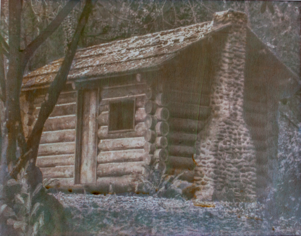
This image originated as a black and white negative; exposed in a Burke & James 5x7 view camera; circa 1984. In the early 2000's, during the last ten years of working with digital imagery, I digitally  hand colored this image, and the one to come next. I liked what I saw, in spite of my having been a black & white printer. It was very recently, during a perusal of some old images worthy of gum printing, and came across the images, realizing gum colors would work quite well with the image. The task would be containing the light in the scene,  holding the print values to show what the light was doing, and the effect of the light on the setting in front of me when I captured the image.

One of the things I may not get right are the digital copy of the print, trying to make the digital image, the fidelity of the colors. Being red/green color blind doesn't help me in that endeavor. I believe I am very close to the lighting and colors of the print. I am using north light when digitally photographing the print.

This print consists of fifteen color print layers, using twenty color mixtures. It is printed on Fabriano Artistico rag paper. sized with two soaks in 2.85% gelatin at 110 degrees F. It is with this print that I began working with various densities of the gum  mixture; into 50%, 75% and 100% gum mixes. Yes, very thick, at 100% like raw honey at room temperature. But, it allows for local applications, using dobbing brush techniques to enhance an area, or even create a sort of textural effect to the image. Such is a 'green bush' center background of the image.

Most of the fuller layers, as well as much of the local applications to the flora in sunlight, the trees, and the branches of the trees in the background were of the 75% gum mixture applications. The proceeding image will have more layers of 50% gum mixtures, as historically done in the past, as I added a final soak of 4% gelatin in 110 degree water on top of the two soaks at 2.85%, as historically done. I am happy with the final results.

Gum Dichromate Print ~ Unique

"Proxy Falls" 11"x14" 

Proxy Falls, Oregon ~ Circa 1984


Tuesday, October 24, 2023

Adaptation and Experimentation

 The new prints arrive slower these days because I no longer make more than one print at a time now. It wasn't so long ago I worked with four prints at a time; two 8"x10"'s and two 11"x14"'s. Considering my age and how long I've been making gum prints, as well as the body of work I've produced, I'm in no need of hurrying anything.

Over the past years, I've lost interested in producing images that look like the original scene or how the subject appeared. My interest is with the light, on the setting or the subject. The Pictorial Effect; setting the lighting conditions to create a mood that connects with the viewer, eliciting an emotional connection with the image. That's the theory.

I have manipulated all of the variables that controls gum printing. There are no boundaries or rules to follow in gum printing. There are but the choices made during the printing, taking an image in a particular direction. Those variables are paper choice/sizing, gum mixture [viscosity], color choice(s) & order of application per print layer, floating time and water temperature. Each one of those variables shapes how each color application turns out, how close to the surface of the paper the image lies, the breath of the tonal range and color separation, color saturation.

As I have demonstrated in some prints, the image can have a full tonal range, and yet, be a 'soft' image, falling into the paper somewhat. "Lady in Light" being an example, or the three Tulip print images. For me, the most successful such print image was "Capt Jack". The color choices and the soft dreamy image of a red cat sleeping & dreaming. Printer's choice.

With the thinner sizing on the current paper of a scene I want to go beyond the standard print. An Oregon scenic in a Douglas Fur stand, with water and rocks, forest floor plants and a bush lit up by direct sunlight. Each leaf and other objects are all being colored with a very small brush. Makes things really stand out, and I get to embellish where I want. The variable I am manipulating is the gum mixture. For many years I mixed my gum at 50%. The commercial gum bought in the bottle is 14 Baume, or approximately 35%-37%. That just wasn't staying on the paper surface, so I mixed a batch of gum at 100%.

A gum  mixture of 100%, using raw crystals currently sold, which has a slight amber hue, has the consistency as unfiltered raw honey. Not easy to work with. Helps to learn a few tricks when getting it into a mixing vessel. Mixing a water color in this thick gum makes a sticky paste and it does not take a lot of said watercolor to create a rich color that is still transparent, allowing light to get through. Once enough color is mixed such that it becomes opaque, That is what will remain on the paper, over whatever textural detail was underneath. The textural detail can't show through a solid color. The color mixes need to be translucent. If you can see through the color mixture, you're on the right track.

I now have three mixed batches of gum; 50%, 75%, and 100%. Each can be used for a specific task, with the thickest used to 'dob' on an area where some actual raised texture would enhance the image. The thinner mixtures used for color larger areas. What remains constant is the print time and float time/temperature, to control at which tonal level the printing will affect, remaining on the paper after floating. One drawback from using very thick gum coatings. Thick gum layers will tend to show cracks after enough layering has taken place. Looks like an old oil painting centuries old. Which could be pretty cool if done right.

I haven't brought up water manipulations, for removal of more gum than is coming off during floating. Turning the paper image up, holding each side of the paper and moving the paper back and forth, lifting and pushing the water back and forth speeds up gum removal. If the water temperature is warm [78-82 degrees] gum will begin reducing in the top half of the tonal range, give or take. If the water temperature is [68-70 degrees] the gum reduction is reduced to pretty much the highlights, and then, slowly. Running water from a tap can reduce fairly quickly over an area or more, depending on the angle of the water stream to the paper, the flatter, more direct on, the more reduction.

I am approximately halfway through the "Proxy Falls" image from an Douglas Fur stand in Oregon. What I have learned, over the forty years I've been making gum prints is that the learning never stops. This is simply because gum printing is the most personalized form of photographic print making. No two gum printers are alike. This, for me, is what makes gum printing so special.

For a fuller viewing of my gum print work; visit my website; https://www.gmichaelhandgisphotography.com 


Tuesday, October 3, 2023

"Tiger Daylili" ~ Gum Dichromate Print

 The second image of the recent printing, one more flower up close. The color of this image was entirely made up of layers of quinacridone burnt orange, and should, theoretically be of an orange color. However, my color seeing source for my prints tells me that the overall color is closer to brown. Not what I had hoped to hear. Sometimes it is painful to ask, cuz I know I'll get an honest answer, and likely not what I was hoping for.

The importance of the print images, especially the flowers, is the light; what the light is doing to the flower,  how it comes through the flower in places. The coloring, well, I work to get things close to what I see in the world, being almost color blind to red/green colors. Not exactly the same as a blind race car driver or pilot, but not helpful either when printing with colors.

This print is also over ten print layers, but using only Quinacridone \burnt orange; hence, my expectation my flower would turn out in the vicinity of orange. One would think anyway. Thus my orangy brown print is what it is, like it or not. I did keep the brilliance of the image, again, a focal point of the printing.


Gum Dichromate Print ~ Unique

"Tiger Daylili" ~ 11"x14"


Sunday, October 1, 2023

"Room into the Sky" ~ Gum Dichromate Print

 More weeks of work has brought two new prints to fruition. I continue to print the gums to 11"x14", likely nearing the lifespan of my printing. I have two new print images set up and ready for printing. These two prints are forest scenes of Oregon; trees, rocks and water. My favorite. These two prints will be printed in the same method of the final print I made over thirty years ago, using a 2X loop and tiny brushes to add color to every single leaf and object in the scene.

That will take several weeks to accomplish, and may be the final prints I make. I've been printing for over forty years now, and the prints I make are from the old world, art that is no longer understood nor appreciated, leaving me to print for the past seven  years for my own accomplishment and satisfaction. Such is life.

This image was taken about  fifteen years ago at Tumacacori, Arizona, a current museum site for the old church that was built during the 18th century by Father Kino, who also built San Xavier, the "Dove of the Desert". That just may be forthcoming, if I'm inclined to continue  printing. This print consists of over ten print layers to arrive at the finished image.

Gum Dichromate Print ~ Unique

"Room into the Sky" ~ 11"x14"

Tumacacori, Arizona


Tuesday, September 12, 2023

New changes

 One of the better notions of gum printing is simply knowing when to stop. The flip side to that has to do with never ending the quest for the best marriage between the  sizing on the paper, and the gum solution mixture. Since I began printing forty years ago I have always mixed my own gum from raw crystals. The days of easy reach of high grade gum crystals seem to be in the past. Now, mostly powdered gum or premix is the primary choice. Although, the crystals can be found, but not the clear crystals of the past. There is a slight amber cast to the gum mixed with crystals from the different gum batches I have.

My gum solutions were historically 50% gum/H20. In the past year I tried out the pre-mixed gum, rated at 14 Baume, and after extensive searching I got something of a conversion to % solution. Turns out to be approximately 35%-37%. I had originally thought that to be a bit thin, believing the thicker gum might aid in light penetration through the many color layers. Turns out, that's not valid. I have been getting very good results with that gum viscosity.

What that change demands is a reciprocal alteration in the paper sizing. The thicker gum remained on the surface of the paper better than thinner gum, using the  same sizing. I used to size in 2 1/2% gelatin, twice. That, using the 50% gum solution. That was slightly overkill though. I have just prepared new sheets of printing paper for the next gum prints, using Fabriano Artistico paper sized with 28.5% gelatin for a full minute at 115 degrees. I am thinking this combination will make a good balance for keeping the image closer to the surface. The Tulip prints go to show how an image can be a full toned image, but sort of 'falling into the paper' softness. For some images I don't mind that. Capt Jack was one such image.

Upcoming print images are "Room into the Sky", an image from the Mission at Tumacacori, Arizona, filmed some years ago. One thing that remains constant, is that ci continue to learn the finer points of technique in making gum prints, with all the years I've spent learning this craft.


Sunday, September 3, 2023

"A Tulip Pair" ~ Gum Dichromate Print

 One of the final flower images I will be printing, the third of a series of Tulip Print images. I've enjoyed making these prints, as the printing of them differs somewhat from other subject matter. While the density range of the negatives remain constant, leaving the print times very close, it is the color mixtures, as well as the color order and selection differs, to accommodate a particular flower's color.

The final flower print planned is a Fire Daylili, a rather vivid orange(s) color, with black pistils and stamens. That one will be made up of lamp black, first layer, followed by layers of Quinacridone Burnt Orange, in various mixture ranges, from fairly thick, shortest print time(s), followed by medium mixtures, with medium print times, followed by a shear mix with print time for highlights. The basis for a fuller tonal range in a print.

As with the other two  Tulip prints, Quinacridone Magenta was used. A base of black, in zones 1 & 2, would offer a richer tonal range, I opted to stay with the magenta for the image. And yes, there is a strong urge to reprint an image after seeing its finished form. "I can do better than that!". Well, yeah, after another two or three weeks of work, using all new materials, beginning from scratch, likely including an updated printed negative. The biggest change would be in the density range most likely. The only 'manipulation' I put to any image before printing it on my Epson 1430 [13"x19"] printer is altering the lighting arrangement of the image, using Lightroom 6.

Lightroom has four 'primary' control slides, controlling highlights, shadow, whites and blacks, each altering how the overall, ambient lighting is arranged, for effect. The Pictorial Effect. Not Pictorialism of the Golden Era, that's another affair. The Pictorial Effect has to do with the 'mood' of an image, set by the lighting. There is the clinical lit scene, whereupon each item is lit up for view, through the overall amount of light in the setting. The Pictorial Effect alters the lighting in such a fashion to create a more personalized setting, perhaps moody comes into  play. Think Alfred Hitchcock lighting. Very theatrically moody. The emphasis is on the 'setting' not the objects in the setting. The objects of the setting are 'highlighted' in some way.

Gum Dichromate Print

"A Tulip Pair"


Saturday, September 2, 2023

"Face of a Tulip" ~ Gum Dichromate Print

 It's been awhile since the last post with a new gum image. Actually any image. I am slowing down a bit. With twelve full portfolio cases on hand, even being a gallery member in a local gallery  isn't reducing that inventory much at the moment. What little money remains in the hands of most folks precludes spending any of it on Art objects to hang on  one's walls, when one is struggling to have said walls to have, these days. But that's another story.

This print continues the series of Tulip images, planned. The final image printed this week, to be shown next. These prints were made using one color; Quinacridone Magenta. Not all Lilies are purplish, or white. Some, like the next one I'll be printing, and likely  the final flower print, for now, will be the Fire Daylili, upcoming. As always, each gum print is unique.

Gum Dichromate Print
"Face of a Tulip" 11"x14"


Saturday, August 12, 2023

"Caribbean Sunset" ~ Gum Dichromate Print

 A third print of the Caribbean Islands. The  scenery was amazing, from every direction and angle. It were the sunsets that were very spectacular. In interpreting these sunsets, it is easy to overdo the coloring. One  of the more difficult parts of gum printing, is learning not to attempt to add everything in one image, and, when to stop printing.

This print was treated the same ias the "Shillelagh and Hat" print, same sizing, leaving the image to 'fall into the paper' effect. Sometimes, not a bad thing. the image is definitely 'softer' than sitting right on the surface. Sometimes, I like that effect. I kept the sky fairly simple, with three color overlays to warm the sky, after sunset.

Gum Dichromate Proint

"Caribbean Sunset"


Thursday, August 10, 2023

"Shillelaggh and Hat" ~ Gum Dichromate Print

This image is one more I captured forty years ago, in a small town of central Oregon. Things that captured my eye at the time. Having Irish blood in me, the  Shillelagh was a natural for me. The more recent gum prints I have been making are all printed on Fabriano Artistico rag paper, sized with a 4% solution of Know Gelatin. That sizing amount allows the image to fall slightly into the paper, leaving the image viewed with the texture of the paper. 

This 8"x10" print will likely be one of the last gum prints of this size, at least for now. I am holding two portfolios of gum prints this size, with twelve portfolios of work in preview cases at present. For now, enough.

Gum Dichromate Print

"Shillelagh and Hat"


Sunday, August 6, 2023

"Edge of Sky and Water" ~ Gum Dichromate Print

 A second print I was able to complete with this round of printing. The photograph is from the view of a sunset from a Caribbean beach. Having owned a 36' Morgan Out Island for some years, sailing is dear to my heart. Seeing the sailboat cruising south, across my view of said sunset, it was one of the 'gimme's' a photographer is  handed  every once in a while.

I interpreted this image slightly differently than the original real deal. Sun sets have many layers of yellow ochres, oranges, and reds of many hues. Being color blind in red/green, that is dicey territory to be working in. I simplified the sunset sky to the rustic orange of skies over Caribbean Islands I had seen so many times. This was a six color print run. What I was after was the transition from the blue of the water in the foreground and the warm earth tones of the sky that met it, right at the edge of the sailboat's path.

Gum Dichromate Print

"Edge of Sky and Water"


Saturday, August 5, 2023

"Doctor's Bag" ~ Gum Dichromate Print

 When you reach elder age, life gets really interesting in ways not even thought of earlier in life. I continue to make progress with the gum printing, which, at this time is about the only printing I'm doing at this time. Not that I have a definitive plan on it.

This image is one of my older ones, shot forty years ago while visiting an old building in central Oregon. At that time, I photographed subject matter that simply captured my attention. I was also mostly printing silver gelatin enlargements, and had only begun making gum prints. Also at that time, I was hesitant to print this image, wondering if it was an image worth printing. Same as now. Difference being  now, I'm printing it in gum as I had originally visualized the setting at the time. 

As Edward Weston noted, concerning viewing an image was to be "the strongest way of seeing" said print. The interesting part of that being that tends to be a bit subjective, leaving the photographer to interpret it the best way they can, at the time. That was mine.

Simple print image of an actual doctor's bag, in use at the time, in a rural setting. This print was eleven printings and even more color mixes, using split color print runs. The bag was not a doctor's 'black bag', but  a natural color leather bag; as I remember it. What I had of the image was on a b&w negative.

Gum Dichromate Print ~ Unique

"Doctor's Bag" 8"x10" 


Friday, July 28, 2023

"Lady in Light" ~ Gum Dichromate Print [Reprinted]

 This print image demanded my reprinting it, getting it right. The idea behind the  first go of it had to do with attempting to add mixed and blended colors to the background, in a way, mimicking a version of Impressionism. It's possible, if done right, and if the printer actually  sees the fuller color spectrum, and has the taste and sense to do said mixing and blending in such a way as to leave the printed image pleasant for viewing. I didn't like it.

The second printing was approached in a different way, use of different colors, in a different order. This one is what I had previsualized it to be, sans the Impressionism part. Some day. This was a ten color run, with better textural detail. The first print was destroyed. There can only be one of each image.

Gum Dichromate Print

"Lady in Light"


Monday, July 17, 2023

"Caribbean Beach" ~ Gum Dichromate Print

This print is part of several Caribbean images I want to print. Upcoming prints will be Caribbean sunset images in 11"x14". This one being a mid day shot. I am also now favoring softer colors, more in line with pastel colors rather than the brighter primary colors I have been using.

This print required eight print layers to accommodate the different and areas variant from standard color layering. There was a good deal of local coating for any semblance of color separation between said visual areas. I have also been printing in the skies of the more recent prints far more softer, lighter, than previously. I have been seeking a soft, light blue, just above what might be a light gray. Don't ask me why, it's just a personal thing that tends to change over time. The biggest challenge for me is digitally copying the original print, considering lighting conditions, camera work, and my being pretty much color blind in red/green. It should be at least close to the original.

I stand corrected. There happened to be a color sighted individual that was kind enough  to tell me what they saw of the digital image as posted here. Not what I had thought. The barely light blue sky just above gray, isn't apparently. It's slightly green with a little yellow showing through, which means the blue I added failed to cover that up. The water is not blue/green, at all, and about the only portion of the image being the beach, which should be in the gray arena, the fence, which should be brown(ish) [burnt sienna].and the palm tree, which I am told is green(ish), which I can't see. Hopefully, for the color sighted, the accumulative visual effect is pleasing, or at least interesting.

Gum Dichromate Print
"Caribbean Beach"  8x10


Sunday, July 9, 2023

"Last Sailing Ship" ~ Gum over Palladium Print

 The world continues to spin, and all the things demanding one's time continues to spin as well. This latest print was in the works for three weeks before completion. To arrive at the color separations I was after necessitated printing split color layering, and that takes more time.

The color fidelity of the print's digital copy is in question as it doesn't appear, even to me, as saturated as the original print. An outcome mostly attributed to being mostly color blind to red/green. I just do the best I can under the circumstances.

This print image needed local color layering for best results, and of course that takes a lot more print times. All told, there are eight color print layers over the original palladium  print. This print image finishes the 'sailing ship' images I have planned for printing.

Gum over Palladium Print

"Last Sailing Ship" ~ 11"x14"


Monday, June 26, 2023

"Vase with Daffodils" ~ Gum Dichromate Print

 This image another flower print. I am finding the yellow roses, daffodils and other flowers have grabbed my attention. A 'primary' color I use in so many prints is Yellow Ochre. Mixed light, and it is a brilliant yellow color. Mixed thicker and it shifts into a golden color, replicating a late afternoon reflected sunlight. Mixed heavy and it becomes a golden brown. Probably one of the most versatile colors in the palate. 


Print times, as always, were very important for capturing and holding the highlights, a well as the textural detail of the glass vase the daffodils sit in. What I have been working on over the past months, is altering the gum mixture viscosity, color mixing and print times, to improve on the number of color layers needed to represent the full color scale and spectrum of the print image. That entails more color saturated print layers with a reduced print time, to keep the color within the tonal range desired, below the highlight areas of the print. Thinner mixtures are printed to the highlight areas, such that any excess color can be floated off in a short float time; usually from 1-minute to 2-minutes. This makes up the contrast control for the printing. Print times being a critical element of the process.

Gum Dichromate Print

"Vase with Daffodils" 8x10


Sunday, June 25, 2023

"Arizona Scenic #1" ~ Gum Dichromate Print ~ Reprinted

 This is another print image I have reprinted. I printed the image in a similar fashion, although using different colors differently layered. Print times were also altered to arrive at a different feel to the finished image. There isn't much to explain beyond altering the outcome to the final image.

Gum  Dichromate Print

"Arizona Scenic #1" 8x10


Thursday, June 22, 2023

"Inside a Tulip" Reprinted Gum Print

 More than once I have reprinted a gum print after posting the original. Not often, but has happened. In this case I simply wasn't happy with the print as it was. Thus, a reprint of the image. I want it right, as I had intended it to be, and in this case it had to do with the brightness of the finished print. I decided to add one more color layer, very shear of course, to add to the textural detail, printing to the edge of the highlights. It worked. There was more textural detail, but the brilliance of the image was dulled. I didn't like that. It was worth reprinting.

Reprint;

Gum Print

"Inside a Tulip" 11"x14"


Sunday, June 18, 2023

"Arizona Sunset #2" ~ Gum Dichromate Print

 It has taken time to finish this print. Life. Family. On top of the three weeks of workiong with the image. Gum prints demand special focus and nurturing to be realized as pre-visualized. Thiis is a second image from the Arizona Sunset portfolio of images I have, yet to be printed.

Until more recently in my printing over the past forty years, I normally stayed away from series images, photographing whatever was in front of me at the time. When I am working on a series of images, like flowers, events like the Civil War portfolio, historical places, like the Tombstone and Jerome Portfolios of Arizona. Now I'm working on sunsets.

This particular sunset was photographed man years ago, and waiting for it's time. The location is Avra Valley, Arizona, outside of Tucson, AZ. This print is made up of twelve printed color layers. Sunsets are a particularly tricky to make, simply due to my near color blindness to red/green, and reds, oranges, yellows and similar colors make up said sunset. I don't actually see red in the sky in this image, but am told by color seeing indivuduals thiere is red there. Interesting, thiat.

Gum Dichromate Print

"Arizona Sunset #2"


Saturday, April 29, 2023

"Wagon Team" ~ Gum Dichromate Print

 As do most gum prints, this print took a good amount of time to build up the textural detail, without losing the light quality on the horses. Something I am more focused on these days. The images I am drawing upon for printing tend to be eclectic, being gum printing is so personal, and unique, that for me, each image is printed as a one time thing, and the outcome should match what I previsualized it to be.

Okay, that's  a squishy gray area of determination. So many factors to consider, such as is it worthy of keeping even though it turned out to be something slightly different than planned, and, do I really want to start over and spend several more weeks at it? Questions.

Being I use a single b&w negative; printed by my Epson 1430 13x19 printer. An amazing printer of all the Epson printers I've had over the years. I use the  CYMK protocol of color selection; basically. I also add my own color mixtures, as well as locally applied colors, however, not done on this print. this print was a nine color layer print, shear enough to build up textural detail while retaining the light quality. That, of course also requires fairly precise print times, float times, and water temperature. All of which demands practice. Lots of it.

Gum Dichromate Print

"Wagon Team"

Tombstone, Arizona


Thursday, April 20, 2023

"Lady in Light" ~Gum Dichromate Print

 This is the second printing of this image. Mostly because I was experimenting with a new style of printing, using  shear overlapping colors in the background, however, that didn't turn out as I had planned, or hoped. Thus, this  second printing. The first printing was a gum over palladium print. This iteration is a gum dichromate print, of ten print layers of color,  some with split colors.

This printing is also using the updated processing of gum printing; thinner gum mixture, thinner color layers; more control over the layers. Being the subject of this image has yet to sign off on me using her likeness in a commercial way, I keep it to this blog, and her.

Gum Dichromate Print

"Lady in Light" 8"x10"


Tuesday, April 18, 2023

"Tombstone Marshals" ~ Palladium toned Kallitype

 I have been keeping my focus on gum  printing of late, due to the time it takes to make them. A simple gum print takes about two weeks to complete, from paper treatment to final clearing and rinse. A more complex image becomes far more complicated to print, and can take up to six weeks to bring it to fruition. A Palladium  print can be made in an afternoon.

The reason for said focus on gum printing is due to my recent membership in a local gallery, and subsequent need for a continued supply of prints to exhibit therein. A hiatus from exhibiting my prints for the past forty years, since they hang in my gallery, in Eugene Oregon. With one exception, to agreeing to hang in a fellow photographer's gallery in Mesilla, New Mexico, a couple years ago. The write up in the local paper, started out; "Come see the Dinosaur!". That be me. showing prints made of a process more thana century old. Yep, that'd be me.

This palladium print was first printed last year. An image I had wanted to print when I began printing the images from the Tombstone portfolio. The images of that portfolio were taken over a ten year span, photographing forays in  Tombstone. The images were achieved by being in the right place at the right time, to be able to exclude any modernity; no cars or turistas. Only people [reenactors] in period dress, horse drawn wagons, stagecoach, and gun  fighter types. The Palladium  process came into being in the 1870's, and was in practical use before the OK Corral gun battle took place. A proper photographic form  to showcase Tombstone history.

Palladium toned Kallitype

"Tombstone Marshalls" 11"x14"

Tombstone, Arizona


Friday, April 14, 2023

{Grandpa's Cabin II" ~ Gum Dichromate Print

 I changed things up a bit, printing this image. I've had it in a folder for some time, having printed the first take on the cabin from another angle, printed as a gum over palladium print. This one is all gum work. I just liked the light effect on the cabin in this image, cropping it tighter than the first print; Skinner's Cabin.

This print was built  of ten color layers, fairly shear and brushed out thin. Mostly the colors are based upon the CYMK colors, with Emerald Green [foliage] and Raw Sienna [cabin] to separate the two. Being mostly color blind to red/green I can say I see any real obvious green in the foliage area or on the ferns, by the tree and corner of cabin. It was applied, although perhaps not heavy enough.

I will be continuing with the gum printing for a while, although I do make a palladium print from time to time. The most recent being "Tombstone Marshals", a favorite of mine, and final print of the edition; 2/2. I do have another print ready to be made of "Team Horses", a sort of portrait of two draft horses hitched to a wagon on Tombstone's main street. It was the brilliant white/silver mane of the one horse that struck me as worth of printing. Well, that's me.

Gum Dichromate Print

"Grandpa's Cabin II"


Monday, April 3, 2023

"Lily" ~ Gum Dichromate Print

 The updated process to the gum printing has been showing good results. The thinner gum mixture works out well, something I wouldn't have believed forty years ago. Thus it is. I am able to brush out a much thinner layer each run, leaving much better textural detail, and, better printing times.

These prints take two weeks to make, give or take. This print received ten color print layers to arrive at a finished level of textural detail, while leaving the brilliance of the image intact. Takes a lot of printing practice. I have settled on a 'color adjustment curve' that works  well for gum printing. I created it in Printshop Pro x9 software. Basically Photoshop for digital photography. This density curve was created for platinum/palladium [Na2 ~ 'double sodium' printing. Works quite well for gum as well.

This series of flower images were photographed as reference material for my late wife's watercolor paintings. Now, they will become gum prints, in her honor.  So many flower images are shot high contrast, with brightly lit flower in a solid black background. I don't do that. 

Gum Dichromate Print

"Lily" 11"x14"


Tuesday, March 21, 2023

"Inside a Tulip" ~ Gum Dichromate Print

Having completed eleven portfolios of print work, in the more traditional sense, people, scenics, studies, historical material and summer thunderstorms in Cochise's Stronghold in the Chiricahua Mountains of southeastern Arizona. My focus will now be on printing flowers; in gum.

Having written a book on gum printing, the fifth book in the Alchemist's Guide; series, and having blogged on hand coated printing, and gum dichromate printing, I continue to learn new things, and evolve. For forty years I have always mixed my own photographic chemistry; developers, reducers, fixers, clearing baths, and other photo producing mixtures needed, including the gum I use for printing, beginning with the raw crystals. Things have changed in forty years. Where once I could by a pound or kilo or pure, clear gum ]acacia] in rock crystal form, today, if, one could find such a deal, it is now a spendy enterprise, as well as finding said crystals not so clear, leaving a sort of an amber fluid these days.

Over those forty years, I mixed my gum to a 50%; 50gms gum to 100ml of distilled water. There were no real sources for gum printing back then, with exception to the "Keepers of Light" book, which is how learned the basic process. The thinking was that such a thickness would rest a good amount of water color without staining, and, the layers would allow light to penetrate the layers of color, add to the depth of the image. Well, turns out, that works, although the primary problem with that being the ability to smooth that out, not leaving coating tracks.

I have shunned the commercial premixed gum because of its viscosity; at 14 baume. I found one source that offered up an equivalent viscosity of 37% solution. Give or take. My thinking being it was so thin it wouldn't hold up to the layering. I was wrong on that point. Being far less enthusiastic about today's selection of raw gum crystals I bought a bottle of the commercial gum. Very clear solution, which seemed really 'thin' upon first use. However, I can say that it does hold up to repeated layers, without over buildup or cracking. I also began using a 4" brush for  spreading the gum on the paper, flattening out the gum mixture to a very, very thin layer, brushing left right, up and down. And that has translated to some pretty nice images thus far.

The print was made with the commercial gum, with eight print layers, slowing building up the textural detail. This is the first of many more flower gum prints to come. 

Gum Dichromate Print

"Inside a Tulip" 11x14


Wednesday, March 15, 2023

"Water Gourd with Dippers"

 This may be the last of the gum over palladium prints for awhile, with the next few prints being prepared for printing are all gum prints. Many of those are flowers, and most of those will be 11"x14". This image is a second perspective image of Native American artifacts at Tumacacori Mission, Arizona. Each of those print views were printed a bit differently as to how the color layers were printed, the order and mix rations.

This print is more subtle with the colors. My printing technique is intuitively directed. Each print image arrives unique. There are eight print layers of gum over the palladium print. One of the recent changes for me is becoming a full member of the Desert Artisans Gallery in Tucson, AZ. First showing for me will be sometime in April, with the second showing of the year, every quarter. For the most part, my prints have never really seen the light of day for viewing, with a couple exceptions, over the past forty years. It will be interesting.

Gum over Palladium Print

"Water Gourd with Dippers"

Tumacacori Mission, Arizona


Sunday, February 26, 2023

"Canyon View" ~ Gum over Palladium Print

 A second print from the Grand Canyon series. Views from the eastern edge of the Grand Canyon, the past two prints view was looking east along the rim. I used slightly different colors, combinations on this print from the last one "River Overlook". I know, lame names. Sometimes I want to subscribe to the earlier photographers who simply numbered their repetitive images of scenery; Scenery #1; Scenery #2, etc.

This print, like the last one, took a bit over two weeks to complete. That's about average for a gum over palladium printing to go through the fuller printing cycle. I am also currently making a 11"x14" gum print "Lily", an image of a single Calla Lily uncurling. I have also begun using an ultra-wide art brush for spreading the gum these days, with much better overall results. That print is being layered with shear mixtures of color to build up the textural detail. A work in progress.

The view from this print image is looking east, down into the Grand Canyon, approximately a mile below the rum from where I was standing. I have changed my approach to the photo perspective using aperture. The technique of focusing 1/3 into the view area of the scene, then stopping down to f42, if you had it, or f32, if you had it. f22 is fairly common in more modern cameras. The Schneider Kreuznach Acutesar 210 lens I used on my Burke & James 5x7, had a focul length just wide enough to cover the full 5c7 image area, working as a wide-angle lens. It also stopped down to f42. That method of shooting, for all practical purposes, leaves everything in the scene focused. From the branch or boulder in the foreground as well as the mountain 40 miles away. That, is not natural. Before forty years before my time there was the f64 Club, and forty years before that there was the f126 Club, led of course by Alfred, and later Minor White. They had aspherical lenses back then like that, to compensate for the aspheric aberrations of the time, although, most excellent lenses were made at the time. Many, German made. The Acutesar I used back then was already a decade or so old, in 1984 when I used it. Old technology that worked superbly.

As I did with the first Canyon print, I developed the print in sodium citrate for the warm toned effect, before toning in palladium for nine minutes. The palladium toning sort of neutralizes the very warm tones of the citrate developer on Kallitype prints. I will likely depart from my long held preference for warm toned prints. Before I began making hand coated prints, in 1982, I made silver gelatin prints. My art photography was printed on Kodak Ektalure G, a sodium chloride silver, a bit slower and much warmer than the bromide papers. My fondness for warm images with full detail, little shadow, has now gone to the other side of the matter. Now, relishing more shadows and deeper shadows, pushing the tonal range down, a zone 3 shadow becoming a zone 2 shadow. Think W. Eugene Smith and his iconic images where over a third of the image was in deep shadow. A good portion of his work was 'light subject on dark bnackground', like old European paintings.

From the above mention of increasingly liking shadows, is also linked to a deeper appreciation of another photographic tool; the 'pictorial affect'. Not to be confused with the classic period of "Pictorialism", with the young woman in a white, flowing gossamer dress, walking in the early morning mist, around trees or water, holding a glass ball, in soft focus. That's Clarence White. The Pictorial Affect simply being the altering of the lighting, of a scene, portrait, study or other photographic image. The point, being to alter the lighting in a setting to create a mood. The idea being not to duplicate what the camera sees, but what the photographer/printer sees, pre-visualizing before snapping the shutter, then making the print.

My printing of gum, using watercolors, is done theoretically, mostly. Being very close to being color blind to red/green, leaves me bereft of seeing a good portion of the color pallet available. It is also the reason there are anomolies in my finished prints, for which I am unable to see, even when those eager to point that out, gleefully point right at it. I know what is supposed to happen within subtractive color theory, layering shear colors over each other. Blue and yellow make green, etc. The rest unfolds all of its own. 

Gum over Palladium Print

"Canyon View" 8"x10"

Grand Canyon, Arizona


Tuesday, February 7, 2023

Website Live

 After a fairly long hiatus from managing a website, I have brought the site back online again. Times have changed and so did conditions. The website is an excellent viewable portfolio.

g. Michael Handgis Photography

gmichaelhandgisphotography.com

Wednesday, February 1, 2023

"River Overlook" ~ Gum over Palladium

 The time intervals between posting a finished print becomes much longer, working with gum prints. That, of course has to do with the multiple layers needed for a finished print. This print has ten color layers on the original palladium print. I mention it more often lately, being nearly color blind to red/green, for obvious reasons. When I can 'see' red on the print, it is going to be RED And that, tends to be off-putting to some viewers. Some see the 'bizarre like color schemes I end up with as some unique to said printer.

Forty years ago, when I owned a gallery for fine art b&w photographers, gallery visitors would query of a print's 'worth'. An example being a young couple viewing a Fred Byrom 4"x5" platinum/palladium print for $50, asking "what is it and what's it worth". I cover print collect-ability and increased value over time, yada yada, to young ears, was, 'who cares?', thus, they marched down to the craft store up the street and bought a framed poster for their $50.

Truth be told, I'm simply not seeing the reds I left in the background, with exception to the more obvious parts. So, why  do I do this? Long story, but suffice it to say, it gives me pleasure. I don't print for 'now', as the draw to buying 'art' has been given over to digital inkjet prints in open editions; archival posters. A gum over palladium print lasts as long as the rag strata it rests on, which archivally has an expected life of a thousand years. My  thought, being any print of mine that make their way two or three or more centuries from now, will have a lot different reception than they do now.

I have close long time friends, painter and graphic artist and fellow photographer who sees all the colors, that I show the print images to for their insights. I capture the print images using a Canon 50D camera,  I definitely hear about the red thing from them. This print may or may not make it into the showing portfolios, but it was very instructive of the new technique I am attempting to employ. That technique is an attempt to replicate some of the principles of Impressionism, that of shears layers of color overlapping other colors to create the capture of light more than textural detail. That is unlikely for my uses, but the base element of overlapping colors is possible, If, I can get the colors right. The color thing is my weakest point.

This image is overlooking the Colorado river, looking east. The day was overcast, with interesting colors forming low in the sky. My printing isn't for replicating what the camera records, but what I visualize aesthetically. The light is everything, with the Pictorial Effect in mind. Not Pictorialism of Stieglitz' time, but the 'effect' of lighting on the scene creating a mood. Well, that's the intent. But that's my perception of it. Question remaining, being the viewers. Just so you know, after clearing the dichromate from the print, I could definitely see the reds.

Gum over Palladium Print

"River Overlook" ~ 8"x10"

Grand Canyon, Arizona


Sunday, January 29, 2023

"Lady in Light" ~ Gum over Palladium Print

I have filled the portfolio case with thirteen palladium prints of the  Civil War Reenactments, and now working with gum over palladium printing. One of the images I have been holding for just this time is the first gum print I have begun working with a technique I have long desired to try out. Until now, I haven't had the right image to try out this technique. What I was after, was adding brush strokes of color, applying layer over layer of each color brush strokes, different colors, creating something akin to Impressionism.

Turns out, the densities of this image were stark, with at least a five-stop difference between the subject's face in the shade of the hat, and the background, which was pretty much off the charts. Once I was several color layers into the printing, getting the subject printed in correctly, I began on the background. Turns  out, the densities were so high, I abandoned printing them in my UV printer, instead, placed the print frame on a stand and faced it into the sun. The print time was 10-minutes. Facing the sun. Even then, the brush strokes of color didn't hold their original shape, but reduces mostly in the edges, leaving much softer points of color.

I've decided to keep the print, for now. May flatten the image and re-print again. The exercise of this technique has just begun, with expected changes and variations upon the theme are to come. Which points to a very important factor when making gum prints. There are no real boundaries, no 'correct' way of printing, beyond, the practical process guide. That is, the basic procedure needed for a workable gum, things like pre-shrinking the paper, sizing when needed, [and their are various ways and levels of doing that], mixing the colors [dry/wet, how much, % solution of gum used,  negative setup [contrast and density range], printing time and water temperature among some of the procedural steps. Water temperature is a primary part of the printing procedure. It' can be a big deal.

This print has twelve print layers using that many print mixtures, some combinations. There is a downside to making many print layers, especially when the contrast is high. Each new print layer of color, darkens the image, even slightly, with the most affect of darkening being in in Zone 1 thru Zone 3, mostly in blacks, then darker areas of shadows, as those areas absorb/hold the pigment the most, and are fully printed in, so no color reduction, at all. Eventually, when they become 'too dark', tiny cracks begin to form, and those areas feel a bit 'crusty, dry'. Care must be taken when possible, when coating.

Something I have to deal with has to do with my being nearly color blind to red/green, leaves me printing theoretically. Using subtractive color theory, I know how colors are 'supposed' to work when overlapped, using shear mixtures. There seem to be 'empty spaces' in areas that likely have a red layer or shade therein.

Gum over Palladium Print

"Lady in Light" ~ 8"x10"


Friday, January 6, 2023

"Confederate Encampment" ~ Palladium toned Kallitype

 This print may be the final print of the printed portfolio. There are twenty images in the original portfolio of scanned images from the original negatives. There are three more 'encampment' images and other in-camp images as well that can be printed later. When this portfolio is finished, I will begin printing the portfolio of images I captured at the Grand Canyon last year. Those will all be gum over palladium prints.

Palladium toned Kallitype

"Confederate Encampment" 8"x10"

Salem, Oregon 1990


Thursday, January 5, 2023

"In the Fight" ~ Palladium toned Kallitype

 This image is one that I almost didn't include in the portfolio, as there is movement in the scene. These shots were taken hand held, sometimes zoomed in, on an ongoing dynamic battle. Reenactors were constantly moving, fast. It was the scene setting that made me want to print this image, as it represents a moment during a battle that the reenactments were all about.

Same processing treatment, same paper, developer and toning. Some of the reenactors will be recognized from other images during other battles. 

Palladium toned Kallitype

"In the Fight"

Salem, Oregon 1990


Wednesday, January 4, 2023

"Forming the Confederate Line" ~ Palladium toned Kallitype

 The task, when I was photographing these Civil War scenes, was capturing the essence of the reenactment scenes;  as a photojournalist. The idea being to capture in a number of images, the fuller story of what was being seen. The images I am printing are samples of Civil War life in bivouac, and battle. I spent the full seven day week with the reenactors, in the bivouac area, mostly the Union bivouac area. I tried to be even handed in selecting the images, showing both sides of the reenactments.

There was a "Forming the Union Line", thus this "Forming the Confederate Line. Again, these scenes were in very bright sunlight, leaving very contrasty scenes, which needed to be tamed, for printing well. My efforts with preparing these images, and printing them, was leaving the brilliant sunlight affect on the scene. It's all bout the light.

Palladium Toned Kallitype

"Forming the Confederate Line" 8"x10"

Salem, Oregon 1990


Tuesday, January 3, 2023

"Forming the Union Line" ~ Palladium toned Kallitype

 This print, as the next one, just printed today, are the forming of the Union and Confederate line; respectively. Treated the same during printing, developing and toning. Both of these images were very high contrast, needing some careful leveling in the editing software. What was important for me was the light, as always. This case being very bright sunshine, bouncing off the battlement wood like a mirror in some parts, with the wood reflecting sunlight off the flat portions.

Palladium toned Kallitype

"Forming the Union Line" 8"x10"

Salem, Oregon 1990


Monday, January 2, 2023

"Sharing the Field" ~ Palladium toned Kallitype

 The next print of the portfolio is another image of troops on the field. Both Union and Confederate troops are lined up. Rare, that. This print was developed in the warm toned sodium citrate developer, then toned in palladium. These field images were photographed mostly in midday sun. Very bright out. I have worked to retain that brilliant sunshine in the print image.

Palladium toned Kallitype

"Sharing the Field" 8"x10"

Salem, Oregon 1990