Friday, September 30, 2016

Digital Negatives ~ Keeping Two Sets

Until my printing paper order arrives at my door I am left to talking about photographic process. I had hoped to post the results of the newly printed negative that PJ created for me yesterday morning. Perhaps yesterday's foray to find Platine paper was a prophetic moment, because soon, I will have a newer brand of printing paper made specifically for alternative hand coated processes, and having all the attributes of Platine paper, at less than half the cost. That's worth the wait. Bostick & Sullivan gets orders to my door rather quickly, being their proximity to me is a short day's drive, in western measurements.

The post yesterday was on the digital negative designed for printing in silver, or Pt/Pd. The scale necessary for accomplishing that. The addition of spectral density to the negative is used as a printing time retardant, only. Adding a green tone to a negative image, utilizing a adjustment layer is a "global" action. That green color is evenly spread out over the entire negative image, thus, the affect is simply demanding more print time. There is no discernible variation to any tonal range over another during printing. That variable has to do with the density range, the density difference between the blackest area of the print, Zone 1, and pure blank white, Zone 8.

That has been the lesson PJ and I have been working through. For our purposes, the green spectral density we are adding to the negative is necessary due to the Solar Printer we are using for printing. It is putting out enough UV intensity to print in a salt paper print in under 4 minutes, when that negative printed in direct sunlight for 14 minutes. You get the point. Not easy controlling the printing in that short a print time. Especially in gum. The green spectral density retards the print time approximately ten minutes, and that is the print time we are working towards. The second variable concerning the density range has almost been worked out, with the last two test prints demonstrated. dMax was reached with the highlights just filling in Zone 7 (white with full texture), under 15 minutes. Now the fine tuning begins.

What is unknown, yet, is how this newest negative is going to print out. PJ was able to separate tonal regions in the negative and manipulate those densities exclusively, separating that density region from surrounding densities, increasing the tonal separation of the image. It was also noted, by PJ, who can actually see green in subtle shades, that as these density regions were being manipulated as a density, the spectral green of that region also seemed to darken or lighten with the changes in density. First of all, the image being discussed had just been altered to a "black and white" in Photoshop. From where came the menu offering slider controls for all the hue levels, of a black and white image. And secondly, even I could see the green spectral density of the image throughout the procedure, of a black and white negative. Yes, I am confused of this issue. One of the best reasons I have for not working within the digital framework of photography. However that process works, it will be revisited often with all future negatives should this test negative print as predicted by the virtue of its characteristics.

The same basic procedural rules for printing negatives will be used for the upcoming gum printing, with exception to density range. For gum printing, any standard density negative that would print well in a silver gelatin print, would work for a gum print. That being said, there are advantages to a 'bright' negative in gum printing. As with printing in any medium, the printer chooses a density range that best displays the image in its best form, or as Edward Weston put it, "the strongest way of seeing". That could mean a full density range leaving the dMax black all the way up to a crisp paper base white, a la Ansel Adams, or, a four tonal range print in soft light for specific effect. That is the printer's choice. How do you want the final print to look. No one else has a clue of the printer's intention even while looking at the print. The viewer may not like the print image, but have little choice but to accept that the printer wanted the image to look the way it does, right in front of their eyes.

Speaking for myself, I keep two sets of digital negatives, in two notebooks with clear sleeves, as well as digitally in two folder systems; silver/palladium and gum. What is in common is the use of spectral density to the negative as print time retardant. The density scaling will be conformed to best printing for each process, respectively. I like tweaking a standard scaled negative just a bit to pull out the middle tone textures, and 'brighten' the upper tones so they are at least a half tone density above middle tones. Even in gum printing, there are advantages to that practice. It could be said, that a negative that prints well in silver gel prints well in gum. It could also be said just as judiciously that a negative that prints well in hand coated silver will print well in gum. The print times would be exaggerated, but every density range would print in. What would change, is the visual appearance of the image. Such scaling for gum printing would of course alter the image in ways that aren't easily explained theoretically.

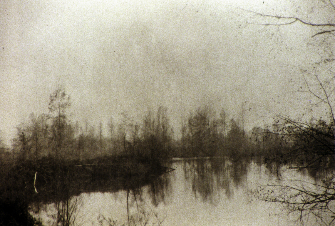
The image below was captured using the same old Burke & James flatbed view camera, and developed for printing in salted silver, although an earlier negative, before I stretched that density curve out much further, later on. Having scanned the image, I am now able to digitally create two negatives, scaled for different printing mediums. Just as I kept negatives in black and white film, I keep digital negatives, beginning with the master, a RAW digital image. That is kept in a marked file folder, and from there another folder keeps the .tif file negative images after being prepared for their specific printing purpose, respectively; silver and gum. This image will likely see both.

Salted Silver Print ~ "Arizona Desert View"
1986 ~ 5"x7" ~ Unique
Upper Sonoran Desert, Arizona


Thursday, September 29, 2016

Digital Negatives ~ Magic Land Densities

I think back to the days of tray development of the 5x7 negatives I was shooting with. There was much that could be done to fully control the density range of any negative in any lighting condition, and spectral differences. Spectral differences including the difference in spectral light between Tucson, Arizona, and Eugene, Oregon. The spectral light of Eugene being up into the blue light area of the spectrum, with Tucson shifted to the lower, red spectrum. On panchromatic film that matters. Panchromatic film is more sensitive to the red light than the blue light, creating the misnomer of it being 'more contrasty' outside. That, is when a compensating developer comes in, and perhaps even a compaction during development. An earlier article.

Having now begun revisiting the arena of reading negatives, along with adding spectral density into the mix, I am coming to read so much better now. When I began this process some weeks ago, and without all the equipment I have now, I was working to build sufficient ink density on the acetate sheet to actually represent a true Zone 7 & 8. Turns out, I learned that particular lesson at the same time I came to grasp the spectral density's part to play in the process. This process is ongoing, and a collaboration with PJ (McArdle) who founded and created the darkroom photographers group, and where my printing is currently done, until my own printing room is done.

We have been developing a sort of hybrid of Dan Burkholder's procedural methodology in preparing a digital negative for printing in hand coated processes. His method works well, by the way, as he has demonstrated. What I am personally after is manipulating certain areas of the negative, representing certainly tonal ranges, for better texture and detail in the print as well as optimal tonal separation, using the longest density scale possible. I believe we stumbled onto that procedure this morning. I am not able to tell you what that was simply because I haven't a clue what he did. What I saw... was certainly not intuitive. I do not have Photoshop. I do have Corel Paintshop Pro which is Photoshop designed for photography. I will be trying to do what he did, then I can talk about it, as I will have some sort of structure to describe.

The simple of it is this, using hue/color slides in the menu, for a black and white negative image, sections of tonal ranges began changing their density, based upon hue assignment. Somehow it is seeing what had been the color assignments, no clue. The outcome was that the section controlling the sky and clouds set that up with a matching density range of the house with a Zone 7 density. The Cyan slide pulled up a Zone 3 area of a large field of grasses, to Zone 4, and so on. It appears that when the density increases or decreases, the amount of green tone followed suit, which would further separate the two tonal ranges just achieved. That negative now represents what would have been magic thirty years ago. If this method is a functional as it appears visually at this time, I will document it fully and writing about it. Grasping the digital aspect is certainly a weak spot for me.

On the way to print today, I needed to pick up a sheet of Arches Platine so I could print this new, most excellent negative. In a town(?) of a million people, not one art store has a single sheet of that paper, or anything equivalent. So, the printing session is off until my online order of a new equivalent of Arches Platine arrives. Revere Platinum paper, sold by Bostick & Sullivan, is less than half the cost of Platine, with the company's tag next to said paper, it is becoming the preferred paper for alternative process printers. This is very promising. It is of the same weight and dimensions, and is also sized, being made for hand coated printing. I will certainly be writing about that when it arrives.

I recently scanned two old 5x7 negatives that were still taped to the printing masks I used for printing a gum. They are of the upper Sonoran Desert in Arizona, taken circa 1986 during a family visit I made with my two offspring at the time. I had brought along my Burke & James 5x7 flat bed view camera, with all the stuff that goes with such a rig. That was also the year I captured the inside of Paul & Jerry's Bar in Jerome, Arizona, with recognizable old timers at the bar. Soon, that will be printed as an 8x10 in palladium. The image below is one I printed in gum, back then. This time around I will print it in both gum and silver to palladium.

Salted Silver Print ~ "Desert Mesas"
1986 ~ 5"x7" ~ Unique
Upper Sonoran Desert, Arizona


Wednesday, September 28, 2016

Test Print ~ Palladium toned Kallitype

As I mentioned before, I find the Kallitype process to my liking, more than salted silver, although I have made a number of really nice salted silver prints. The Kallitype uses a iron binder mixed with the silver solution at the time of printing, unlike the salt paper process where the salt (iron) binder is attached to the print paper by soaking it in a salt solution before drying, before later printing. The Kallitype process is almost exactly like the platinum/palladium printing process. Both use a ferric oxalate as the binder in equal amount to the silver/platinum/palladium solution; 10%/20%/15% respectively.

The Kallitype formula I have picked up uses 10% solution of silver, which has proven to be very effective. That, mixed with a 20% solution of ferric oxalate in equal amount then brushed on the printing paper. I use Arches Platine pretty much exclusively for Kallitypes. The full Kallitype process is laid out in detail under "Processes" right side of the blog page next to article listing. I only single coat the Kallitypes, thus far, with the problem of removing all the ferric iron in the paper being difficult. I have also come to learn that there is a better chemical for this job than the Citric Acid this formula calls for. That would be EDTA (Tetrasodium Salt) used in Pt/Pd printing to clear the print after development, same as Kallitype. My understanding is that EDTA can be used in the Kallitype process.

That brings up another quality of the two processes that I will be experimenting with. Both processes use ferric oxalate as the iron binder. For Pt/Pd the solution is 27%. For Kallitype (silver) it is 20%. The developing agents for Pt/Pd are ammonium citrate, and sodium citrate, which is also used in the Kallitype, this developer being a warm tone or brown shade for both processes. The different developers create the primary print color due to their reaction with the metallic salts. I prefer to use the black developer for Kallitype prints as it sets up a good deep dMax black in the lower tones which then remain deep black after toning with palladium, bringing the warm tones to the print.

This Kallitype print was developed in the black developer; sodium acetate & tartaric acid, and cleared in citric acid before toning in palladium. One of the attributes of the Kallitype is that the print is developed after printing out. This is not totally unique to Kallitype in silver, as a salt paper print can be developed out, just like a Kallitype, with exception to not then needing to be cleared, as in a Kallitype. Likely because the binder is in the paper. That would be a guess though. What that comes down to is that when you develop out a printed out print, the image is not fully printed in before development. In the case of a salt paper print, using Gallic acid calls for a print out time of 1/3rd standard print time. For Rodinal development it calls for 1/5th print time.

That means you won't see any detail above probably Zone 4, maybe Zone 5 before development. I am not used to that, printing in salt paper. This is new and remains a bit bizarre to my senses, yet. This image for this print was mostly prepared in Lightroom, using the slides for the visually inspected density assignments I put to each density range, before toning the negative green. I always work with an image I will be printing, in its negative form. This was close, however being I boosted the densities as well as added the green tone, it took some time to print it down. This print was a 20 minute print, with only the lower half of the tonal range printed in. I have come to know what happens when the print time exceeds 20 minutes. It isn't good.

Palladium toned Kallitype ~
8"x10" ~ "Sacred Dance"

Tuesday, September 27, 2016

Test Print ~ Palladium toned Salted Silver

The testing continues, with interesting outcomes cropping up that become real head scratchers. One of the variables that will be dropped out for now is two silver processes; salt paper and Kallitype. There are two really good reasons, one being cross contamination, and the other being simply the two processes are different enough to create more questions than offer up good prints. Both processes print roughly equally even from the same negative. Roughly equal meaning if a negative is scaled such that it prints nicely on salt paper, then it will print approximately equal as far as tonal range is concerned. That being said things can go sideways quickly without altering print times, as Kallitypes don't print like a salted silver (salt paper).

My direct experience with silver printing has been in the salt paper process. That process can be stripped down to two chemicals; table salt and silver nitrate, to make the print. There are formulas that include citric acid in the silver nitrate solution. I am currently staying with the formula I used before, as it is tried and true and I use it now as a baseline. I will print a batch of images with the citric acid included, as well as try out gelatin sizing on the paper when salting the paper. That is the fine tuning part that is a lot more fun than testing, even when there are breakthroughs.

I have come to find Kallitype printing more enjoyable, as a process, than the salt paper process. Perhaps it has to do with not having to pre-treat paper, which then becomes fixed at the salt % used, as well as using four times as much silver, in more saturated form. Part of the testing has to do with realizing the optimal level of binder to silver with the salt paper process. Printing my 5x7 negatives that were developed traditionally using pyro/OH required the binder (salt) at 2 1/2% and the silver solution saturated, at 13%. That agreeable handshake was a very good mixture. For the salt print then, the current 3% binder (salt) solution is actually a bit too much. The negatives as they are scaled now, would fit the 2 1/2% solution better.

In the salt paper process, the binder (salt) to silver ratio can be adjusted to suit the density range of the negative, to a degree. For thinner negatives, less than Log 1.2-1.8 say, the silver solution should be at 10%, and the salt binder between 1%0-2%. For thicker negatives Log 1.2+, the silver should be at 12% by the book, {I use a saturated solution of silver at 13%} and the binder between 2%-3%. And therein lies the tuning range for the negative's density curve. As the binder decreases, with the silver constant, the more contrasty the print. Less binder (salt) = increased contrast. Increased binder = ability to record negatives with a very long density range.

I am at that tuning point now, needing to decrease the salt binder to 2 1/2% while keeping the density range of the current negatives approximately the same. The print times between a salt paper and Kallitype are quite different, using the same negative. Also, when printing a salted silver, you print the image in fully, to the tonal range desired, for me that would be Zone 7, textured white. Then I slip the print into the wash tray or 30 seconds or so to allow the print to become wetted, as well as watch some of the unused silver begin to wash off. Then into the toner which will arrest any further darkening, or, fading from bleaching effect when in the fixer.

Printing in a Kallitype normally doesn't run like that. There are times when a dense negative is used and printing in the upper tonal ranges until them show up, when they seem to not want to come in, turns the print very dark when it is placed in the developer. Very dark. A print this morning was one such prints. After twenty minutes, in print increments of usually 4 minutes, I pulled the print, even though none of the sky had even begun to show up, as well as anything above Zone 6. When it hit the developer, the sky came in like magic, as did a lot of other attributes that hadn't even begun to appear during printing. Much is being learned from this.

Anyone wanting to look at either of these processes, on the right side of the page is a Processes section listing four processes, for easy access. The print I'm posting is a subject I have been wanting to print; flowers. I have too many such images to count. One has to begin somewhere, so I begin with my wife's favorite flower, one she has painted in watercolors many times. Still a work in progress, but it is getting close to what I want it to look like.

In yesterday's post I showed the negative I used for this print. Now you an see how that negative translated in silver, toned in palladium.

Palladium toned Salted Silver Print ~ "Lilies" ~ 8"x10"


Monday, September 26, 2016

CI Curves and Digital Negatives

I have been discussing negative controls using nomenclature suited for chemically developed negatives. Each time I interact with digital negatives, altering them to suit a printing medium, it becomes ever more clear that discussing contrast index curves has to be done under different terms. The two posts concerning contrast index curves and density range is an example. The explanation only works in theory; digitally. Altering the contrast index curve proportionally, or favoring middle tones, is accomplished using digital tools, which have no real rules or boundaries, in the traditional sense. Theoretically, one can manipulate the densities in any given tonal range for increased or decreased density, or other digital attributes. There is no command that alters the density range. That also comes from digital manipulation.

I alluded to this issue in the last post, describing the basic approach I take in digitally manipulating a negative before printing. In short, an in intuitive manipulation done by visual inspection. Knowing how the densities chosen relate to other densities that will all be affected by a constant light source. Meaning, the density range will ideally print down such that when texture shows in zone 7 the print is done and all the tonal ranges below zone 7 are reciprocally in their respective range as well. That can be accomplished in more than one way. The first way was my stripping out a good portion of the middle tones to realize more tonal separation. It worked too well and the effect was akin to a lithograph. All the creamy middle tones add much to a print. Lesson learned. These upcoming negatives have been manipulated to increase all the tonal values, however, not necessarily  proportional or equal. The manipulation was done to favor certain tonal zones, for emphasis.

The Print Negative

Today's work with the negative printing should prove to be pretty much in the sweet spot. A simple  printing with said negatives will be the arbiter of that of course. One of the negatives printed this morning was 'developed', as in scaled and toned using Dan Burkholder's method. The other negative printed was an image of Lilies that I have been waiting to get to for some time. Flowers are especially beautiful in palladium, as well as gum. That will begin happening hopefully very soon.

The negatives I'm posting here have been prepared for printing using the methodology I've been writing about; density assignment applied visually, then spectral density added (green tone). I am far more comfortable working with densities in the negative view. The densities show themselves better when I see them in that form, and being I don't use a preset density range that can be assigned an image, it is through visual inspection that I rely upon to interpret how I would like the negative to print, then assign the densities visually by using the four slide controls in Lightroom, to arrive at a negative I feel will print an image I am pre-visualizing.

These is one of the negatives I will be printing tomorrow. First run will be as a salted silver, toned in palladium (if I like the print). I will be posting a print image then.

"Spring Lilies" 8x10


Saturday, September 24, 2016

The Refined Gum Print ~ Viscosity Matters

The last post was on gum printing when I was just beginning to learn the process. Therein also lies a lesson almost exclusive to gum printing, i.e. no one knows what you intended, thus whatever you have, if it has any visual equity, could be a finished print, if you like it. The gum print of the last post is an example, being it is not what I was after, yet the outcome was visually appealing to viewers. Whether a print should be seen by eyes other than your own is one of those personal choices printers make.

What was obvious about that gum print (9/24) was the more vibrant and distinct color layers of the  print. They didn't overlay or meld their transparencies to form an additional color (2 colors added to create a 3rd), they remained mostly distinct. In subtractive color layering, two, or more, thin translucent color layers will combine to create an 'added' color. For example, a magenta color layer followed by a yellow color layer leaves orange of some shade, depending on the amounts of each color applied. By adding a cyan layer over the same magenta layer results in a warm, or cool brown tone, again depending on the amounts of each color layer.

This is a form of mixing an additional color layer palate of colors during each printing. The pigment amount of each layer adds to and alters the resultant colored image. That is the primary control, beyond the selection of sizing & mixture levels. The gum print is shaped many ways during the actual printing, at each juncture of control; paper choice, sizing, gum viscosity, pigment type and amount applied, length of print time and floating time, each layer. There is much room for personalizing an image.

This print was the final print I made back then. I had learned a number of these controls and their visual outcomes behind me, however I was still using paper negatives at that time. I had tuned the mixtures to better accommodate each other for my printing method. I was working to achieve a print with a fuller tonal range and better separation, as well as increased textural detail. That meant cutting back on sizing amount and increasing gum viscosity. The paper was working out well.

It is fairly easy to see the differences between the two print outcomes. Separation of tonal values and textural detail can be achieved even with a paper negative, however, that entails very close scrutiny of printing and float times to achieve any success. Not every color layer was a full page coating. One such coating was applied locally, using six small cups of gum mixtures, each with a bit different color mixed, from a dark Forest Green mixture to lighter green to yellow-green to yellow. Each of these colors were applied locally to leaves and other portions of the background trees, using a loop and a very tiny pointed brush. The final layer was a 'golden' color, to my eye anyway, applied as a very thin shear layer, then floated off of the highlights, leaving a sort of golden tone to the lower tonal ranges, in an attempt to mimic the late afternoon "golden glow". I leave it to the viewer to decide if I was successful.

Process: Arches 140lb hot press watercolor paper:
Pre-shrink paper ~ Water @ 120 deg; soak paper minimum 30 secs ~ dry paper
Sizing; (2) coats sizing;  2 1/2% solution Knox Gelatin @100 deg ~
Gum Mixture; 50% mixture ~ (50g gum Arabic to 100ml distilled water)
(13) Print layers of translucent colors


Gum Printing Viscosity Values

The wood shop at the Formulary has once again opened for business, giving me opportunity of ordering a 11x14 contact print frame. Allows me to use larger print sheets with trimmed borders for handling and coating, as well as signing and numbering beneath the window matt. The last printing returned much information on better scaling the digital negative. That means reversing something I tried out but didn't like, even though it turned out as planned. Test negatives will be printed and used until the print frame arrives and I can resize things to work better.

For now the discussion will be on gum printing, continuing from earlier posts. Where I left off was after treating the paper and formulating a sensitizer/binder relationship. As I pointed out earlier, controlling the image stability on the paper, while at the same time also controlling the amount of pigment the gum solution can hold without staining the paper, is a hand shake between the two. Each is an dependent variable, meaning it is a variable, but also having influence on the other variable.

The two gum prints posted have two entirely different looks, one looking something akin to a Pastel and the other much smoother continuous tone, with transparent color depth and some texture and detail. That had to do with this handshake. I reformulated the chalky one and ended up with the smooth one. At the time of this printing, looking up information meant a trip to a local library in hopes the librarian there had even a scant interest in historical photographic processes. What I found was "The Keepers of Light", my first foray into the world of coating your own paper techniques. Being I had already been contact printing with paper negatives this seemed like a win-win situation.

The pastel looking gum (9/20 post): That gum was printed in four color layers; Magenta, Yellow Ochre, Cyan, Magenta. Exactly what was in my thinking at the time, why I didn't run a black layer, or why two Magenta layers, is but speculation at this time, even for me. What generally drives my thinking at the time of  printing is how the print image is moving along at that given layer and what the next color will do to that image, where I want to keep the pigment away from to retain whites, and other considerations. I say it often, gum printing is technically a photographic watercolor. It's a photographic process by virtue of using a negative to arrive at the printed image. The gum process, however, works the same as watercolor rules, utilizing subtractive color theory, and retention of paper base white in areas for later coverage, or through the entire process to represent pure white.

Process Notes;

Paper; equivalent of Arches 140lb hot press watercolor paper.
Sizing; (2) sizing coats of 5% Knox Gelatin solution @ 120 deg; 30 secs to 1 min
Gum Solution; approximately 30% mixture {30g gum to 100ml distilled water)
*Premixed gum Arabic is usually measured in Baum. I do not know anything about Baum beyond it being a measure of viscosity. The premixed gum I've seen online is listed as 14 Baum, and if I had to make a guess as to it's % measurement, it would be that 14 Baum roughly equals 30% by weight.

That part is important, being the gum mixture, with pigment mixed in, is mixed 50-50 with the sensitizing solution, which is potassium dichromate (13%) in water, and mixing water with gum effectively cuts the viscosity in half. Half of 14 Baum is thin to my method of printing. This print was a bit further along than the first few I made, yet still fairly crude to later prints. I was still learning about the balance between sizing and binder thickness. One of the better habits I began early on, was marking the printing layers, a 1" strip of the finished gum mixture painted along the edge of the paper before each printing, leaving a permanent color strip after printing, showing the exact color, and in which order of printed layers.

Because of the thinner gum mixture carrying the pigment, the pigment wasn't fully suspended or contained within the gum mixture, thereby losing some of the transparency otherwise seen. That pigment was unable to penetrate and stain the paper due to the heavy sizing. *Heavy to my methodology. I use half that now. If the paper had been sized at 2 1/2% solution, along with the thinner gum mixture carrying a perky amount of pigment, the outcome would likely have seen some real paper staining. At exactly what point that would happen isn't clear, until it is done, for visual inspection.

It could be that printers prefer this look in a print, and can replicate it by following the process notes above. I found it interesting but not where I wanted to go. Using a paper negative obviously works, and I would say rather well actually. However, compared to a digital negative, there is no comparison between the two for added density control and acutance, offering up superior texture and detail with the latter. The print in this discussion is below to see what the information above represents.

Gum Dichromate Print ~ "Sunset Fern Ridge"


5% Sizing; (2 coats) ~
30% Gum Mixture ~
4 Color Run; magenta, yellow, cyan, magenta (for sky)
Color strips along the bottom of the print showing print run color/order;


Next post will be with an example of how I do it today.


Thursday, September 22, 2016

What the testing is telling me...

The point of photographic testing is of course to learn the attributes and characteristics of a process or procedure. That part is paying off handsomely. What I had learned, and applied thirty years ago is now having to go through a revision, to accommodate new variables that weren't around back then. One of those newly arrived variables is the digital negative. Not even a concept back then. The second is the newly built Solar Printer, also not even in my dreams at the time. The proven wisdom's that worked so well must now be altered, like it or not.

What I was writing about last post had to do with the 'fallout' of densities in the middle tones of the print I had just completed. In a sense, that was my fault, having dropped out some of those densities intentionally for the purpose of 'separating tonal values'. It did that better than I could have hoped, leaving an image that was for me visually more of a lithograph than a continuous toned photographic print. I am mending my ways.

There are two ways of achieving that feat. You thought otherwise? I will be exploring both to compare the prints to see which defines the print values as I prefer them. That means employing Burkholder's method of bulging the CI curve in the center and toning the negative with a green color; spectral density. Because the Solar Printer is putting out so much UV intensity as it is, instead of varying the height of the printer we prefer employing spectral density to retard print time. I have a negative ready for printing via Burkholder's method. Also is a negative that I did almost the same thing, by increasing middle tone densities and highlight densities (zone 7-8) as well, separately. Both will have the same green tone, keeping that variable constant.

I have always preferred an image with full textural detail, over the entire tonal range, (those having texture; zone 3 thru zone 7). The current, fairly constant print time of 13 minutes is within the time frame we had been seeking. For now, I plan on printing salt paper prints, as the differences in Kallitype prints made yesterday ended up working in opposite directions; one print darkened considerably and the other lightened up considerably, losing the zone 7 to a blank zone 8. Weird. We'll be finding out why later.


Wednesday, September 21, 2016

Testing Day Notes

To be honest, I had intended on posting the last two posts in reverse order. The paper preparation comes before the mixing of the coating, and, the samples of each level of printing demonstrate what was learned from the earlier print to the final print. Most notably, the sizing, print times, and learning the sheerest watercolor pigments. The images are representative of those differences, respectively.

I came away from today's print session with one workable print, although still not to my liking. I am here working with three processes. Each with unique printing characteristics, and each with variant formulas to deal with as well as print times. Having covered these three processes in general terms, as well as detailed explanations, procedures and formulas, I will begin focusing more on each process in more detail as dynamic progress allows. So far, testing has been the focus, especially since building the Solar Printer. It is working flawlessly. The switch from sun to Solar Printer necessitated increasing negative density overall, and in some cases increasing densities relatively, as in middle tones and highlights; this is increasing the density range of the negative.

The overall density increase was achieved using Dan Burkholder's method of overlaying a green color using a adjustment layer. As I move along I am recognizing and dealing with more variables added to the process. Each variable alters the outcome of the image, sometimes in subtle ways, sometimes jaw dropping things come along that take some time to figure out why a predictable outcome didn't happen, or happened opposed to what was predicted.

During today's testing I began printing Kallitypes, using the new negatives that were printed yesterday. Those negatives were created in two different ways, with the outcome showing up quite well. My normal procedure is taking any negative that wasn't created on b&w film and developed out traditionally, and using Corel's photo algorithm for making an image a black & white image. I have found that to leave the image with the very long scale expected from a black & white negative that was scaled the same. Merely changing an image to a gray scale likely returns a tonal gradation of 250, whereas a true conversion would realize a scale much, much longer than that, in a continuous tone. Smooth, with lots of textural detail.

One set of negatives were processed using this algorithm, then being reversed (negative) then were toned green, to a known amount. The second negative of this tale, was a black and white image shot on film and developed out, then the negative was scanned, leaving a very nice positive. I took that positive, without any manipulation of any tonal range, 'inverted it' (PJ's updated Photoshop & LR)
then added the known amount of green toning and saved it.

The only real variable between the two images is the the tonal scale assigned. For the one, it was reversed as a scanned RGB image. The other had been filtered through the "Black & White Film" algorithm. Print #1; Adley on the Stump (Inverted RGB) and Print #2; Disuse #1 (Black & White Film) What I am finding is that image #1, direct reversal from positive to negative is a shorter scaled print than image #2, which was converted to what I believe was a longer scaled tonal range represented in the negative. I have yet to confirm this with specific testing but the preliminary results do suggest this.

The reason I haven't accepted this yet as fact is simply I printed the two images in different processes, although the print times for each print were the same; 13 minutes in the Solar Printer. That was the good news. We are closing in on the print time desired, which is possible using the spectral density of the green toned negatives. That retards the printing sufficiently to roughly double the print time before using the green toning. The measurement of that derives from the 'shift' to green (Lightroom) PJ put to the images before printing.

Turns out "Adley on the Stump" printed quite nicely, far more contrasty than I could have imagined from the visual densities on the negative. "Disuse #1" is visually has roughly the same visual density range. I printed Adley as a Kallitype, and Disuse as a salted silver. There was a reason for that. A sort of secondary test for comparative analysis, between the two. The first print through was a third image, with seemingly the same density range and the same green assignment. That print took 30 minutes to print in. Even come close to printing in. Then when it hit the developer it darkened down like crazy. I used the "Black" developer, using thiocyanate & tartaric acid instead of sodium citrate. This was way more than normal darkening upon dry down. Somewhere I went wrong.

The two other prints were both 13 minute prints, as hoped for. Adley, being another Kallitype, reacted quite differently. The image had printed in right up to Zone 7, filling in detail nicely, with the rest of the tonal range falling into place as expected. When that print went into the developer, it lightened up, losing all the detail in Zone 7 turning it into Zone 8. I was not happy. And that is why I shifted to salted silver printing. I know that process intimately and there is no dry down like the Kallitype.

That print also was a 13 minute print, and there was no darkening or lightening. Just where I printed it to. Both of those prints were toned in palladium, now rendering them palladium prints. What is noticeable to my eye right away is the tonality differences, and how they arrived. For the Adley image, beyond the loss of texture, is the gradations of the tonal range are short and few. It is a much more 'contrasty' looking image, whereas the Disuse image has a much longer tonal range. A secondary visual aspect of the Disuse image is that the middle tones are missing, leaving an image that to my eye looks like a lithograph or Inked type of image. I have no doubt that is derived from earlier manipulation of the tones in an ill advised attempt as 'increasing contrast'. It didn't. Just dropped out the middle tone densities between high tone ones.

Having these prints for comparison now shows me a methodology that will leave an image that mimics a traditional continuous tone negative. That is the task for now. I will of course be posting them, just as soon as they dry down fully. Stay tuned.


Tuesday, September 20, 2016

Test Print ~ Palladium toned Salted Silver Print

The prints have dried down and the copy work of the image I'll focus on here isn't too bad. What gets lost in the digital translation is the warmth of the print tone from the palladium toner. The digital image will have to do. As I had pointed out in the last post, it is the middle tones that suffered in this print were the middle tones, and that was of my doing, when I was less practiced with the Lightroom controls. I am getting better though.

This test print is about 90% where I want it to be. The important thing about this test print is what I learned from it, which is visually relating the density range with this print, added to the spectral density to create the same 13 minute print with a better adjusted tonal scale, adding bulk to the middle tones.

Palladium toned Salted Silver Print ~ "Disuse #1"
Under construction ~

The Gum Print ~ Paper Preparations

Preparing the printing paper for a gum print shapes much of how that print will appear in the end. In gum printing, the handling of paper sizing and the thickness of the gum mixture is a handshake on how the pigments will be suspended in the emulsion and bound to the paper in the finished print. It is that combination of attributes that set up how the final image will look on the printing paper. Not enough sizing in combination with too thin gum solution and the pigments stain the paper and that pretty much ruins the print. Too much sizing and and a thick gum mixture results in the image sitting on the surface, which is the explanation for the print below, a test on just how much I could get away with on the 'heavy' side, respectively. All the colors sit absolutely on the surface, in addition to losing some of the transparency in the layers, resulting in a colorful print, yet, again, with little texture or detail. What becomes obvious is that the print looks more like a Pastel than a gum. Not to my liking. It's a personal thing.

Before sizing though, I highly recommend shrinking the paper. An extra maneuver yet I believe an important one if you intend on multiple print layers. Each print layer is floated in water, and being rag, tends to shrink just a wee bit each successive dry down.

My method: I bring  1000 ml of water to 120-125 degrees. Pour into tray and begin placing the pre-cut sheets one by one in the water and let soak for at least thirty seconds. I soak mine for a minute, then pull out and let dry. I am making two 16x20 drying frames to dry paper flat and even. The reason I go the extra mile is that really good rag paper, like Platine or other good heavy weight papers, will indeed shrink under the conditions of gum printing. You want as much shrinkage on that first run to mitigate any further future shrinkage.

The sizing of a paper is part of the story. The paper is also important. The paper needs "tooth" to be well suited for gum printing. Tooth being the ability of the paper not to be too smooth, which doesn't give the gum solution much to hold on to. After each coating and printing, the gum print is "floated" in a tray of room temperature water. That part of the gum area that wasn't affected by the UV light will begin to float off the paper. That area that was affected by the UV light won't. It has become impervious to pretty much anything at that point and will only be floated off of those tonal ranges that have yet to be fully, or partially affected by UV light. This is why print time is very important to know for controlling the amount of color floated off a print, and, at which tonal value.


Left: as the gum Arabic color layer is floated away at some areas affected by UV light, it can leave areas where there is no gum, spaces where there needs to be some paper connection to the gum, to keep the gum attached to the paper base. This is where the paper's "tooth" comes in offering this bridge between gum and paper.


My personal choice for paper tends to fall on Arches 140 lb Hot Press Watercolor paper. It doesn't feel 'rough' but it does have this 'tooth', and I get very good results from it.

After the shrinkage dry down, the next step is sizing. As in gum printing itself there is leeway in sizing, in the sizing solution, and number of sizing layers. How much do you want to size the paper before printing. Knox Gelatin is probably the most used sizing in history. Arrow Root is likely close behind. Gelatin is cheap and easy to find, being every grocery store. Sizing can range from as little as 2%, up to 5%. Sizing is also recommended to be done twice. That, from the old books, and my own recommendation.

My personal choice of sizing my paper is two sizing runs of 2 1/2% gelatin solution. This was not the case with the print below. The above information was learned from the print below. 

Sizing Formula:
Gelatin Sizing; 2 1/2%

Distilled Water              280 ml
Knox Gelatin                     7 g    (1 packet)

Take 100 ml (room temperature) water ~ Add 7 g gelatin
Let sit 15 min for absorption
Add 180 ml Water @ 120 degrees to make 280 ml

*Submerge paper 30 seconds each side
For larger sheets of cut paper, or for several sheets at a time, a larger mixture can of course be made up, either doubling or even quadrupling the above formula. Know Gelatin comes in a box with four 7 gram packets. For a full mixture using all of the packets; for large paper or several sheets.

Distilled Water              1120 ml
Know Gelatin                    28 g

Take 450 ml (room temperature) water ~ add 28 g gelatin
Let sit 15-20 min for absorption
Add 670 ml Water @ 120 degrees to make 1120 ml
Same paper treatment as above.

The mixing formula for the below print is from memory, although autobiographical memory is something we don't lose over time. Making prints is autobiographical memory. As seen in the print, there is little texture and detail. There is also not a lot of tonal separation, which translates to colors sort of mooshing together, more than enhancing each other. This was an early gum print, when I was still testing the boundaries of viscosity and pigment intensity, and finding answers. The colors aren't transparent so they tend to dominate regions of the print where a density is variant from another.

Paper; Pre-Shrunk; 2 coats of 5% gelatin sizing
Gum Mixture: (approximately) 30%
4 (CYMK) color print layers

Gum Dichromate Print ~ "Sunset Fern Ridge"
1985 ~ 5"x7" ~ Unique
Vaneta, Oregon

The Gum Print ~ Sensitizer & Gum Solution

Now that the paper has been prepared, by shrinking and sizing, it is ready to receive layers of colored gum Arabic. The gum Arabic mixture is another personalized part of the gum printing process. You will notice when you buy premixed gum from B&H Video/Photo or Bostick & Sullivan that gum is advertised in Baum. Their particular brand is a 14 Baum. How thick that is I haven't a clue. I mix my own gum. You thought otherwise? Thirty years ago it was easily found in raw form, which is, in my humble opinion the best. Now, unless you are interested in a palate of 100 Kilo bags of raw gum, you will likely be forced to use the powdered form that seems to be the only choice in the entire country. It works.

Gum Arabic (Acacia variety) grows from Acacia trees, mostly in far away places unwilling to sell and ship small amounts anymore, without a sizable shipping charge equal to purchasing the palate of 100 Kilo bags. It melts quite nicely in room temperature water, but use distilled water. No free metals needed. If you are sufficiently awesome as to actually have raw gum, cut a square piece of flannel shirt, cotton works too, and tie the measured raw gum up into the cloth and tie string around it, leaving about six inches. Place the measured amount of distilled water in a ball jar and suspend the cloth ball of raw bum in the water just off the bottom of the jar, then put the lid on with the string hanging out so the ball remains suspended when the lid is on. Let it melt overnight.

The same procedure is used for the powder form, with exception to all the steps in the middle. Place the measured amount of gum powder in the bottom of a ball jar, pour in the measured distilled water and close the lid. Wait about 24 hours. The gum should be clear if it is a good grade of Acacia Gum.
The above use of "measured amount" being, again, there is much latitude in the gum mixture, but that mixture/thickness or viscosity has to suspend the pigment enough to keep it from touching the paper, through the sizing. With the 2 1/2% sizing solution with two coats I use, I reciprocally use a 50% solution of gum. Thus, my formula is twice as much water as grams of gum.

The Gum Solution:
I make about 300 ml of solution so as to use it up before it breaks down, and in time it does break down. That comes to;

50% mixture;
300 ml Distilled water
150 g gum Arabic

Also, important, a preservative is needed to keep the gum from molding, over time. That preservative is Formalin; which is made from a 10% solution of [Formaldehyde (37%)]
Use; 5 drops per Oz (30ml) gum solution; for 300 ml = 50 drops   {20 drops = 1 ml}

The Sensitizer:
Potassium Dichromate;

Distilled Water                               100 ml @ 100 degrees
Potassium Dichromate                     13 g
Add dichromate slowly while stirring constantly until completely mixed in. Bottle in dark bottle.
*This mixture represents a saturated solution of potassium dichromate at 13%. Same as silver.

The basic gum mixture for printing is to take about 1 ml of clear gum (eye dropper works well) and place in a small clear plastic cup (1 Oz medical pill cup). Use a small plastic rod or other small rod to pick up a very small amount of watercolor pigment on the tip and mix and stir it into the gum. What you are looking for here is a transparent color that sufficient to leave its mark on the print yet not enough to overtake the other transparent colors that go over it, or a layer it is going over. This is the part that is artistically intuitive. It only takes a few layers of practice before you come to know what a various amounts of pigment are going to do. I use the clear plastic cups so I can hold it up to a light source to look through the color to determine amounts.

When you have the gum color to your liking, pour in an equal amount of the dichromate solution. Much like the Kallitype and Pt/Pd printing mixtures of equal proportion to their sensitizer. For an 5x7 print I used 1 ml of each solution. For an 8x10 print I use double that; 2 ml each solution. I apply mine with a decent quality Sable brush of about 1" to 1 1/2" width for best results.

The next step in understanding gum printing is layering of the colors. How much, which ones and in which order. That is one of the reasons gum printing remains the most versatile, most personally expressive of all the historical processes. There is just so many variables one can alter to achieve so many different outcomes. The variations are endless.

I began printing gums using the standard four color print run. I first began with Magenta, Yellow, Cyan then Black. Here, the black must be watercolor transparent black. This is important, as it being the last layer covers the other three, and if that layer is too thick, it then covers the colors underneath. Too light and there is little affect beyond a bit more shadow density. That is why I have flipped things around now. I now begin with Black, using Black Gouache, which is quite opaque. That wouldn't work on top other colors for obvious reasons. I use the Black Gouache as a base color to achieve dMax, which means I can only print 30% of full print time, to only reach Zone III. Then I float the print to just begin to reduce the black to remain as a deep black up through that tonal range. Then I run the color layers, all transparent, to achieve the depth of color I am after. Sometimes that takes several layers to achieve.

 The print below was the last gum print I made thirty years ago. I had not learned about the above method of printing; black first. What I did learn was that a full coating of each layer wasn't necessary, and sometimes counterproductive. I used a 2X eye loop and a few cups of colors, variations on green and yellow/yellow green, and using a very vine brush I added colors to different parts of the tree and foliage. I got creative. I was beginning to intuitively realize the subtler handling of colors and printing times to achieve the enhanced texture and detail achieved with 13 color layers. Now, with digital negatives, this is going to be so much more easily achieved.

Paper: Canson White  ~ Sizing; 2 coats 2 1/2%
Gum Mixture ~ 50%  ~ 13 color print layers
*Final coat was a thin coat of an 'amber/gold' color mix, thinly brushed on to replicate the late afternoon 'golden glow' effect.

Gum Dichromate Print (from a paper negative) ~ "The Quiet Pond"
1986 ~ 5"x7" ~ Unique
Eugene, Oregon


Monday, September 19, 2016

Gum Theory ~ Layering

As noted in the last post on gum printing, the process itself as a step by step guide will be forthcoming when I have begun printing gums again, moving through the procedure as a process that I employ. There is a simple reason for this. I am self-taught. There are no academic credentials to point to for photographic authority. As I wrote in my Artist's Statement, many years ago, my credentials come from my work. If you like what I am doing with a process, and have a desire to learn it, those are all the credentials needed for success. I am going to stick my neck out and say that Dan Burkholder derives from the same credentialed position.

I have gum prints with two color layers and a couple with over a dozen color print layers. The two coat gum was printed as a 'duo-tone'. Well, best I could do with it anyway. The two 'colors' were black and what my eye approximated as a 'palladium brown'. Then there's the little problem of digitally copying and presenting the image without grossly shifting what color it is, to a replicated image fabricated with my red/green deficient eye. I leave it to the color sighted for judgement of the end result.

There is a sort of traditional procedure for stacking the CYMK color layers. I found that to be Magenta, Yellow, Cyan, then Black. Then there is another that follows the acronym for the colors and they stack Cyan, Yellow, Magenta, then Black. What I would tell you is that both are correct, as would be the way I print, which begins with the Black. Pigment selection is important for two reasons. First, being a high grade of pigment is important for archival quality. Student grade or even lower grades of pigment also work, but aren't going to have the longevity as a professional grade. Secondly, the different pigments mix differently. Subtle but different.

I have always used high grade watercolor tube colors. My wife being a watercolor artist has them around for my perusal, as well as excellent inside knowledge of each color's attributes and 'translucency', and that is very important. Selecting the colors is also important, to keep to true CYMK colors instead of RGB colors. That is a different color arrangement and printing outcome. An RGB tri-color gum of course uses three colors instead of four. Black isn't included, as the three colors mimic a dark color which is sort of a 'shadow black' not dMax type black. Such a finished print can be quite attractive, and for my eye looks much like a color print from the early color negatives, which left a somewhat soft pastel color look. Perhaps someday I will try one out. For now I stick with CYMK printing. I like a dMax black in the image, and sometimes a paper base white as well.

I will get into detail on my personal approach to color stacking, and why it works for me, later. What I want to talk about now is what is happening with the color stacking, and why I follow that path. Beginning with the basic subtractive color theory, the four colors, stacked on top of each other, add up to a full spectral color image. Same as the summation of RGB colors, making up the color spectrum of visible white light. That would mean equal amounts of each color, either transmitted or reflected to create the illusion of a color image. The addition of the black in the CYMK arrangement of course adds shadow and depth to the image.

The most subtle but important aspect of this color stacking has to do with pre-visualizing the affect of each color layer over the current layer(s). If a lot of Magenta pigment is printed on the first layer, then Cadmium Yellow is added on top, in equal amount, Orange is the result. Layer Cyan over that and you end up with some form of reddish Brown. Lesson the Yellow and keep the Cyan constant and you end up with darker warm brown. A thin layer of Magenta with a heavier layer of Yellow, followed by a healthy layer of Blue and you end up with a Greenish color.

Once the printer has some experience with layering colors it doesn't take long to know now much of each color layer to mix for the desired outcome. There are also other printing variables that can further enhance the image, one being altering the color layering, as I do, for a different result. Another method took me some time to realize, but nothing says the printer needs to cover the entire print area with each and every layer. I would encourage the printer to brush color(s) only on specific areas of the image that would enhance them, as well as arrive at a more precise color for that specific area, such as flowers or other vegetation with colors that would be difficult to replicate stacking every color layer over that area. By mixing a specific color for that specific region of an image, further enhancements can be obtained. I learned this on the last gum print I made, thirty years ago. I will post that again, later. That gum print has thirteen color print layers, a few of those layers were specifically targeted for vegetation.

Beginning with the simplest multi-layer gum image, one I refer to as a Duo-Tone. The image below is my interpretation of such a Duo-Tone using Black and a Brown (to my eye). The Black was printed first, then the Brown on top. I confess to not remembering the brand of watercolor, after thirty years. l look for Windsor Newton or Van Gough brands today. This is also the first gum I printed the Black first. The actual second 'color' is iffy compared to the original, due to said digital replication. Forgive that failure. What I learned from this printing is that dMax can be reached, as well as leaving a paper base white, using only two layers. The texture and detail will be greatly increased and enhanced by using a digital negative. Soon.

Gum Dichromate Print (from paper negative) ~ "The Conductor"
1985 ~ 6"x9" ~ Unique
The Blue Goose Line, Oregon


The Gum Printing Process

When I began this blog I posted one of my favorite gum images, "The Flute Player". I was rather excited about how that test print had turned out, demonstrating the efficacy of the digital negative in gum printing. The texture and detail is amazing. I haven't forgotten the gums nor changed my mind about blogging on it. The Solar Printer made the entire enterprise really possible, and printing in silver is a process of a more immediate return. Not that they are quick and easy. They can be printed in one day.

Gum printing is a commitment. Preparing the paper for printing can take two or three days. Printing a simple four color (CYMK) color run is another four days. The Flute Player is slated to have at least a dozen color print layers. You see where this is going. It's like an artist's painting, done over many days, sometimes weeks. That, is why I only do one, make them unique. The reason isn't simply because attempting to duplicating a gum print is a fool's errand, unless doing a four color separation gum with tightly measured pigment to gum ratio. None of that method appeals to me one bit. That doesn't mean someone else might like such an approach, but you would learn little from me.

The principle of gum printing is fairly straight forward. Suspending a pigment in a clear gum mixture, then mixing an equal amount of a potassium dichromate in 13% solution, brush it on a treated paper then contact print onto the sensitized paper with a negative the size of the desired image. That has been said in hundreds of variations, in excellent publications of photographic how-to books. Following any one of those would lead to learning gum printing. What is different is the individual approach to the process, as this process is the most malleable, the most artistically expressiven with the most leeway for personalized influence of any of the historical process.

It might be said that the gum process is a photographic watercolor. My wife being a watercolor artist has demonstrated that many times. She even attempted to 'teach me how to paint', soon realizing what I told her about my being seriously lame drawing anything was an understatement. Gum printing employs subtractive color theory. Stacking primary colors using translucent watercolor pigments realized something akin to a color image. As you can imagine, the exact shade of primary color, the amount used on that layer, influences the next layer and the one after that. Each tonal range being affected slightly differently for any color layer applied, with the most influence at the higher tonal values, for obvious reasons. The tonal ranges from Zone III down to Zone I are affected, but not as much as higher tonal ranges.

It is for this reason that a full separated tonal range on the negative is important. The more separated the better, to a point. There is a diminishing return at some point. A nice bright negative is the best printing negative. A negative that would print well in an enlarger with a cold light head would work. The reason that a bright negative is beneficial is that there is increased tonal separation. Ideally, a print time of ten minutes would be ideal. Basing the tonal range on eight tonal ranges, using a ten minute print time, or a bit less, is that each minute roughly corresponds to a tonal range, and that is one of the secrets of successful control over the printing process. Too much print time and the gum becomes insoluble, and nothing can change that. Like a watercolor, the higher tonal values must be left untoned with color if a near white is desired. Once that tonal range has been affected by color that won't float off, it isn't leaving. The art of it is printing just up to the tonal value that you want some pigment to float off, but not all. That would be the "float point'. I made that up. That's my term for just exactly enough light to allow the floating time for the paper to be around 1-2 minutes in room temperature water.

The above is not meant to be specific instructions on how to print in gum. That comes later, with specific mixture amounts and rations that I use, as there are numerous approaches to printing in gum. I am covering the concept and practice of gum printing here. I will also soon be doing print time testing for gums, but first the silver needs to be finished. Tuesday will be printing new negatives, trying out green images as well as predictable density range settings. Wednesday is print day again. I will know so much more. Before gum testing can begin there will be a few days of paper preparation.

For now I can only show gums printed thirty years ago, when I first began. The early prints were predictably flat with little texture or detail. To learn that, took five years of study and practice. Eventually things began to fall into place. Perhaps in a week or so there will be new gums to show how digital negatives have made this process something available to anyone who will take the tome to learn the basic procedure and apply themselves. The cost is seriously low, and the supplies can be found in local stores.

Gum Dichromate Print (from paper negative)~ "Just Before The Rain"
1985 ~ 5"x7" ~ Unique
Eugene, Oregon


Sunday, September 18, 2016

The Difference Between Contrast Index and Density Range

When talking with other photographers about digital negatives in general, and scaling an image more specifically, there seems to be a misunderstanding about the difference between density range and the contrast index curve. Both are inexorably linked, and would be dependent variables of processing, yet not the same constructs. I have written on this subject twice now, although for a different reason. Those posts had to do with the differences in procedure between the two processes.


The above chart shows three contrast index curves. Each represents a difference in contrast, yet not a change in density range. If one were printing on silver gelatin papers, what would be seen in the finished print, using the same print paper, would be the contrast differences of the finished image. Silver gelatin print papers have a tonal range somewhere in the vicinity of 50, where black and white negative film has a potential tonal range five times that. Finding the right tonal range on the negative to match that of the printing paper is the key to a fully scaled print.

The tonal range of a hand coated silver print far exceeds that of silver gelatin paper, and therefore requires a negative commensurately scaled for such an extended tonal range. As has been demonstrated, the density range of a negative can be scaled without altering the original shape of the contrast index curve, as shown above. The contrast index curve (above) is scaled proportionately in each CI curve. That is all densities along that curve are increased proportionally with the increase of the density range.

The other method being used for digital negatives (Dan Burkholder) alters the middle of the curve proportionately to the other tonal values; See below


As can be seen in the graph, the method above increases the density range of the negative, yet not proportionally. To arrive at the needed density for Zone VII & VIII, the spectral density is employed. This method works just fine. The difference between this method and my own is the appearance of the image when printed. There will be far less area of the image with Zone II and Zone III, simply because of the inflation in density of those tonal ranges in proportion to the original contrast index curve, which is a much flatter line, although moved upward in density, proportionally. The final print of the above method will be very similar to the outcome of my practice of pushing the CI curve to the shoulder, away from the toe, eliminating the lower densities; Zone II & III, from the increased densities of the lower tonal range due to the movement of all densities upward.

The first curve represents the method I employ to digitally increase the density range of a digital negative. The second curve represents the Burkholder method of this procedure. The second curve will show an emphasis in the texture and detail of the middle tones, and a bit less highlights, than my method, which is more proportionally related to the original curve. What I take away from this is the need to follow Burkholder's increase in the middle tones, more proportionally than the increase in overall densities; respectively. The middle tone range of my prints are a bit thinner than they should be in my view, to keep the print image brighter. The heuristic value of these two methods is simply that it offers two different procedures for photographers. A choice in practice that fits their photographic vision of how they want their prints to look like.

The basic difference between 'density range' and 'contrast index curve' is simply this; the density range is a measurable difference between dMax black (Zone I) and pure white (Zone VIII). Those two points identify the full range of tonalities of a print, black to white. The contrast index curve is the 'shape' or identity of the printable range. It is what is in between the black and the white ends of the tonal scale. That shape can be altered without altering the black and white points. Subtle, yet pertinent. It is possible to have a short tonal range from black to white, or 'contrasty' and a long tonal range between the black and the white points. This was far trickier to accomplish traditionally using chemical development & careful placement of light values on a desired Zone before shooting. Digitally, this becomes a fairly easy task, by adding or decreasing densities in a chosen tonal range of the digital negative, as per Burkholder's or my method for scaling a digiral negative.

I should add here that PJ uses Burkholder's method with good success. I of course employ mine, and that keeps us both quite happy with our print results. One of the next print tests will be variation in UV intensity and image outcome. I'll raise the printer 4", which is 50% increase in source to print height as it is now. Roughly speaking, that should decrease light intensity in half. Theoretically, this will increase print time, which reciprocally increase print contrast. That is derived from past experience using the sun, either in north light with low intensity of around 15-20 lumens, to printing facing full sun, when there is no practical means of actually measuring the intensity in lumens, beyond it being amazingly bright. All other variables will remain constant. Stay tuned.

Saturday, September 17, 2016

Kallitype Print Charistics Between Wet & Dry Print

In an earlier post I showed a before and after image of a Kallitype print still wet after printing and again when it had dried down, to show how much the print darkened, which was considerable in an untoned print. That image was one of my favorites, which of course is why it continues to pop up on this blog. That same image is the subject again, this time the before and after of the Kallitype print after gold toning.

Thirty years ago when I was actively printing hand coated silver, even gold toner wasn't in the budget. Platinum and palladium was in the realm of me buying a Rolls Royce with cash. My prints went untoned, and the existing portfolio I still have of those prints show them to be as pure as the day they were printed. Now, I can tone in both noble metals, and both of them arrived last week, before the printing session, so the logical beginning for me would be to begin with the gold, which is exactly what we did. I say we, including PJ who made his first Kallitype print from a digital negative he produced via Dan Burkholder's method of producing digital negatives, replete with the green toning.

To digress just a moment, PJ's print turned out very nicely, and the gold toning enhanced it even further. That print, much thinner than any negative I would have, printed 12 minutes, triple the print time of the image below, with a print time of 4 minutes. The difference between these two approaches is the use of spectral density for suitable printability. It doesn't really matter which method one uses, as it comes down to personal taste in the final image. If you are not new to this blog you will have read two posts on this subject, with graphs, demonstrating the differences between the two methods. Both work. One if savable for replication for each succeeding negative, the other is visually intuitive, manipulating the entire range of tonal densities along the contrast index curve, increasing the densities proportionally along that line. Not for everyone.

I am able to detect subtle differences in 'color' of a print, between when it is wet and after dry down. Barely, being I am all but color blind in red/green. Yeah, makes things a bit dicey when copying a finished print and trying to replicate it digitally for viewing. To keep that at a minimum I don't do any manipulation of the image digitally before showing it. That of course has its own set of problems. One being the brightness of the print is lost in the digital transformation. Realizing photographers with good eyes can see these differences easily enough, makes me sweat.

The image below shows the footbridge image before and after; wet then dry. The darkening was far less than in an untoned print, yet still some darkening, mostly mid-tones and highlights. I also notice a slight shift in print color with a warming effect on the dry print. My eye sees a warming of the print tones upon dry down. Not that this is a bad thing, being I tend to prefer warm toned prints. What becomes fairly obvious is that although there is darkening, it is in the right places, mostly in the deeper tonal values in the lower tonal range of Zone 1 thru 3, the black regions, although the warming effect is seen in all the tonal ranges.

Gold Toned Kallitype; wet print

The textural values of the wet print are not that different than the dry version. The tonal separation and visible texture and detail remain the same. There is no overall darkening as with an untoned print.


Gold toned Kallitype; dry print

The warming of the image can be seen in the dried print. Also there is no overall darkening of the print, which would be mostly in the middle tones, and lower tonal ranges. What is lost in these images is the brilliance of the actual print.


For comparative sake, I'm including the second print image as comparison;
Gold Toned Kallitype; wet print


The same toning affects on the print can be seen between this wet image and its dry counterpart.
There is not overall darkening of the print due to the gold toning, having coated the silver has kept the overall tonal range intact, yet deepening the tonal ranges Zone I thru Zone III.


Gold Toned Kallitype; dry print


The end result of the gold toning is that it makes printing a Kallitype more predictable in tonal values and overall print darkening, without toning. The gold toning also doubles the longevity of the print.


Friday, September 16, 2016

Print Tests ~ Day 2

Day two of the print testing returned more information, and fairly good prints as a result. Those who have been following along have seen the progress of the testing, including the strip test for print time. We have used what we learned from that test last week, using the inferred printing time and jumped right into seeing how that transferred to an actual digital negative. PJ made up a new negative, which was much denser overall, with just a bit of green over the image. Turned out to be a four minute print, and it turned out quite nicely. I used a copy of an earlier negative, of three I have, with densities that corrected the image areas that were off in the last print.

Today's prints also were toned in gold chloride 1%, with sodium thiosulfate, a toning/fixing formula provided by Bostick & Sullivan. That wouldn't be my preferred choice of gold toner formulas. If I continue using gold as a toner the formula I am interested in using uses sodium thiocyanate with the gold chloride. This formula is said to replace most of the silver salts with gold, rather than merely coat them. It is also one of the very cheapest forms of gold toning because of the little amount of gold in the formula, which turns out to be a 10% solution by volume using the 1% gold solution. If you are a math person you immediately realize that this translates to a fairly weak solution of gold compared to other formulas.

I took a snap of the prints when they came out of the wash, blotted off the water and took photo to see the difference in print darkness between wet and dry. I didn't want to do any digital manipulation of the image before posting to alter the image as it represents the print. The lighting in the darkroom area, although well lit, isn't what one would call bright, so I used the on camera flash to brighten up the print as I shot it. Being the camera is set at about 5800 K for most shots, using the flash brightened up the image enough for it to look different from the natural light shot of the print. The warm tone of the actual print was lost. It looked great as an image, just not an accurate accounting of the actual print. So, I am not going to show the wet image of the print, even though it does show the difference between wet print and dried print.

The gold toning enhanced the image quite nicely, separating values and deepening the blacks, leaving a nice warm toned finish to the print. I tend to like the warm toned prints, it works for me. I reprinted the same two images as before, not only because I would like to have a finished print to hang in my house, but also comparative images to see as they progress through the testing.

Gold Toned Kallitype ~ "Bicycle on the Stairs"
8"10" ~ when it is in final form it will be 1 of 5 (limited edition)
Arches Platine paper ~ Print time 6 minutes


Left wall is finally below paper base white and beginning to show the texture that was meant to be there, as a Zone VII. The stairs are in the correct tonal range to show up like poured silver, which is the thing that drew me to take this shot in the first place.
The wall on the right is now separated from the man and still shows Zone III texture, and the man is not longer enveloped in darkness. The separation overall is how I had envisioned it.


Gold Toned Kallitype ~ "Footbridge in the Forest"
8"x10" ~ 1 of 5
Arches Platine paper ~ Print time 4 minutes
The overall tonal separation is as desired, and the gold toner deepened the shadow area under the footbridge, finally bringing it out as an actual black. The Zone1 blacks, opening to the building top left, and large rock by the water bottom right, reached dMax, the water remains Zone VII-VIII. The trees in the background are no longer blank white, but now Zone VII as intended.


The Solar Printer has exceeded my expectations at this point. I couldn't ask for a better way to make these prints. Various forms of testing will continue for some time to come as there are several variables I still want to work out. UV intensity being one of them. Soon, I will raise the printer 4" and retest these prints. Less intense light increases print density range, another way to say it tends to increase tonal range. One of the reasons this print finally printed in the areas that were before blank white is because of the high intensity of the UV light source. Printing in an image from a negative as contrasty as this one is, in 4 minutes speaks for itself. The last "sun" print of this image was 14 minutes directly into the sun.

Also I've noticed the gold toner not only deepened the blacks and separated the tonal ranges, it also warmed the print image. I have no explanation for this. I have never been able to afford gold for toning. Now I can. I can also afford to buy palladium for toning, which I have done, and that wonderful little bottle of joy sits on the chemistry shelf in the darkroom awaiting use. After more testing using new digital negatives that will be forthcoming before next print session, I'll be using up the gold toner. That will be the time to being toning in palladium. By that time the digital negatives will be worked out and it will be time for working on exhibition quality portfolio prints. Then it will be time to begin talking about gum printing.

Thursday, September 15, 2016

Green Image Setting in the Camera

One of the next test negatives I will be doing print tests on will come directly out of my camera, with no manipulations. That's the test. My old Canon 20D has a function that I won't give up, the menu setting for 'black and white', with additional ability to add black and white filters; red/blue/green/yellow.... The red one has been used a lot for scenic shots with sky. Another setting is for image 'tone' which also comes is colors. I of course chose the green tone. So now I have a folder full of such images, divided into two broad groups; +1 contrast boost and +2 contrast boost images. Green of course.

The significance of this being fairly obvious, using Dan Burkholder's green toned image for boosted density range. If Mr. Burkholder is roughly correct with his determination that a standard negative density range boosted 50% (density range increase) said negative will print nicely on hand coated processes. My test is to see if the green toned, boosted image will actually convert to a printable negative from the camera settings alone. I already know that spectral density isn't needed to reach printable density range, so my thinking is that with a green toned image, even less density is needed, as demonstrated quite nicely by PJ, printing his visually thin, green toned negative, which printed longer than my much denser negative.

For now, that negative will come from PJ's printer, which by the way is a very large  Epson printer. With the breakup of this weeks planned meetups, life got in the way for me, which means it will be likely next week before any such negative is forthcoming. Today will see more print testing so there should be promising results to post.