Wednesday, December 13, 2017

Jars in the Window ~ Final Coat ~ Split color

A Christmas gift to myself, is to have finished this gum print. A gum print is designed, all through the printing series. The final image is a reflection of decisions made along the way, the choice of color(s) to use, each layer, how thick, how shear, where to apply, how many layers and in which order, how long to print, how long to float.... Making a gum print is like directing a score, keeping everyone working as a unit, and in harmony.

Overall, I am quite happy with the final print. In spite of the color problems, which I am unable to see. Even now, the wood appears a sort of neutral grayish brown to my eye. My artist wife tells me I am looking at plum and pink. Alright, I accept that. Can't help that, but I can have said color seeing wife sign off on the photos of the prints I shoot to post here. I have corrected that, I believe. The colors are what they are. I had no exact color in mind when printing. What I had hoped for was for more than one color showing up throughout the image. What I am more happy with is the light in the scene. The light outside that window was at least five stops above the interior, so the task was preserving that relationship of light on both sides of the window. It was in printing this image, with this particular obstacle to overcome that brought up the flash of insight into printing the light. I believe this gum captures that light.

Every gum printer will have their own style of printing, simply because copying a gum is a fool's errand, unless it in a lab using strict scientific measurements and timing. That's a scientific experiment, what I want to do is art. The art part simply referring to one's personally developed style, and in gum printing, that shows up big time. So, one thing I can imagine is viewers reactions to my gums, with the wild colors. It is a photographic watercolor, partially watercolor rules apply. What came through in the print was the light quality and textural detail. If I could see color I'd be on a roll.

"Jars in the Window" ~ Final Print ~ Unique


Tuesday, December 12, 2017

Jars in the Window ~ 10th Print Layer ~ split color

I had hoped to see this print complete after this print run. The print is finished when the printer is  satisfied, or, a mistake has been made. It will be notices that the overall color below the window is different, more neutral (less blue) than the wood area above and to the right of the window. This wasn't happenstance. I directed it with subsequent additions of color during each printing to enhance and strengthen areas that needed it to my eye.

Black was added to the wood outside the window, as well as the outside window frame. A light yellowish color remains on that area, as that is the dichromate stain, which will be reduced considerably, leaving a more neutral color that will appear as detail when it's done. I also added a shear layer of Cadmium Yellow over the jars and their lids to pull out more color to that area, shifting it towards a more natural color for a jar with peaches. The final touch of color will be added to the foliage in the background, still light, and not separated from the roof line.

Jars in the Window ~ 10th print layer

Monday, December 11, 2017

Jars in the Window ~ 9th color layer ~ Split color

* Correction; This print layer is the 9th print layer, the second printing using a split color application. The sixth printing layer got lost when posted as the seventh. 

This printing was to take care of two areas outside the window, the foliage on the left, and top of the image area, and secondly, the edge of the house outside, which was a turquoise color.  Once the print has fully dried down a final judgement will be made on the foliage. That area is in bright sunshine and I want to leave that effect. The side of the house has a slight cyan(ish) tone to it, which actually works, representing faded house paint. The final area to be handles is the whites, f the fascia board along the roof and the window frame that remains almost blank white. I also want to strengthen the black tar that has run down over the fascia board. A final touch to the image may be to make a thin, shear mix of Cadmium Yellow to brush over the jar with the peaches in it, and the gold colored bands.

The print image as seen here was copied before it was fully dried down and pressed flat. Multiple layers of dried gum, each of different thicknesses in different areas, begins creating highs & lows in the paper, between those densities. One of the reasons I use Arches hot press watercolor paper is because it holds up well to this repeated layering and soaking. It is this effect that makes the bottom of the image in the darker area to appear streaked. The light reflected off the highs & lows. The finished print will have been cleared of the yellow dichromate stain and pressed flat after dry down.

Jars in the Window ~ 9th coat ~ Split Color


Friday, December 8, 2017

Jars in the Window ~ 9th Coat ~ Split Color Coating

I am now working on specific areas of the image. Today's printing was with two colors; lamp black and Hooker's Green. The black wasn't a thick mixture, but was used for enhancing areas which have yet to begin printing in. One area needing this was the window seal frame, the outside area of window frame that was still blank white, as well as the area of the house not yet printed in. The focus was printing down those areas, respectively. The house, outer wall shingling, fascia board (with black tar) and window framing received the black coating. It wasn't a thick coating, but one that still showed light through the mixture. I also brushed a thin layer of black over some of the shadow areas below the window, and to the right of the window, adding a bit of depth to the image, as well as smooth out any blotching that was showing up from earlier removal.

The Hooker's Green can be seen mostly in the foliage to the left of the house, with the hottest spot in the image being that area above the roof line, which remains almost blank white. That area will get a special printing in, due to the added print time needed to make that so. The next printing will see more printing down of that outside area. The inside area is now finished. The window frame glass will get another coating to bring in the reflective elements. I will likely use the Hooker's Green for that layer as that would be the expected reflected color, with heavy foliage outside said window. The house wall is a soft turquoise. The framing is white.

I have taken the pains to show how each printing layer alters the image as it moves along. The more important aspect of gum printing is the print time/float time, for controlling the image as the printing proceeds. Mix the colors in accordance with their translucent properties with other colors, and print to the light. Extra attention to detail adds further depth and beauty to the print image, such as adding a light coat of Yellow over the jar with the peaches, green to the other jar. Such additive qualities brings out elements in the image, by separating tonal values and adding further color. The yellow dichromate stain remains in the image, and that will be cleared when the print is done.

Jars in the Window ~ 9th Print Layer ~ Split color

Thursday, December 7, 2017

Jars in the Window ~ 8th Coat

The final full coating has been applied, using cyan. That is because it is the triad of color I've been using to build up the textural detail, each layer; Magenta, Yellow, Cyan. The K or black layer began the printing process, laying out the overall structure of the image and setting up the blacks. The shift away from yellowish, to bluish is visible, as well as a bit more detail in the wood and brick of the foreground. The window frame is also at zone 7, ranging from lighter to darker, from bottom to top respectively.

The next color layers will be applied locally to specific areas. I will use a Hooker's Green or Forest Green for the foliage, Turquoise mix for the house wall, which is what it was, black on the facia board tar run under the roof. The print time will be increased about five minutes to print down that dense (in the negative) area. The temperature of the float bath has been around 65 degrees so far, leaving me a lot of room for floating off overprinted gum. It was necessary to do this for this layer, in the lower and darker area of the interior foreground, the wood, brick and cement counter top. I merely slid the print in 90 degree water gently, moving side to side then down to the lower area and back. That removed a bit more blue that hadn't floated off with the color in the highlight area. Local manipulation in the gentle sense, using warmer water, but not yet demanding brush work to further the removal of more gum. There are a number of natural tools at hand for a gum printer.

What is left to do after the full printing is clearing in a bisulfate bath which clears the yellow dichromate stain, which would amount to about a 1/4 to 1/2 shade of yellow less. The detail outside the window continues to fill in. The print time will now increase for those high densities.

Jars in the Window ~ 8th Print layer

Wednesday, December 6, 2017

Jars in the Window 7th Coat

The print count is off by one, not taking into account the first black layer, thus this last print layer is the 7th color print layer, which was Cadmium Yellow. My standard. This layer was intended on preparing the backdrop for a Cyan layer, printed for the outside of the window. It is these two layers that will better define that area in general. The task is using just enough Cyan to create a translucent effect over Yellow, which shifts the color to variations of green, from middle green to turquoise green.

The print time now increases to match the full range of densities in the window area. Like the inside, the outside has a full tonal range of densities. Even now the deeper shadow area in the foliage area shows up as black, which is right next to areas at four stops beyond that, which have to be printed down, without losing the area that need to remain white, like the window frame. Printing to light, technically that means printing to a tonal range, white, just like when developing a negative. It begins at the blacks with each successive density twice the previous, in a logarithmic stepped scale. A predictable scale. The Dictum is "shoot for the shadows & develop for the highlights". In gum printing, you begin with the structure of the shadows and print for the highlights, controlled by print time/float time.

This color layer was fairly thick, at the point of becoming almost opaque. I wanted the yellow influence to overtake the magenta layer beneath, leaving the color that will mix with the next layer of cyan, to shift the primary color in the window area to greenish as I indicated earlier. That cyan layer becomes the final overall layer of the image. The foreground, the inside area, will be complete, needing nor more layering for its full effect. Once the outside area is a bit more detailed by adding more print time on this new layer, the detail and the green color then becomes permanent, what survives the floating.

Up until now, I have used cold tap water at around 69 F, with that dropping a bit further as the outside temperature decreases. That allows me to increase the water temperature by up to twenty degrees for floating away resistant gum that is wanted gone. A lot of leeway, so I can add several more minutes print time, adjusting to the new density area. That area, hopefully, will have a full tonal range from zone 1 thru zone 7, matching the zone 7 I'm working on to keep intact along the window frame, as it is now. What is becoming more evident is the detail around the edge of the window frame showing up now.

As can be seen, the color shift is back to Yellow, part of which is the dichromate stain. If a bit of yellow is reduced in the darker darker areas it would also reduce the more evident yellow of the open window area. The cyan layer will shift this to greenish, and if I can hold the light right at the zone seven point on the window frame, while printing down the pure white areas outside the window I will arrive at what I want. That means the next cyan layer has to be printed the same as the yellow layer, to stop at the (white) area of the frame. After that layer, only the area outside the window gets any color, and then, printed down to the necessary level by increasing the print time.

Jars in the Window ~ 7th Print Color Layer ~ Cadmium Yellow

Tuesday, December 5, 2017

Jars in the Window 5th Coat

For those actually following along with the print layering of this gum print, you will notice the subtle differences with each new layer, and I'm pretty sure you are seeing far more of the colors than I, being I don't see red/green for the most part. That of course makes it a bit trickier to make a multi-layered gum print using color pigments. A lot of theory goes into the task. Having shown each layer for the first five layers, I will begin showing photos of the progress when there is sufficient to be noteworthy for the printing process. One of the problems with shooting a gum print that hasn't fully dried and shrank back to flat again is the light reflects off the print differently on the highs and lows, leaving streaking in the image. Not the original image. Also it takes a long time to dry down a freshly floated gum print. Each newly added layers increases the density of the part of the image that needs to dry down, taking more time as printing proceeds.

As a gum printer I would tell you that the obstacle to overcome was the difference in lighting in the image, with the area outside the window at least five stops higher than the foreground of the inside. That had to be bridged to continue printing the overall image as one unit that actually works. The primary goal of each layer is printing to the edge of the light. Once that has been printed down, it's gone and can't be un-gone. At this point in the process the spectral light can be seen in the reflection on the wood wall behind the jars, and the window frame. The window frame is now at the desired zone 7, right at the breaking point of losing the light off the white. The window panes and the area outside the window can be seen filling in a bit more with detail. There are two more full color layers to come for the overall  image; Yellow then Cyan. This will  make the second pass of those colors, which make up the primary range of color that can be applied.

The following two coats have to do two things. Be at the right mixture to continue adding to the detail of the foreground, and not be printed beyond zone 7. Those two things will mean the area outside the window will be further filled in with detail, and a bit of color. It is as that point the the foreground of the image will basically be finished, and I will do any further printing strictly on the window area, hand coating color onto areas that will enhance them, like various colors of green, like Hooker's Green, applied by a small brush on just the leaves of the Oleander bush, black on the tar spilling onto the fascia board at the roof line, and the house underneath. There may be added layering to the window panes, just slightly to increase the reflective detail in them.

This is why gum prints take so  long. They are photographic watercolors that can be manipulated in infinite ways. And that, is the beauty of this process, it is the most difficult to learn simply because there are so many possibilities. The actual process can be taught easily enough, if one knows what it is that controls the printing process. Few do. There are the wet/dry areas to the lower portion of the print, the bottom is the last to dry, leaving what looks like streaks in the darker areas. Reflective light, as the surface of a gum print is shiny. The next example will be after the next two coats, which finished up the foreground area, when the 'specialty' coating begins. Going through the posted images the progress can be seen, in color shifts and more detail along the way. More to come.

Jars in the Window ~ Fifth Coating ~ Cyan

Monday, December 4, 2017

Jars in the Window 4th Coat

The addition of the last color layer, continues the direction I'm headed with the print. This fourth color layer is Cyan, the first of the CYMK colors, although not printed in that order. My biggest weakness is seeing colors. Being nearly color blind to red/green, making gum prints using colors might seem counter intuitive, and for a logical person, would be. Making gum prints takes some logical analysis for print direction of each image, however, I would tell you that gum printing isn't a cognitive exercise, which covers pretty much the spectrum of Art in general. Art is a personal expression using an artistic medium. I use photography to make photographic watercolors.

I was forced to use a corrective technique for removing unwanted gum from the print, without destroying the print of course. When I pulled the  print off the surface of the water after floating, the pigmented gum flows off the print, in proportion to the amount of gum that has yet to be hardened in some degree. That happened on this print, with the blue layer draining down towards the bottom of the print, leaving a streak where it covered an area that shouldn't have gotten that run off layer. Hence the removal by heating the water to near 100 degrees and using a fairly stiff artist's brush to work that area and hopefully remove sufficient cyan pigmented gum off the surface area in the image. For the most part, that worked. The remnant of this will decrease with further layers that will even out the color differences in the end.

What can be seen at this time is the continued filling in of detail in the foreground and more detail outside the window, with the window frame now roughly zone 7, which is where that will remain. What I'm after now is filling in the flora outside the window as well as the house and roof line. What I am being careful not to lose is the spectral light, shown on the window frame and back wall behind the jars. That is the light that can be captured with correct printing/floating. Also keep in mind that the Yellow stain of the dichromate is still visible. That will be cleared after the printing if finished.

Jars in the Window ~ Fourth color layer ~ Cyan

Sunday, December 3, 2017

Jars in the Window ~ Third Layer

The first two layers were used to define the image area, with the first coat, then bringing in the off the chart density area of the open window, with the second coat. The second being magenta, a natural first color for background. This third layer, using Yellow, will shift the magenta to an orange(ish) color, mostly in the highlight area outside the window. The foreground will continue to fill in the details each applied coat, also darkening the shadowed areas.

This Yellow layer was applied all over the image, with the yellow mixture just shy of opacity. This layer will influence the next layer of Cyan, shifting the foreground color to a more warm toned brownish color and the area outside the window will shift green, and being there is mostly Oleander bush as backdrop, the green will work well. It is at this juncture of the printing that decisions have to be made, about the final applications, where the image is to go. There is only so much theory that can be predictable, as there are so many intervening variables during each coating, each printing and floating, specific predictions of outcome is simply silly.

What is coming along is the added detail of each layer. I am working with mixtures that are transparent, allowing for further depth and textural detail, without losing the spectral light, or the glow of the image from the window light. I am photographing the print before it is completely dry, thereby leaving the warped light in the foreground, light and dark streaks. That is the curl of the paper before being pressed when dry. Note the added texture in the window area and outside, as well as to the wood backdrop behind the jars. Each layer adds a little more to the final image.

3rd color layer; Jars in the Window


Saturday, December 2, 2017

Gum Print Layering ~ Jars in the Window

I decided against posting a photo of the base layer of the new gum print. With exceptions, pretty much any image chosen for a multi-layered gum print, using a single b&w negative, presents its own obstacles to the printing. This is why gum printing remains the most difficult medium to work with. There is no "this is the way you make a gum print". There is a process, beyond the sense of using gum Arabic (Acacia) and a dichromate in equal proportions, laying it on paper with a negative on top and put some UV light to it. That's the process. Try applying it without knowing the underlying controls and you end up with color blobs on said paper.

Something I want to also address is the dichromate part of this process. The original method of gum printing used a bichromate as the sensitizer. For the past century, or so, dichromate has replaced this, being faster than the original form of bichromate. There are two base forms of dichromate; ammonia dichromate and potassium dichromate. I have always used the latter form, although the former is a bit faster, more light sensitive, than the former. Both can be bought today. The dichromate solution I use is 13%, which is saturated at that point. The ammonium dichromate is mixed to 25%, hence, more sensitive.

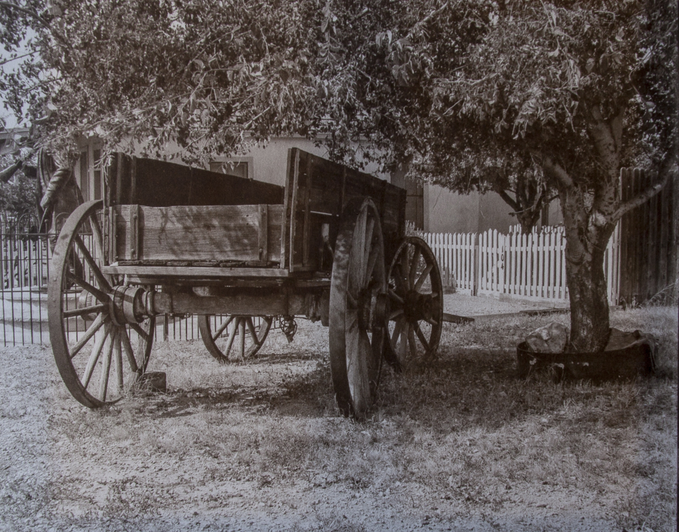
The obstacle to overcome in this print image is the window area, which is about three to four full stops beyond the foreground, in any photographic medium that a good amount to deal with in printing. There were two avenues open to me to bridge the two areas for further printing. The first one was a second layer of lamp black just in the now nearly blank white area where the window area is. One drawback to that direction is perfectly laying on the gum without crossing any of the visible areas of the image, which would then create a black line after printing.

I chose the second avenue that arrived just moments after running through the original idea. This method was simply to fully coat the image with the next color up, then print the entire image down to accommodate the higher density range, leaving that color as the base color, and of course all the densities below it. I mixed magenta just thick enough for a near opaque color layer and left a nice thin even coat over the image, then printed the window area as zone 7, enough time for 2-3 minutes of floating to leave the window area at zone 7, or just breaking thereof.

What that leaves is a full scale print, from zone 1 black to zone 7 white, on the white window frame, when finished. I am also being careful not to print down the spectral density, or the glow of the light in the room. That light floats between zone 7 & zone 6. Knowing your print times of any given negative image is oh so important. No different than not knowing the developing time of your negatives. Makes a big difference, in time and temperature. Those rules apply here and overlay the gum printing process pretty much exactly. When one tonal zone is done, any tonal zone before it has become permanent, and can't be altered with normal treatment afterwards. With negatives, once zone 5, or middle gray has been developed, zones 1-4 are permanent and no amount of time in the developer can change it. In gum printing, once a tonal area has been hardened by the UV light, no amount of floating will change that, or remove any more of the gum without physical manipulation, life a stiff brush or other removal tool. Once the gum has hardened, it's impervious to moisture and will last as long as the paper holding it, which has been judged to be 1000 years.

One of the reasons I am firmly against academic classes for classical printing such as gum, is that those teaching said class simply do not understand the process and certainly have never employed it. I see instructions for gum printing with print times assigned to a color, or floating a print for hours, or washing the gum print afterwards. Things one can only shake their head at and wonder what the students take away with such nonsense.

This is the second coat of gum; magenta. I use the flexible one ounce pill dispenser cups to mix the pigment into the gum, just enough color to still be able to see light through the color after mixing. This also is important. When layering the gum, to be able to see through all the colors to the base layer, adding up to the fuller image, each layer must be shear enough to be able to see through. Actually, this one is common sense. If you have ever seen or done Decoupage, you will understand the depth an image gets with increased layers of clear coat, in this case, shear layers of color stacked to make an image. A photographic watercolor.

At this point in the image, the basic texture of the wood paneling of the scene is just beginning to show up, as are the shadows. The window, and outside area is now within the tonal range of the foreground. Each subsequent layer will now be printed to that window frame, which makes up zone 7, or white with full texture. That's the goal of this printing. Now, each layer will require sufficient pigment to add further depth and texture to the image, without blocking what's already there. If I don't screw this one up it will likely be my best gum yet. I would estimate this image will need close to ten print layers to complete, bringing all the values into their correct relation to the larger image. The material in the lower foreground  is brick and wood, as is the wall on the right side, all good for textural quality. That's the task.

Gum Dichromate Print
"Jars in the Window"   ~
Second coating; #1 watercolor lamp black ~ #2 magenta

Friday, December 1, 2017

New Gum Print Beginning

Along with the testing for platinum/palladium printing I just began, I also have two newly prepared sheets of paper for gum printing. It has been since June when I finished the last gum print, The Swing. I did begin this same print a few months ago, trying out a different sizing routine. I have often wondered if there was a real difference between two coats of 2 1/2% gelatin sizing and one coat of 5% gelatin sizing. Yes, there is. And I don't like it. Didn't like it thirty years ago either.

With fresh printing sheets on hand I got the negative & paper in registration and applied the first coat, using watercolor lamp black. The negative is slightly thinner than I prefer, as the print time is under 10 minutes. With a float time around 2-3 minutes a six minute print time holds to zone 7. That just means more care taken for each layer to get the color up to the textural zone I want to hold, after floating. At this time, theoretically, the print time is round 30-45 seconds per tonal range. Give or take on the float time, and water temperature.

The first coat came out well, floated for over five minutes to bring down the black to where it belonged. The print is titled "Jars in the Window", with two ball jars in a nook near a window, which is open, and the densities outside that window are very much higher than inside. Most of the image of the outside of that window floated off, being the high densities in that area. To connect the two areas I will apply a second coat of lamp black, only to that window area of high density. I will then print that down and float the image only to a textural range of zone 6 & 7, or just slightly below. Then, the two areas will be in normal printing range of each other and the colors will then be added layer at a time, and printed to the tonal range chosen for that color.

When the print dries down I will take a snap and post it for a sample of what that print image might look like. I might even show each print layer as it is applied for further example of how a gum print goes together, layer at a time. What you end up with is a photographic watercolor. Stay tuned.

Thursday, November 30, 2017

New Printing Cycle

As I mentioned earlier, I am coming to an end to the printing cycle in silver, for now. With the completed Tombstone Portfolio, palladium toned and what I have of Portfolio II, which consists now of eight prints, developed in sodium acetate for the rich black and white base image, gold toned for deeper blacks. The aforementioned printing was practice for what's to come, printing in platinum/palladium using the double sodium Na2 method. This will be pretty much the standard for my printing now, with exception to the gum printing, which is part two of this post.

Today was a testing day for platinum/palladium, using test strips to begin. Much was learned from today's tests. The first thing I came to learn is that palladium is slower than silver when printing. The palladium can easily handle the density scale that silver can, it just takes twice as much light or double the print time, plus a skosh. The negatives I used for printing the Kallitypes were very consistent 10 minute prints. Same negative printed in palladium, using the 2.5% Pt solution (4 drops) printed for twenty minutes, leaving the zone 7-8 whites still almost blank white. That was the fourth test strip, and comparing each one, beginning with 9 minutes, then 12 minutes, then 15 minutes before the final 20 minute final time, shows another 3-5 minutes is needed to bring everything into textural range.

The first course of action was to reprint the digital negative, leaving off the <Curve> function I added. That returns the tonal range back to a standard density range, tweaked a bit to separate the tones a bit better, in Lightroom. I made the black and white image look like how I want it to look when it's in final form. For silver, I add the <Curve> function I made. The test print for this negative printed in at 10 minutes, for my taste, a bit too printed in, dulling the zone 7 area. I could simply print less time, but the rule of blacks still follows, that more time equals deeper blacks, with caveats of course. Overall, the image appears dull and flat. Not my type of print. There are two courses to take at this time; alter the <Curve> function to better conform to the palladium, about half the density as for Silver. Or, increase the platinum solution to 5% or even 10% for increased contrast.

Being I am more into finding the correct density range on the contrast index curve than throw more concentrated platinum at the problem. That can still be added later for tuning things ever further. What I want out of the print is a full scaled image with deep blacks and crisp whites, with good gray scale in between. Just takes a bit of testing. First off I will redo negative bringing down the density nodes to about half what they are now, and that, theoretically, will bring the print time somewhere in between the 10 minute and 20 minute print time. A 12 to 15 minute print time would be fine.

There is a third option, which is print the negative in direct sunlight, but that would likely necessitate adding even more density, or spectral density to the negative image to be able to keep the print time above a minute or two. For me, a direct sunlight print time would be between 5-8 minutes. But that's just me, for the image I am after. I don't like dull flat print images. Soon I should have a finished image to show. I'm getting close.

Tuesday, November 28, 2017

Final Print ~ Tombstone Portfolio

The first print made after the fuller completion of the darkroom recently. The new portfolio case cabinet is doing its job quite nicely, and the new 12"x24" light box is working as designed, with the final touch of framed prints hanging on the walls over the newly installed shelf, creates a very nice aesthetic ambiance. And that, made today's print session so enjoyable, enough so to have excited me sufficiently to flip the negative over when placing over the sensitized paper. So, I have a mirrored print image to the final print I made following. I have one last spot in the darkroom that could handle a 16x20 frame on the wall to show an artist's proof of the image. A reminder to paying attention.

The print itself is the good news, being a 10 minute print. The prepping method I use for the digital negatives is finally paying off, with predictable print times and full scaled outcomes for the image. This will be the final silver print to palladium I will make for awhile. The Tombstone Portfolio is made up of palladium toned Kallitypes, which is what is listed on the certificate of authenticity that goes with each print. Technically they are palladium prints now.

One of the characteristics of the palladium toning is the increased clarity of the image after toning, as well as a shift in the tonal color to a bit cooler tone. This print was also made in cooler, dryer weather than the earlier prints made this summer. Temperature and humidity does have some affect on the final image. As far as materials, this print is the same as all the others in this portfolio;
Paper; Revere Platinum
Developer; Sodium Citrate
Toned; Palladium

Palladium toned Kallitype
"The Town Dandy"
Tombstone, Arizona

Wednesday, November 8, 2017

Printing Time ~ Writing Time

The slack in the momentum of printing new images has to do with focusing the available energy onto the other side of my retirement; writing. It is also no secret that I have nine books in print at this time. The last book completed was The Alchemist's Guide; to black & white film and photo chemistry. It is that book and a most propitious chance meetup with another local photographer who happened to have a large darkroom facility that he offered to pretty much anyone wanting to use it. Free. The one thing that led to another part of the story isn't needed to know all turned out well. I began writing about something I know and love, which led to a custom darkroom, and platinum/palladium printing. Almost makes you want to believe in Leprechauns.

On that topic of darkrooms, I have not fully completed that project, and that is one more reason for being away from the printing routine. I am building a cabinet for storing presentation cases that will fit under the counter top work space. The final piece will be an 12"x18" light box, able to compare two 8x10 negatives in their acetate size of 8 1/2"x11". It will also have a 40 degree forward slant, and that will enable me to also use it to copy negatives with my digital camera and 70mm-300mm macro lens. Then the darkroom will be complete and the work flow ability will be enhanced, as will storage area, now taken up with presentation cases, soon to be tucked away yet easily reached.

On that other side, the writing, is currently working out the second book of the soon to be the Alchemist's Guide; series. The original book being the one noted above, the book I am currently working on is The Salt Paper printing process. It is the first hand coated printing process I worked with, over thirty years ago. I found it to be very rewarding as a printing process, especially with it being a printing out process, as well as the very long tonal scale. When I began hand coating there was little information on the subject, outside libraries with old books on the subject. I still have a number of books I found in book stores, from the thirties and forties that gave me the foundation to my knowledge of black and white film photography. They were actually invaluable for that task.

As I have learned from the years of getting the books into publication, using a POD platform, that from the reader's point of view, technical and instructional books should be 150 pages, give or take. And I believe for good reason. It's long enough to cover a specific topic fully and in depth without becoming a text book. The secondary reason is cost, as the alternative to this are the current "Bibles" on photographic subjects, from lighting to wildlife shooting, or the bibles on alternative processes that cover every single possible iteration of how to get a dark color on paper using chemicals and light. Systems you never even heard of, and for that, they deserve credit, as that isn't an easy task. For those individuals that have come to stumble onto photography and found it a bit addictive, and want to learn what you can and try stuff out, the bibles are the ticket. A bit spending relatively speaking yet worth the money just for the information they contain.

For the photographer that wants to learn a specific process, a walk through step by step method, including formulas, the short version becomes far more useful, and cheaper. Books to come will include The Kallitype & Van Dyke processes (identical, using different developers), Platinum/Palladium (Na2) printing and finally Gum Dichromate Printing. One of the things I learned when I started out was that being a competent writer or a competent photographer was good, but being able to be a photographer & writer was way better and made more money. The books will be works in progress for many months to come, as will the printing. What will change will be my focus on printing in Pt/Pd and gum exclusively, as well as scale up at some point to make 11x14 prints. Now that's something that excites my senses.

Saturday, October 28, 2017

"Wyatt Earp's Wagon" ~ Palladium toned Kallitype

For those who have followed this blog for any time know first hand I have been working steadily to find the optimal, and consistently applied density range for making a Kallitype print. Technically, using the UV printer, this same density range should also play well with a platinum/palladium print (Na2) procedure. That will be focused on in the near future. For now I finish the Kallitype portfolio work. Those images will be number 1 of an edition of 5, for all metallic print images; silver, platinum/palladium.

One thing I do not want to do is get into a habit of 'standard' print images, every one the same. That only works for me if that tonal range benefits the image. Some images aren't meant to be exactly the same tonal range as another, and it is obvious. Considering the images in the Tombstone Portfolio, they center around activity on Main Street during the day with the sun out, which happens to be the reality of things in real life. So, for me, having the same tonal range over the majority of those prints isn't out of the ordinary. It's usually always a sunny day in Arizona. It would be my guess one wouldn't see cowboys hanging out on the street when it's raining, these days.

The other portfolios of prints aren't nearly as standard. There is far more variation in tonal ranges within those bodies of work. Each shot was a different place different time and under different conditions, making them more unique in the lighting conditions, and hence print images respectively. Having said all that, with this portfolio I have arrived at a preparatory process that defines each image to its best effect, then reverse it to a negative and apply a <curve> function I created for Kallitypes. That is giving me a ten minute print time, which, as I have written on many times, is the sweet spot, for me. Twelve minutes would also be good. Under ten minutes not as good. It has to do with arriving at dMax during the print time.

I'm using the same digital preparations for the negative as the previous print images. Also the same paper, developer and toner; palladium. Being my eyesight is basically crap, for seeing finer details and any color within the red/green spectrum, I tone my prints close to ten minutes to ensure the toner is reaching the blacks, as most toners I use are 'top down' toners. That is the toning begins at the highlights and works down to the blacks, from five to ten minutes, usually. I have no doubt I miss much of the subtle shifts in tonal color over that toning time. I just make sure it's toned to the fullest.

Palladium toned Kallitype
"Wyatt Earp's Wagon" ~ 8x10 ~ 1/5
Tombstone, Arizona

Friday, October 27, 2017

Second Kallitype ~ Different Printing/Toning

The palladium toned Kallitype print posted yesterday was what I had originally intended on doing. That isn't what I actually did when printing. When you print enough Kallitypes, reading the image before development gets easier to predict correct print times, depending on the image, and the desired outcome. This doesn't mean one can't coat a print paper, then cut it into 2" strips to use as test strips is as always, a good thing, saving precious metals. Having said that, I decided to push the envelope a bit today, printing in more of the visible part of the image before development. The resultant image wasn't exactly what I had wanted, yet not unusable.

The two extra minutes darkened the image perhaps a third stop over what I wanted, which is just about the bleach back effect of thiosulfate on the print image if immersed after clearing, before toning. That bleach back brought the image back to where I had intended, at which point I then toned the print in gold toner, to intensify the shadows and add to the tonal separation. It worked quite well, leaving one difference between the two prints. This print was much warmer than its twin. Printing the image down will do this, being more affected by the citrate developer, which warms the image to begin with. If I had used the sodium acetate developer that shift would have been neutral to cool toned and the blacks would have blocked up the middle tones much more than the citrate solution.

This print is identical to the first palladium toned image, with the exception to the print time;
Print time; 12 minutes
Paper; Revere Platinum
Developed in sodium citrate
Toned in gold toner

Gold toned Kallitype
"Three Cowboys in Town" ~ 8x10 ~ 2/5
Tombstone, Arizona

Thursday, October 26, 2017

New Prints ~ Tombstone Portfolio

The recent interruptions to the printing work weren't all distractions from the cause. Showing off Arizona for Chicagoan guests offers up a plethora of desirable destinations. Turns out, one of those destinations was Tombstone. An old photographic haunt over the years, different times different days, each time there with different characters doing different things, and that adds up to a lengthening portfolio. If I am presented with a tasty shot, especially devoid of the normal heavy tourist presence, like cars and other intrusions to an historical western scene, I will definitely accept it as yet another photographic gift. This trip was one such photo opportunity.

Shooting events, in the street shooting tradition, has everything to do with 'seeing' the event before it takes place. Usually counted in seconds, it becomes clear at some point if the subjects are going to form a photographic event, and if the shooter has chosen position and background well, when that golden moment arrives, clicking the shutter merely finalizes what was previsualized. Something a photographer rarely becomes fatigued or bored doing. I do miss the street shooting, which is why I have lately returned to this slice of photography. I was able to capture five more images of the Tombstone scene of the late 1870's, when Wyatt Earp roamed the streets.

This image was one of the shots that formed without me seeing it beforehand. I heard heavy booted footsteps behind me, on the wooden sidewalk. The sound was closing in very swiftly as they were soon to overtake me. I had my 20D in hand, set on aperture priority (just for such events) setting; f.8 (ISO 100). I simply turned and found the image anchor, the bottom right corner of the frame, then squeezed off a shot, hoping the auto focus was quick enough in the low light. All of which took under three seconds. Ten paces further on the sidewalk was my second gimme shot, walked right past me, coming from the street, onto the wooden walkway. Those images to come as I print them.

The testing for correct density range of a digital negative, to match the preferred tonal range of a Kallitype print is no longer needed, and I now work with one image at a time, printing the negative then making the print. When I have a master print in hand and all the notes to how I did that, I move on to the next image. This print negative was prepared in Lightroom, then finished in Paintshop Pro, to reverse the image to a negative, then apply a <curve> I created for Kallitype images. This curve should also work decently with a platinum/palladium print, for the most part. If needed, I can certainly kick up the densities easily enough. A second Kallitype print was also made. That's next.

This Kallitype was printed for 10 minutes;
Paper; Revere Platinum (open side)
Developed in sodium citrate
Toned in Palladium toner

Palladium toned Kallitype
"Three Cowboys in Town" ~ 8x10 ~ 1/5
Tombstone, Arizona


Sunday, October 22, 2017

New Images ~ New Print to be

The time to return to the print room is soon in coming. Life just doesn't seem to care I have things I would rather be doing, like making new prints. It's just in your face, demanding time, now. I have new images to print, with two such images posted thus far. There are more destined to become platinum/palladium prints. For now, I can only show the images in the digital state they are at this time.

"Barrio Window"

Saturday, October 21, 2017

Limited Editions vs Open Editions ~ Thoughts

I have been perusing galleries these past weeks, talking to gallery owners and photographers, sort of feeling the pulse of the exhibition scene, and expectations therein.

While visiting these galleries and black and white photography studios, the interactions with gallery owners and black and white photographers on the subject of limited editions, versus open editions, has shown me there is much disinformation bantered about, and little use of said editions in this state. Every photographer has their own perspective of what constitutes photographic art, visually, technically and presentationally. That is the three legs of the issue for gallery sales that directly affect said sales. If a print image is printed well it tends to grab the attention of the viewer, and if the print is within the price comfort zone of that buyer, the likelihood of a sale increases, a lot. If that photographic print is rare in printing medium, like hand coated prints, and, in a low edition (5), the rarity of the print and its finite nature increases the likelihood of the sale increases once again.

The argument against limited edition, coming from a photographer, was that doing so was flagrantly egoistic thinking you were going to sell a hundred or more prints by having an edition of say 1/100. Precisely the argument for limited editions. The vast majority of black and white photographers who actually have prints to show, and make sales, will ever sell more than a small number of any given print image. How many buyers of art, interested in b&w photography, would be willing to spend $500 or more for a print from an unknown photographer if there were going to be any number of copies to come, in perpetuity? For photographers, this is a touchy subject that tends to bring out lots of energy by just bringing up the topic. I don't mind making it clear that selling photographic prints in open editions is photography, but it doesn't constitute "art". Art, is collectable, holding it's value over time and generally always increasing in value over time. Speaking for myself, digital prints in open editions is but making posters that people will buy if cheap enough, if they like the image and it matches their couch or living room decor. I just don't find that clientele a desirable one.

Realizing much of my personal opinion comes off as condescending and snooty or elitist. I will say here, I don't care. I've done this for thirty years, owned a gallery representing black and white photographers, and dealt with buyers and collectors. If I could pass anything along to younger photographers who fancy themselves visual artists. Be artists. Create something unique, and rare, with your signature flare. And don't be silly enough to believe that limited editions hold you back. Simple math takes care of that. Come up with a number representing all the images you have that could be made into a print worthy of making it into a print. Then multiply that number times an edition of say 10. If you are a serious photographer and aren't just beginning, you likely have hundreds of images. If you shoot digitally that number jumps to thousands of images. If you have 100 images in editions of 10, that constitutes 1000 prints. How long do you suppose it would take to print that 1000 prints, even if you were filling orders.

Just my thoughts and take on the issue. Google Los Angeles black and white galleries, and from the lengthy list available, along with their focus and exhibitions, you will come to know that in California, if the word Art is attached to a visual image, it necessitates a Certificate of Authenticity. If you sell photographic images of any stripe, under an Easy Up tent at street fairs and art markets, much of this doesn't even make sense. Photographs are being sold and the only condition is if the viewer likes what they see. If you are looking to hang in fine art galleries with a clientele price stream that accommodates collectable prints, the rules and expectations are higher. There is no good or bad or right or wrong approach to this. It simply comes down to the clientele you are after.

Friday, October 20, 2017

New Images ~ New Prints

Carrying the 20D around over the past week of a family visit bore fruit with new images to be made into platinum/palladium prints. Before I make those prints, however, I will fill out the current portfolio of gold toned Kallitypes using some of the new images. These prints will comprise print number 1 of an edition of 5. These prints will then be offered for a very favorable price to the buyer, stimulating sales, thereby opening up for print number 2/5, and that print will be a platinum/palladium print, making said print more desirable for sale. What I believe to be the collectable avenue of photographic art.  Something I expound upon in tomorrow's article.

One of the stopovers of this past week was Tombstone, during a week day, which turned out rich in subject material and very little interference with tourist presence. That gave me almost straight up images ready for printing without need for any clone brush work to remove infractions to a period image. This type of shooting is also a bit invigorating from the normal scenic or study. Street shooting, with the focus on the certain people. In Tombstone, those people are dressed in period attire, acting out for the cameras and viewers behind them western themed actions and events, like the shootout at OK Corral.

The sample shot below was a momentary event, quick and instinctive. I heard the booted steps behind me on the wooden walkway, and I had the 20D set on aperture priority at f.8, ISO 100, auto focus, using a 28mm-135mm lens. From realizing the sound of the footsteps behind me, through quickly turning and looking for the bottom right corner anchor point, to clicking the shutter took place within three seconds. I wasn't sure I had got what I had hoped for. Turns out I did, and with a bit of tweaking in Lightroom balanced the tonal range more appreciably. The remaining distraction to the image is the girl and partial man behind the cowboy on the right, as well as the SUV passing across the street in the background.  Removable artifacts using the clone brush.

For the Kallitype print to come I will apply a softened version of the platinum/palladium <Curve> adjustment. Then on to a digital negative for printing. The hand coated print will of course add to the textural quality and depth of the print image. The platinum/palladium version will be the richest. After three weeks of interruptions it will be sweet to be back in the darkroom again.

To be Gold Toned Kallitype
"Three Cowboys in Town"
Tombstone, Arizona

Sunday, October 15, 2017

New Images ~ Platinum/Palladium printing

My apologies to those who have been visiting this page over the past couple weeks, seeing no new material or new prints. I've been driving over to Las Cruces to help out an old photography friend who had open heart surgery. Big deal at our age. That would be David Shaw, whom hung in my gallery in Eugene, Oregon thirty years ago. At the time he worked mostly with silver gelatin prints, however I still have his platinum print of "Penelope", a photo view of a classic MG, with men's straw hat hanging on the mirror.

I have been utilizing what time I have as best as one can while on the run from one place to another. The tool for this is my old trusty Canon 20D, shooting in the black & white mode. Even has color filters, like the 23A or No25 red filters, also the green, yellow and blue. That could actually make for a good article, covering the tonal shifts in b&w using color filters. Speaking for myself, I rarely use a color filter, and when I do it's usually always the red filter, for the deep tonal shift in the sky and whitening of existing clouds.

An image that made itself available while I was in Mesilla, New Mexico, walking around the downtown square. The buildings that make up most of that area were built well before I was born, and that says something. Old adobe buildings and home, with old weathered wood just all over the place. Just makes you proud to be a photographer. A sample of one such shot is of a store front just off the main square. What made this shot worthy, for me, was the lighting. Just happened to be there at the right time, as I've stood on that street many times before. This is a digital image. Soon, it will become a platinum/palladium image. The goal of course, is matching this image's tonal range.

"Store Front"
Mesilla, New Mexico

Thursday, September 28, 2017

Printing Day

Today turned out to be a printing day. Just decided it was the thing to do. As I continue to work with the Kallitype print, I'm experimenting with the two developers I use, as well as the density range of the negative. Each shapes the final image quite a bit, and I have a previsualized image I am attempting to arrive at. The tests today fell a bit short of my expectations, with the density experiments teaching me a lot, yet not on the first try, so the prints are a bit lacking from what I want them to be.

This image has been in the pipeline for printing for quite a while. It was down the list a bit. My choice for printing this image was using the cold black developer, and that shifted the overall image color to more neutral grays, although to my eye the image remains a bit warm. I also fell short of the print time by about 2-3 minutes to bring zone 7 in better, separate from the other values.  When I print this again, it will be with the increased print time, as well as developed in sodium citrate instead of sodium acetate. The citrate developer is the warmed toned version. The print will then be toned in palladium, instead of the gold toner I used for this print. I just don't like the image color. For my eye it looks like a split toned imaged, trying to be a neutral cool and a warm print at the same time. It is also not fully printed in.

I continue to use Revere Platinum paper for my printing; coated on the rough or open side.
Developer; Sodium Citrate ~ Clearing Bath; EDTA
Print time; 12 minutes

Gold toned Kallitype
"Weight of Spring" Unfinished
"Eugene, Oregon"

Wednesday, September 27, 2017

Shooting Time ~ Printing Time

I have been in Las Cruces visiting an old photographer friend who is soon to have open heart surgery. At our age it becomes a big deal. I will be returning once again, for a few days after he returns home from the hospital stay. This being the case, in tandem with the snap of autumn in the air, finally, begins a very good period for capturing the Arizona scene. The next day out will be with the Burke & James 5x7 view camera. I have been wanting to capture many of the buildings and homes of the old Barrios of Tucson. The Barrios snake around the downtown area and appear again in South Tucson, a city of its own, and the flavor there comes in many flavors, from various regions of Mexico. Known locally as Little Mexico. For my friend in Las Cruces, Mesilla, N.M. is their traditional Mexican Puebla known to have hosted Poncho Villa and his riders.

Flavor is everything for every photographer, looking for something that really grabs your attention, the brain calculating density ranges and lighting conditions, what to leave out what to leave in.... the very best of setting up a shot with a view camera. All of the view camera photographers I know also shoot digital images, but they all keep attached to their view cameras and use them. I'm likely preaching to the choir.

I will also be digitizing negatives differently now. Due to incompatibilities between the otherwise awesome Plustek scanner, and the fact that there is no useful software to actually make it work on Windows 10, I will be shooting the negs on a light box using my Canon 20D. An entirely new experience. Embarrassingly enough it took way too long for the light to go off when I was working to find said scanner, which, by the way, came all the way from Australia. I'll be back soon, either with new negs to show, or perhaps I'll have time in between jobs to get more prints made. Thanks for taking the time to visit the page.

Friday, September 15, 2017

New Kallitype

I suppose the idea behind posting finished images on one's blog is to show the finished 'perfect' print. As most photographers know, certain images are similar to a new food treat, looks pretty good until you print it, or eat it, respectively. I had been wanting to print some of the images I have of wild mustangs of Arizona that I photographed during a motorcycle trip I was on with an old friend. We were returning to Arizona from the Four Corners area, and were nearing Safford, Arizona when we came across these wild horses with markings one links to Pintos or Mustangs. Horse aficionados will know right off.

I won't likely be adding this to any portfolio. Perhaps I may hang it in my house as something new, but not likely a portfolio. Simply put, I just don't find it inspiring. It's almost like a color image, what you might see if you were standing there. There needs to be something in the image that makes the whole thing speak to you. Something. For me, Nada. I'm posting it to simply demonstrate that not all images make it to the show, as it were. I have several other shots from that short encounter. Perhaps there might be one that does grab me, in a good way.

Gold toned Kallitype
"Two Wild Ponies" ~ 8x10
Eastern Arizona


Thursday, September 14, 2017

New Kallitype

Slowly I continue to add to the new portfolio, which, given time will evolve into two portfolios. Currently I am printing images captured in Arizona. I still have images from Oregon to print, some, not so much as recognizable scenic images, but more like the one I printed today. I have printed this image before, testing. The test part is behind me now, for the most part, and I have arrived at a standard curve function that fits very nicely into Kallitype and platinum/palladium printing. This is one of those new negatives for printing.

One of the realities of shooting in the Willamette Valley, and surrounding areas, was a persistent condition of "zone 7 skies", translated to being a totally gray sky, no indication of where the sun might be. A gray domed sky. Being that condition can last weeks, sometimes months, any young photographer with a format camera and film in hand isn't going to wait a long time. Photograph what you have available. This image represents probably a portfolio worth of images in the "Disuse" category, although they were some of my earliest photographs, and at this time, looking back, not my favorite images to spend time making into prints.

One of the great things about printing in silver, is the ability to mimic platinum, palladium and platinum/palladium images, by altering the developer and toner used. There are ways to mix that up to arrive at a desired print 'color' and tonal range leaving reciprocal blacks matching the more precious metals. This print was developed in sodium acetate to arrive at the overall cool black image, then toned it in gold to reinforce the blacks and keep the image a cool tone. Later, I will be posting another Kallitype image of "Paul & Jerry's" in Jerome, developed in sodium citrate, toned in palladium. That print mimics the same image I printed in palladium. This Disuse image mimics a platinum print, with exception to the steely cool middle tones of platinum, which aren't so easy to mimic. The overall look is similar, that is the point.

I am keeping the other variables of the prints the same, as in paper and other treatment issues. The print time for this image was 10 minutes, which, again, is for me the sweet spot for printing in silver. Enough time to reach dMax blacks, leaving crisp zone 7 whites. This print was also gold toned for ten minutes. This image was a late afternoon, last of the light shot.

Gold toned Kallitype
"Disuse #1" ~ 8x10 ~ 1/5
Eugene, Oregon


Friday, September 8, 2017

Second New Kallitype Print ~ Portfolio II

Yesterday was a good day for printing, coming away with two workable prints. This image was shot in one of the forest within the Willamette Valley, Oregon thirty years ago, using the same Century Graflex 6x9 as used for the children shots. Loved that camera. At the time, I was shooting a lot of scenic images of Oregon's forests and rivers. I came across this cabin with footbridge right in the middle of the forest. To be fair, hiking trails were nearby, as they usually are through those forest ranges. Hiking through an old growth Douglass Fur stand in a forest can be fairly impressive, especially when you are carrying camera equipment.

Because I was not what you might call a good note taker at the time I don't have a good way of knowing exactly where this scene was photographed, beyond it most likely being in said Willamette Valley. That period of time was a time of continuous experimentation with film developers and film settings. For whatever reason, back then, I highly valued lots of texture in the image, and to optimize that, I shifted the densities on the contrast index curve upwards, right up to the shoulder of the curve. That can be seen clearly in this image, being there are precious little shadow area in the image, when normally there would be lots and lots of shadowed areas. The intent was to hold as much of the textured area around zone 7 would reach that density range that looks like poured silver in the image. I didn't quite get that in this particular print, as it is slightly under printed. This print could use another three to four minutes print time, which would bring down what is now in the zone 8 region down to zone 7, and hence what is now zone 7 would be moved downward to zone 6. That would be the range I had intended in the final print. This was the test print for that final print. This image was also printed as a silver gelatin print at the time, 1983, and the image I use on the cover of the first photographic book on black and white film, and photo chemistry.

Gold toned Kallitype
"Footbridge in the Forest" ~ 8x10 ~ 1/5
Willamette Valley, Oregon

Thursday, September 7, 2017

New Kallitype Print ~ Portfolio II

Once again returning to the Kallitype portfolio printing after switching over to the portfolio of 5x7 platinum/palladium print portfolio, has been instructive. That means a jump from digital negatives to original film negatives with long density ranges, respectively. Now I am back to using digital negatives, and have found a good method of printing those negatives to a consistent density range that will give me an average print time of 10-12 minutes. That is the sweet spot for a Kallitype, for me.

This image is one I have wanted to print for over a year now. The original negative was a 6cmx9cm format, shot with a Century Graflex 6x9 that I did a lot of portraits of children. The old fashioned camera setup, with dark cloth seemed to fascinate them long enough to get off a couple shots before they became bored and began moving about. I have printed digital negatives for this image several times before, with the original intent on printing this image as a salt paper print, using the same process formula I always had; 13% silver solution to 2 1/2% salted paper. That combination demands a lot of density to acquire a decently scaled image. For whatever reason, whenever I made that print the image would solarize, mostly around the subject. No, I haven't a clue. I would make a wild guess that when I was expanding the density range in the software I moved the printable range of that density area out of printable bounds for an RGB image, thereby the solarization. Unless one of you readers has a  more brilliant observation, we'll go with that one.

This image printed very nicely at 10 minutes. Just as I had hoped. I used the sodium acetate developer to keep the image a cool black, then gold toned the print to ensure the cool rich blacks. As all my other images, I use the same Revere Platinum paper, usually always the rougher, open side. I tend to like the textural quality of the image on that side.
This visual area for this print works better a bit smaller than I normally post. Works better when the entire image can be seen.

Gold toned Kallitype
"Adley on the Stump" ~ 8x10 ~ 1/5
Eugene, Oregon

Thursday, August 31, 2017

Portfolio II (Arizona Portfolioi) ~ Gold toned Kallitype

The basic Oregon Portfolio has been printed, with the final image shown with its diptych mate in the last post; "Sailboat on  Canal". The print today is a gold toned Kallitype, continuing on with the Kallitype portfolio of 8x10 prints, mostly of Arizona. I find it pretty interesting to be printing in silver again. in a mirror process to the platinum/palladium process. The only difference being the dilution of the ferric oxalate solution; 27% for Pt/Pd and 20% for silver. As a side to this, I will mention, again, that the ferric ammonium oxalate works fine with Pt/Pd, making it a printing out process, whereas using ferric ammonium oxalate with silver in the Kallitype process does not work so well, if, gold toning is desired. I have yet to try other toners, but am not all that enamored with the process enough to wade deep into chemical testing to find out. I am fine with the standard Kallitype processing.

The print I'm posting here is a Kallitype made from a digital negative I printed some time ago to try out making a Pt/Pd print of it, printed in the UV printer. First test came out about half printed in, looking to me to be far more advanced, with the "stage whisper" image before developing. I'll know better next time. I am still looking closely at the differences between a silver image, Kallitype or salted silver, next to palladium and platinum/palladium to try and differentiate between the middle tone differences, as in how the middle tones are represented in gray tones. I would not be the best person to do this with my color deficiencies, but I can see the basic differences. The silver tends to be more neutral in gray tones, whereas the influence of platinum adds a lighter more 'steely' gray. Palladium is just a warmer toned image.

What the printer can take away from this is that silver can emulate palladium~platinum/palladium, by the process used and the toner used thereafter. Developing a Kallitype image in sodium citrate warms the print, emulating a palladium image. Developing with sodium acetate leaves a very 'black & white' image emulating a platinum in color, especially when gold toned. Developing a Kallitype in sodium acetate then toning in palladium toner leaves a warm toned image with deep dMax blacks, much like what you might see in a platinum/palladium. Knowing these differences allows the printer a range of options for final print color, and generally how the print looks overall.

This print was made from a digital negative, developed in sodium acetate (black developer) then toned in a gold/citric acid toner for the deepening of the blacks and crispness in the whites. Personally, I think the image would look even better when it has been printed in Pt/Pd. But that's just me.

Gold toned Kallitype
"Desert Blooms" ~ 8x10 ~ 1/5
Cochise Strong Hold, Arizona

Monday, August 28, 2017

Final Print in "Oregon Portfolio"

Once I began making palladium prints, it was a rebirth of printing spirits for me. Adding to that the recent discovery of the Na2 process using platinum, I really have little interesting in printing in any other medium, save gum. Anyone having visited this blog know first hand my feeling for platinum/palladium printing being the grail of hand coated printmaking. I announce it here that I will complete the Gold toned Kallitype print portfolio I had begun, before the palladium periood.

This image is the final addition to the Oregon Portfolio of 5x7 platinum/palladium prints. These negatives were all shot thirty years using my Burke & James 5x7 flatbed view camera. The one I use today, well, actually next week. This image is the second shot taken of a gimme shot. The first image I have posted before. This second image continues the theme of the sailboat on the canal. The first image I have is of the canal itself, without any sailboat. The point of this shot was testing a new developer; (Windish) pyro/OH. This was the first image using this new formula. I took the shot to test how well the foreground would show up when shooting directly into the sun, seen on the horizon, to the right of the sailboat. Just as I clicked the shutter on that image I hear the putt putt of the sailboat's motor, as it came out of the refuge area and turned into the canal.

This is the second shot I got off having quickly replaced the dark slide on the first shot, flipping over the cut film holder, pulling out the dark slide and resetting the lens, I got off this shot before it sailed out of sight. I have only shown this/these two images together, as a diptych, as together they make up an image greater than either of them would alone.

Film; Kodak Super XX (250/125)
Developed; Pyro/OH 12 minutes
Paper; Revere Platinum (smooth side)
Printed; Palladium ~ Direct Sun ~ 3 minutes
Developer; Ammonium Citrate
(First image ~ same film/treatment

"Sailboat on Canal" ~ Two Images ~ As a Diptych


Thursday, August 24, 2017

Platinum/Palladium Print ~ Portfolio nearly complete

This image, along with a second image to "Sailboat on Canal" will complete this portfolio of 5x7 platinum/palladium prints. Most of these images are scenics from Oregon. The next portfolio will be focused mostly on images of Arizona, beginning the the newest images shot at Cochise Strong Hold in southwestern Arizona. That portfolio will be made up of 8x10 platinum/palladium prints.

The images from this time frame of shooting with the Burke & James 5x7 view camera make up a period whereupon I preferred the densities shifted upwards towards the shoulder. This increased detail in the image, mostly in the lower tonal ranges where they might normally be lost in deeper shades of gray, or black. I also used a fully compensating developer; a rejiggered formula of the Windish Pyro formula, using sodium hydroxide as the accelerator. This is the saving grace to the images, keeping the upper tonal ranges zone 6-8 separated from the lower ranges. Looking back, I would alter that formula, sliding the image back down the contrast index curve about one stop, which would return the shadow areas and deepen the blacks. Interpretation of an image, through development is everything.

This image negative is pretty much the same as the earlier samples; this print is unlikely to make it into the final portfolio, as it is an uninspiring for me. Not worthy a Pt/Pd print.

The Negative: Kodak Super XX (250/125)
Negative Developer; Pyro/hydroxide 16 minutes (Windish Pyro) reformulated
Paper; Revere Platinum
Print Developer; Ammonium Citrate (Bostick & Sullivan) pre-mix
Coating solution; (5x7) Palladium 12 drops ~ Ferric Oxalate (Part 1) 11 drops,
                               platinum (sodium chloroplatinate) @ 2.5% (solution) 2 drops.

"Willamette River Afternoon #2" ~ 5x7 ~ 2/5
Eugene, Oregon


Wednesday, August 23, 2017

Platinum/Palladium Print

A second platinum/palladium print finished today. This one had a correct print time. Another image out of the Oregon scenics. This one was shot at Fern Ridge Reservoir, just before sunset. Oregon isn't known for their big sky fluffy clouds type of place for much of the year. There is a lot of zone 7 skies, of overall gray skies without any way to know where the sun is at any given time. This was one  of those days.

The differences that can be seen between the salted silver version and the platinum/palladium print version of this image is the steely gray of the foliage in this image, compared to the silver image. There is a distinct color of each of these prints. Personally speaking, I prefer the platinum grays to the silver grays.

This negative was much like the last ones;

Negative; Kodak Super XX (250/125) Developed; Pyro/OH (Reformulated Windish) 15 minutes
Platinum/Palladium mix; Pt 2.5% solution (2 drops) ~ Palladium 12 drops ~ Ferric Oxalate 11 drops
Print time 9 minutes ~ Full sun
Paper; Revere Platinum 140# ~ Developer; Ammonium Citrate

"The Train Trestle" ~ 5x7 ~ 2/5
Eugene, Oregon

Tuesday, August 22, 2017

New Platinum/Palladium prints

The printing work on the new portfolio continues with two added images from that 5x7 series. These are the same images I printed thirty years ago, in the salt paper process. The close resemblance between those original silver images and the ones I'm printing today in platinum/palladium is fairly amazing to me. I see the Pt/Pd images a bit richer, deeper blacks and a bit better tonal separation over the silver prints.

These negatives are also don't have the density range of the earlier negatives I've been printing. Those negatives demand a twenty minute print time in full sun, using the 2 drops of 2.5% platinum solution to the palladium mix. The images I'm printing now I'm using 10% platinum solution to boost contrast. The print times are then half of the 20 minute time of the denser negatives.

This print is one I want to get exactly right. This test run was just a bit short of that. This was a twenty  minute print time, using the 2.5% platinum solution added to the palladium mixture; this image will likely need a 23-24 minute print time, full sun.

Negative; Kodak Super XX (250/125) Developed; Pyro/OH (Reformulated Windish) 18 minutes
Platinum/Palladium mix; Pt 2.5% solution (2 drops) ~ Palladium 12 drops ~ Ferric Oxalate 11 drops
Print time 20 minutes ~ Full sun
Paper; Revere Platinum 140# ~ Developer; Ammonium Citrate

"Overlook Cougar Reservoir" Unfinished Print

Sunday, August 20, 2017

Oregon Scenic ~ Platinum/Palladium Print

Another Oregon scenic I was able to capture during a late afternoon photographic outing with the 5x7 was at a watering hole that was very popular with Oregonians was Cougar Reservoir, which also hosted the Cougar Hot Springs, and that was nothing short of deeply awesome. Those were geothermal hot springs, so no odors, just lots of hot water moving from one pool to the next in an ever increasingly cooler movement from one pool to the next. If you were hearty, you sat in the first pool, just below the small cave from whence the water flowed.

There is a condition in the Willamette Valley of Oregon referred by photographers as "zone 7 skies", another way of saying there is no visible point of where the sun might be, with the entire sky being an overall light gray, like a dome over the earth, sort of illuminated but no discernible location of the sun. That can lasts for weeks. For photographers who demand fluffy clouds in the sky to make the scene, it would be painful. I didn't let that stop my shooting. Irritating as that was at the time. Same negative treatment and same printing formula, with exception to print times.

The Negative: Kodak Super XX (250)
Negative Developer; Pyro/hydroxide 15 minutes (Windish Pyro) reformulated
Paper; Revere Platinum
Print Developer; Ammonium Citrate (Bostick & Sullivan) pre-mix
Coating solution; (5x7) Palladium 12 drops (B&S pre-mix) ~ Ferric Oxalate (Part 1) 11 drops, platinum (sodium chloroplatinate) @ 2.5% (solution) 2 drops.

Platinum/Palladium Print
"Cougar Reservoir" ~ 5x7 ~ 2/5
Willamette National Forest, Oregon