I have been remiss in new postings of late, I know. Life stuff, which includes a most excellent trip to Ruidoso, New Mexico to visit a friend for a few days. Beyond personal egoic experiences, I am at a printing cycle juncture. I will be splitting my printing efforts into two directions. One being a continuation of the gum over palladium printing as before, but with an added avenue making palladium, and platinum/palladium prints via printing them directly, not the poor man's palladium, toning the silver (Kallitype) print with palladium, thereby replacing all the silver salts with palladium salts. That makes it a true palladium print, in look and in archival longevity, no different than a printed palladium.
What is different is the scaling of the negative specifically for palladium printing, as well as adding the (double sodium) Na2 ~ sodium chloroplatinate platinum version, not the traditional potassium chloroplatinite. The two versions are platinum, and when added to palladium, as most platinum printers do, two different effects take place. The potassium based platinum doesn't alter the tonal range, as in contrast, to the print image. That platinum adds deeper blacks to the palladium. For any contrast control, if the negatives lack's a sufficient density range. For that function a second binder mixture is used, in conjunction with, or replacing the standard binder mixture; ferric oxalate (27%) solution. The contrast agent is the second mixture of ferric oxalate, adding a small amount of potassium chlorate, creating a chelated version of the binder. Adding more of this increases contrast.
The drawback to that is that with the added chelated oxalate increases articulation of the image, a sort of 'grain' that begins to show up when the oxalate binder is mostly the chelated form. And that, is why the Na2 method is so effective. In my mind, brilliant. This form of printing was created by Richard Sullivan of Bostick & Sullivan, and Dick Arentz, a platinum/palladium printer. I see this printing form more of an addition to palladium printing, than anything like traditional Pt/Pd printing. The switch to the sodium based platinum, hence 'double sodium' format, the platinum becomes a contrast increasing agent. This is accomplished by degrees of platinum solution used, from the pure form of 20%, which would be for basically dead flat negatives, to 2.5% solution; 2.5%, 5%, 10%, etc.
When making a palladium print, there is a condition called 'bronzing', which is where the light affects the darker areas of the print, zone 1 & 2, causing a buildup to this density which appears as a sort of solarization on the darker regions. This is not a given, and can be brought about by a number of issues, some with print preparations, as well as an overprinted image, which implicates the tonal range being insufficient to handle the UV light source. The good news is that the sodium based platinum, when added to the palladium, stops this bronzing effect, effectively making those areas a deepened, richer black. The second benefit is the platinum also being the contrast control agent, there isn't any articulation, no grain, just a clean, potentially long scaled print image.
This will be the subject of the next book; Alchemist's Guide; To Palladium Printing. I will also be including a full section on this Na2 Pt/Pd printing method, which, for my way of thinking is an extension of palladium printing, not traditional platinum/palladium printing, using the potassium based platinum. This will be that second avenue I brought up earlier, printing a portfolio of palladium prints, including some new Na2 Pt/Pd prints. I have already printed one portfolio of these Pt/Pd prints, using 5x7 negatives I had from thirty years ago. I still use the Burke & James camera that made those negatives. They were developed to be printed in the sun, developed in pyro/OH, a Windish Pyro formula I rejiggered for my use, 18 minutes worth.
These negatives printed in direct sunlight (facing the sun) for 10 minutes. These negatives were mostly of Log 1.8 density range, those that were of shorter range printed between 5-7 minutes. Today I print using my custom UV printer, which is of much decreased power than any sunlight. Today I also use printed digital negatives for my contact printing. New prints are being prepared for printing. Soon, I will have something to show. Stay tuned.
Wednesday, August 29, 2018

Saturday, July 28, 2018
"Discovery" ~ Gum over Palladium
This gum over palladium print nearly completes the portfolio on people that I intend to print. There will be ten prints in that portfolio. The second portfolio has of course already begun with the two prints I've posted in the past weeks. I have caught an error in some of my postings that is regrettable. When listing the conditions of a print, in the form of developer used, paper and the like, it is important to get things right. I believe in some of the posts on gum over palladium prints I listed the paper as Revere Platinum. If I did that it should have been Hahnemühle Paper. All my gum over printing is done on Hahnemühle paper.
I didn't photograph each layer of this gum simply because I have been doing so for a number of gum over print images to demonstrate "technique", over "process". Process is the framework for how things work, technique is how all the variables of that process can be manipulated to end up with a print image that was pre-visualized and intended throughout the printing, arriving at the printer's version of how they wanted the scene should look. In gum printing, those variations are limitless. Gum printing is the most versatile and personal of all the photographic printing processes. No other medium process allows the variety of directions a printer can take, with the only 'ending', simply knowing to when to stop.
As all the other gum over prints, this one is printed on Hahnemühle paper, pre-shrunk. There are six print layers of gum over the base palladium print. Several were split color runs, mostly to emphasize a color or separate it from another. I also altered the color palate somewhat, using colors I have never used, in color ranges I can't full see. An example of that is the boy's jumpsuit. My normal inclination would have been to use blue, as in denim, as I've done in the past, where it fit the setting. I wanted to do something different here. I shifted to earth tones using burnt sienna as the base color for the boy's jumpsuit, instead of phthalo blue. I also had to emphasize the values of the larger goose to separate it from the surroundings which were of the same tonal value. Here, the normal tonal separation of black and white differs. The tones here, blend. Several layers of earth toned colors to enhance the goose it began to separate from the greenery surrounding it.
The focal point of the image is the connection between the boy and the goose. That was my intent upon setting out, using colors I mostly can't actually see. As always, another really fine adventure in printing. Gum printing utilizes subtractive color theory, exactly the same as used in watercolor painting. Being my wife is an excellent watercolor artist I learned a number of subtle things about that subject and have been applying them in my printing.
Gum over Palladium ~ six gum print layers, six colors
Hahnemühle paper (pre-shrunk) ~ Sodium Citrate developer
"Discovery" ~ 8x10 ~ Unique
Geneva, Illinois ~ 2016

I didn't photograph each layer of this gum simply because I have been doing so for a number of gum over print images to demonstrate "technique", over "process". Process is the framework for how things work, technique is how all the variables of that process can be manipulated to end up with a print image that was pre-visualized and intended throughout the printing, arriving at the printer's version of how they wanted the scene should look. In gum printing, those variations are limitless. Gum printing is the most versatile and personal of all the photographic printing processes. No other medium process allows the variety of directions a printer can take, with the only 'ending', simply knowing to when to stop.
As all the other gum over prints, this one is printed on Hahnemühle paper, pre-shrunk. There are six print layers of gum over the base palladium print. Several were split color runs, mostly to emphasize a color or separate it from another. I also altered the color palate somewhat, using colors I have never used, in color ranges I can't full see. An example of that is the boy's jumpsuit. My normal inclination would have been to use blue, as in denim, as I've done in the past, where it fit the setting. I wanted to do something different here. I shifted to earth tones using burnt sienna as the base color for the boy's jumpsuit, instead of phthalo blue. I also had to emphasize the values of the larger goose to separate it from the surroundings which were of the same tonal value. Here, the normal tonal separation of black and white differs. The tones here, blend. Several layers of earth toned colors to enhance the goose it began to separate from the greenery surrounding it.
The focal point of the image is the connection between the boy and the goose. That was my intent upon setting out, using colors I mostly can't actually see. As always, another really fine adventure in printing. Gum printing utilizes subtractive color theory, exactly the same as used in watercolor painting. Being my wife is an excellent watercolor artist I learned a number of subtle things about that subject and have been applying them in my printing.
Gum over Palladium ~ six gum print layers, six colors
Hahnemühle paper (pre-shrunk) ~ Sodium Citrate developer
"Discovery" ~ 8x10 ~ Unique
Geneva, Illinois ~ 2016

Tuesday, July 24, 2018
"Girl with Horse" ~ Final Print
The sixth and final color layer was added as an enhancement for the areas of the image that have direct bright sunshine on it. The final color was quinacridone gold, mixed very sheer and laid on thinly to those higher tones. The intent of this application is simply to infer the sunshine reflecting off the different textures.
The purpose of step by step, layer after layer posting was to give those taking the time to read the material an insight into how the process is done, and how technique by the printer shapes the image, layer upon layer, until the printer's "gesture" can be clearly seen in the final print. After several examples of this process I will be posting the final print image and discussing it. The amount of time it takes to photography and track each print layer is very time consuming. The third book in the "Alchemist's Guide;" series is finished and in final stages of layout before being uploaded and listed. I will soon begin the work on the fourth book of the series on Palladium printing, with a section on the Na2 platinum/palladium process. There simply won't be time to photograph each layer and write on it and keep up with the printing schedule and writing.
I can even see that the photo of the print image falls far short of representing the actual print and the colors therein. My apologies for this lack of color perception in the transition.
Gum over Palladium Print ~ digital negative
Sodium Citrate ~ Hahnemühle Paper (pre-shrunk)
"Girl with Horse" ~ 8x10 ~ Unique
Willamette National Forest, Oregon

The purpose of step by step, layer after layer posting was to give those taking the time to read the material an insight into how the process is done, and how technique by the printer shapes the image, layer upon layer, until the printer's "gesture" can be clearly seen in the final print. After several examples of this process I will be posting the final print image and discussing it. The amount of time it takes to photography and track each print layer is very time consuming. The third book in the "Alchemist's Guide;" series is finished and in final stages of layout before being uploaded and listed. I will soon begin the work on the fourth book of the series on Palladium printing, with a section on the Na2 platinum/palladium process. There simply won't be time to photograph each layer and write on it and keep up with the printing schedule and writing.
I can even see that the photo of the print image falls far short of representing the actual print and the colors therein. My apologies for this lack of color perception in the transition.
Gum over Palladium Print ~ digital negative
Sodium Citrate ~ Hahnemühle Paper (pre-shrunk)
"Girl with Horse" ~ 8x10 ~ Unique
Willamette National Forest, Oregon

Monday, July 23, 2018
Girl with Horse ~ Layer 5
I am told by my color guru that the background area with trees is simply not visibly green. More knowledge of subtle color issues, being, the lower tonal ranges, say from zone 4 down, don't show color as much as the upper three tonal ranges, using the same color mixture. The deeper tones need much more pigment to make them that color. The print Tammy's Rose has proven that out. The comments returned from viewing that image is that the print tones were muted, basically neutral in the background. And here I thought I was seeing green. Such is color blindness to red/green.
This print run was focused on strengthening the darker background area with the trees, especially the foliage lighted by direct sunlight, showing as highlights to the surrounding area. I believe I have accomplished that. The rest of the print is where I had intended. The girl's denim shirt and jeans look like worn denim and the lighter grasses in the sunshine, when the dichromate stain is removed, will remain the yellowish color they naturally are at that time of year. The overall color arrangement, as well as the brilliance of the sunshine is left, which was the object of the printing.
I photographed the print just before it was fully dry. The slight wrinkling of the paper shows a streak left from the shine of light across that area in the background. Not in the print.
Gum over Palladium ~ Gum Layer 5 ~ Hooker's Green mixed with Cadmium Yellow
"Girl with Horse" ~ 8x10
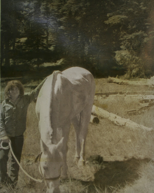
This print run was focused on strengthening the darker background area with the trees, especially the foliage lighted by direct sunlight, showing as highlights to the surrounding area. I believe I have accomplished that. The rest of the print is where I had intended. The girl's denim shirt and jeans look like worn denim and the lighter grasses in the sunshine, when the dichromate stain is removed, will remain the yellowish color they naturally are at that time of year. The overall color arrangement, as well as the brilliance of the sunshine is left, which was the object of the printing.
I photographed the print just before it was fully dry. The slight wrinkling of the paper shows a streak left from the shine of light across that area in the background. Not in the print.
Gum over Palladium ~ Gum Layer 5 ~ Hooker's Green mixed with Cadmium Yellow
"Girl with Horse" ~ 8x10

Saturday, July 21, 2018
Girl with Horse ~ Gum Layer 4
This print layer is the last of the coloring layers. The print is where I had intended with the color depth of each area colored. The mid-ground got another layer of cadmium yellow to keep it in the yellow spectrum after the dichromate stain has been removed. The darker area in the background also got that yellow layer to strengthen the blacks as well as shift the blue(r) color in the trees to a definite greener look. The second color added was phthalo blue, mixed to replicate denim, applied over the girl's shirt and jeans, and the horse's shadow, to shift it to a cool tone shadow in a warm toned area.
The print is now at it's end, with exception to an embellishment that will cap the end of the printing. A very sheer mixture and thin layer of quinacridone gold will be applied to the yellow grasses, the girl's hair, and the highlighted foliage in the background. This has to be done very, very sparingly not to look like gold has been painted on the paper. The idea is the 'affect' of 'golden sunshine', not a gold color. The horse remains the brightest object in the image. It is the central focus leading to the area around it. X amount of yellow must be visually subtracted from the image for what it will look like after clearing.
Gum over Palladium ~ Gum Layer #4
"Girl with Horse" ~ 8x10

The print is now at it's end, with exception to an embellishment that will cap the end of the printing. A very sheer mixture and thin layer of quinacridone gold will be applied to the yellow grasses, the girl's hair, and the highlighted foliage in the background. This has to be done very, very sparingly not to look like gold has been painted on the paper. The idea is the 'affect' of 'golden sunshine', not a gold color. The horse remains the brightest object in the image. It is the central focus leading to the area around it. X amount of yellow must be visually subtracted from the image for what it will look like after clearing.
Gum over Palladium ~ Gum Layer #4
"Girl with Horse" ~ 8x10

Subscribe to:
Posts (Atom)