Below is the before and after images, from the negatives I compared in yesterday's post, respectively. At one time, I would have likely preferred the first image for it's strong contrast, and deep blacks. Apparently my tastes have mellowed over the years, as I tend to like to see textural detail in all the zones that would normally exhibit detail, even texture. What was altered in the newer negative is an adjustment of approximately one tonal range worth of density added to the lower tonal range; the shaded area under the roof, especially the deeper shadow area around the woman at the door. I also manipulated the highlight region, representing Zones 7-8 and decreased the density.
In this particular instance, using the contrast adjustment would have corrected the too long of density range, but the hand manipulation, using standard Lightroom controls works best for me. Perhaps when I get good at reading densities I can incorporate other tools and techniques. After a thirty year hiatus, my eye has forgotten a lot. There is another element involved with decisions of negative density and how much to print down a negative, personal proclivities of vision, tastes. I am not yet finished with this image. All the images I am posting are test prints, considering all of the above variables. I have arrived at a workable printing range in the basic sense. I can get each negative to print and come out alright, I just haven't reached any final analysis on how exactly I want the image to look like. At this time, I am inclined to go the way of PJ's exploration of masking work, whereupon I would be able to work with just the tonal ranges in the shadow area under the porch roof, separating them better dropping the glassed area densities to Zone 1, woman Zone 2, porch area Zone 3 and the roof top and building facade Zone 6-7. That is the next step in fine tuning the negative to print exactly as envisioned.
Palladium toned Salted Silver Print
"OK Corral" ~ 8x10
First Negative
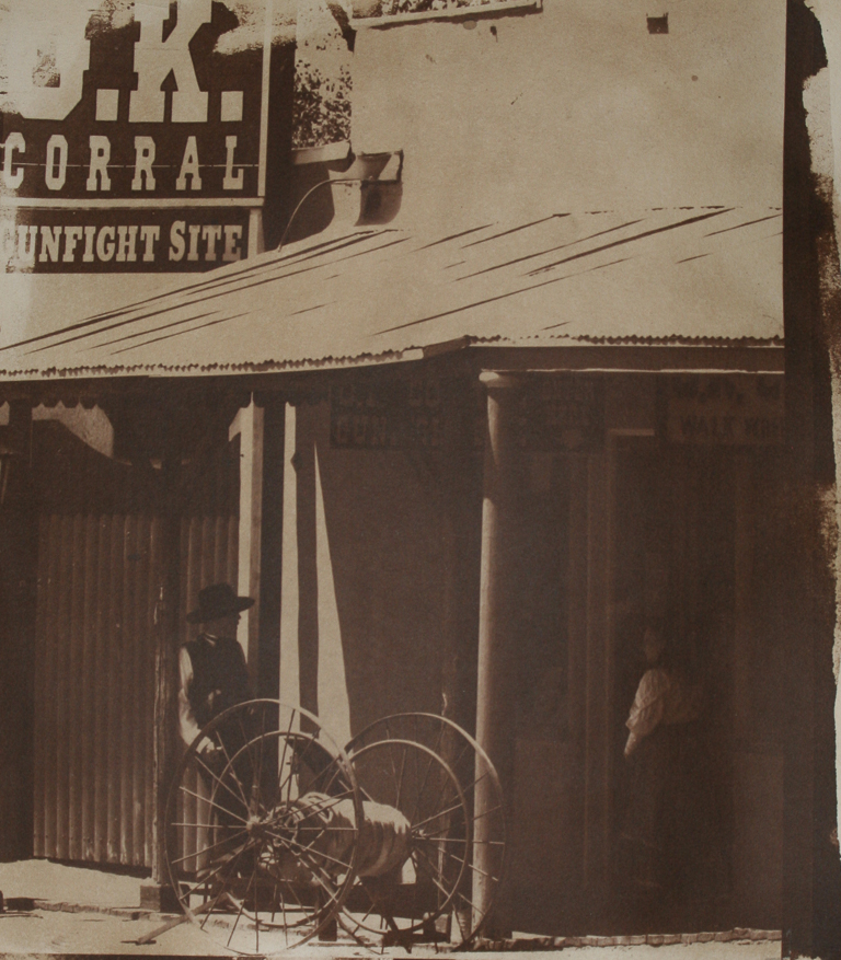
Area under the roof line has good separation and rich blacks but much is lost in the deeper shadow area around the woman. The roof and building facade have no detail at all.
Palladium toned Salted Silver Print
"OK Corral" ~ 8x1
Updated Negative

The area under the roof line here has been flattened by increasing the densities from
Zone 1-3. The manipulation I did affects this tonal range. The second manipulation was with the highlights Zone 7-8, which I decreased a full tonal range. This effectively compressed the entire density range of the image from the ends, towards the middle tones. There are parts of this I like, seeing detail and even texture, however I also want more contrast to show up, and that will take more local control of the densities. The next negative I print of this image will have the best attributes put to the final negative.
This is why I have come around again to my original approach to negative development. Each image is unique in all of its qualities, including density range, shape of the curve for controlling the relationships between densities, printing depth, toning choices and so on. Alter any of those variables and the final image is altered. Each image is an expression of one's artistic expression. I cannot imagine showing a portfolio with a dozen prints that were all identical. That's for computers to do, not an artist. Oh yeah, I am going to get slammed for that remark. Takes me back to explaining to a room full of photographers of every level and stripe that what we are actually looking for, in our gallery, were accomplished black and white photographers with a body of work to show for it. Raucous to mayhem in under ten seconds.
One thing is becoming very clear to me about toning with palladium. I do like the warm tones it brings to a print image, for the most part. One of the things it does do, in the formula I am using anyway, it lighten the shadow area over the course of toning. This was evident in the second print, whereas what appeared to be a rather dark area under the porch lightened up considerably after toning in palladium/citric acid solution. What I had thought to be plenty of print time, calculated by watching the highlights printing in, turned out to be just shy of where I had wanted it to be after toning. Gold toning is another animal. The formula I am using with the gold chloride (1%) luxuriously deepens the shadows and blacks. I mean Weston blacks. Choices. That is what it is all about, making artistic choices.
No comments:
Post a Comment