I promised something visual on my last post. Today was going to be a test day. It wasn't. PJ wasn't able to make it today so I'm putting that off until tomorrow, as there will be several tests to be done. What I did do today was satisfy a hunch I had about how the printer would affect the negatives I was seeing as too thin. Not so apparently. I pulled out two digital negatives I had tried printing before using north sky, but the outcomes wasn't all that good. The print tests today were easy to do, and they did tell me what I had wanted to know.
The primary problem in digital negatives is building up enough ink density to replicate the equivalence of the dense tonal ranges that would be on a chemically developed negative. That was until today. I had surmised that I had one negative that had surpassed that density, having printed it some time ago, first in north sky, and when there was no way to print in the two top density ranges reprinted it in full sunlight, facing the sun. Still, no printing in of those two tonal ranges, and those print times were 14-18 minutes north light, 10-12 minutes facing the sun. Today I printed that negative on a salted silver paper in five minutes, reaching absolute dMax. The second print I tried out was one I had no luck with using sunlight, with print times similar to the above. Today that negative printed in seven minutes, which was about 1 to 1 1/2 minutes too long. I printed it as a Kallitype, and Kallitypes darken down quite a bit after drying.
I took a quick snap of each print, when they were wet and a second when they were nearly dried down, to show the difference in darkening, as well as slight color shift, from a warmer brown to something closer to neutral to cool black. It takes a bit of practice to know when to pull a Kallitype print for development without practice. One is merely developing an eye for realizing at what tonal point in the print to make that call. Also to be noted these two prints are un-toned. There is Gold Toner on its way, for now, hopefully sometime soon I can move into palladium for toning. The price differences between Gold, palladium and platinum have risen drastically in the past ninety days. There seems to be a run on the metals by speculative hoarders. May they shriek in agony for a very long time.
Palladium went from $33/gram to $44/gram within one month and is now even higher. Platinum isn't even in the wish list right now. For now, gold will have to do. The formula I have and want to apply that uses thiocyanate with the gold chloride that is said to replace most of the silver salts with the gold. First time I had come across this but will most definitely be trying out.
Salted Silver Print ~ The Footbridge ~ 8x10
Sensitizer; 13% (saturated) silver
Binder; 3% sodium chloride
Print time; 5 minutes
Print is still wet here
The tones here are more reddish brown, although the reddish part is speculative being I don't see red much. What can be seen is the texture in the Zone 7 areas of the trees center top of image.
Print is nearly dry here;
The area between the trees, top, and the shadow underneath the bridge have darkened and the rock on the bottom right in the water has reached a darker black. Even a salted paper print will darken some upon drying.
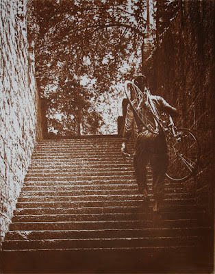
Kallitype Print ~ Bicycle on the Stairs ~ 8x10
Sensitizer; 10% silver solution to equal parts Ferric Oxalate ( 1ml each)
Developer; "Black Developer" using sodium acetate, tartaric acid and potassium dichromate (2% sol)
Print time; 7 minutes
Print is still wet here;
The negative's density range is actually just slightly longer than needed. The wall on the right has a lot of texture and light, which was depressed by my continuing the print time by 2 minutes to see if the wall on the left would come into the texture range; Zone 7. In doing so the texture on the right wall was lost, but that was the point, to see the differences between them. Now I can make that negative right.
Print is almost dry here;
The print has darkened as it dries, with the left wall now showing texture, and the right wall losing even more of its texture. The stairs are an important part of the image as when it is printed correctly the light areas show as melted silver, which of course is the object. This print will also be altered to make the density range fit the print time of the printer, once we've figured that out. That comes tomorrow.


No comments:
Post a Comment